From Surface to Subsurface: How Alexey Shulgin Visualizes the Invisible
When it comes to infrastructure projects, what you can’t see can cost you millions. Whether you’re building a tunnel or installing foundations for critical structures, each decision is a calculated risk, especially if the shallow subsurface isn’t fully understood. Unmapped bedrock highs, weak sediment layers, or unexpected voids can derail timelines and inflate budgets fast.
That’s where Alexey Shulgin comes in.
As Chief Geophysicist at Submara Survey (formerly Geomap Norge), Alexey’s job is to “see” through soil and rock, translating geophysical measurements into clear subsurface insight. But collecting the data is only part of the equation. The real impact happens when that information is transformed into visuals that stakeholders can understand.
The Art of the Multi-Audience Map
There’s an art to turning data into visuals that are understandable. For Alexey, that art becomes especially important because his audience isn’t just one type of professional. He works with project managers focused on timelines and risk mitigation, as well as civil engineers who need to evaluate bedrock quality and structural integrity in detail. Each group looks at the same subsurface but through a different lens. That creates a challenge.
Raw seismic data can be overwhelming for non-specialists. Dense velocity values, processing parameters, and technical annotations can quickly blur into noise. But oversimplifying the data creates another problem: engineers may lose the depth of detail they rely on to make structural decisions. Alexey’s solution isn’t to choose one audience over the other. It’s to design a final output that speaks to both through a deliberate three-visual narrative.
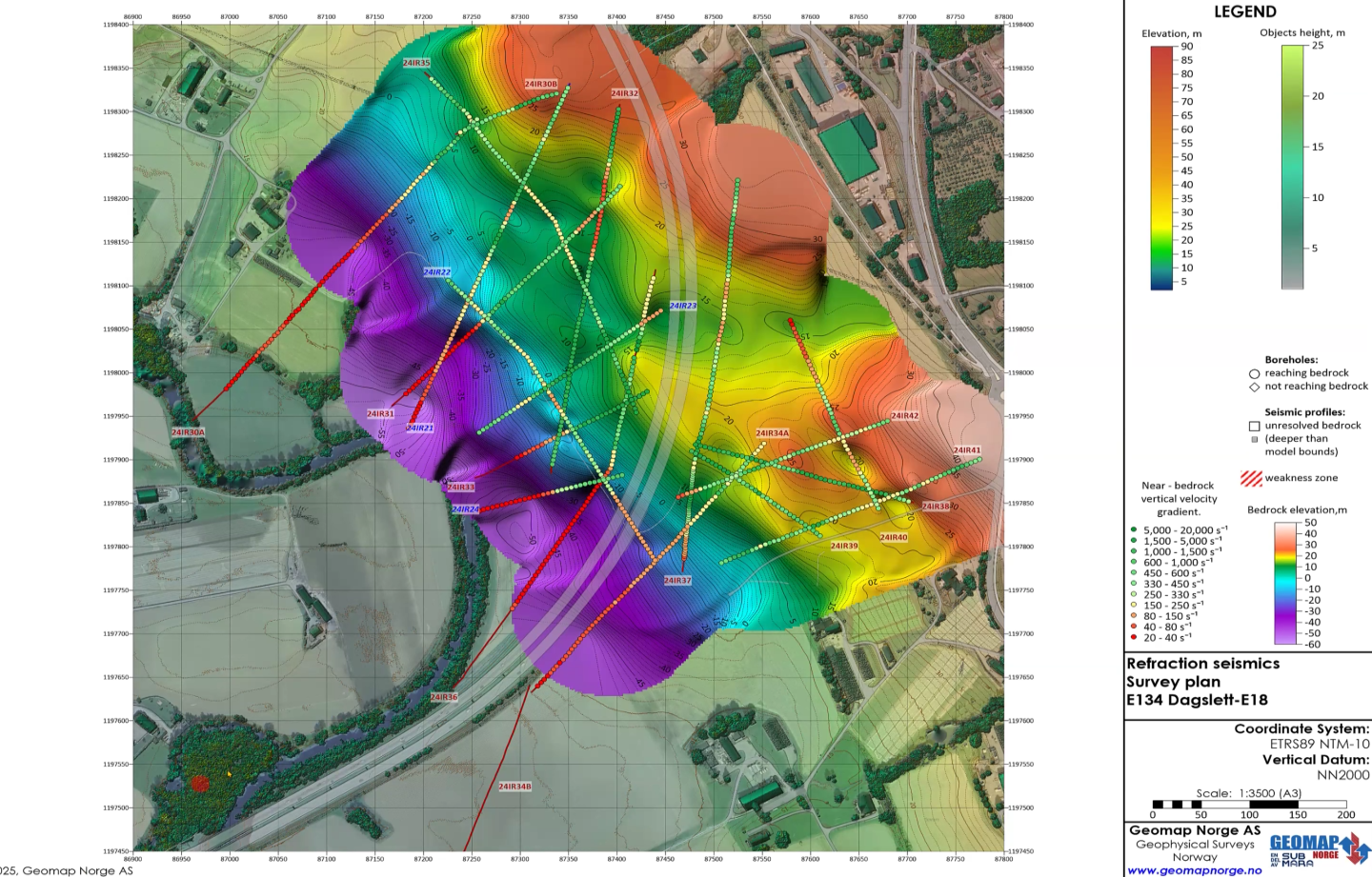
The Top Visual: Structural Interpretation
At the top of his final output is a visual Alexey uses to present the structural interpretation. This visual uses intuitive color schemes to clearly distinguish bedrock from sediment. For a project manager scanning the map, the takeaway is immediate: where is solid ground, and where are weaker materials likely to exist? It’s the high-level story told visually.
“For non-geologists, we can use this visual to say, ‘Okay, here are sediments and here is the bedrock,’ so that everyone is happy,” Alexey said.
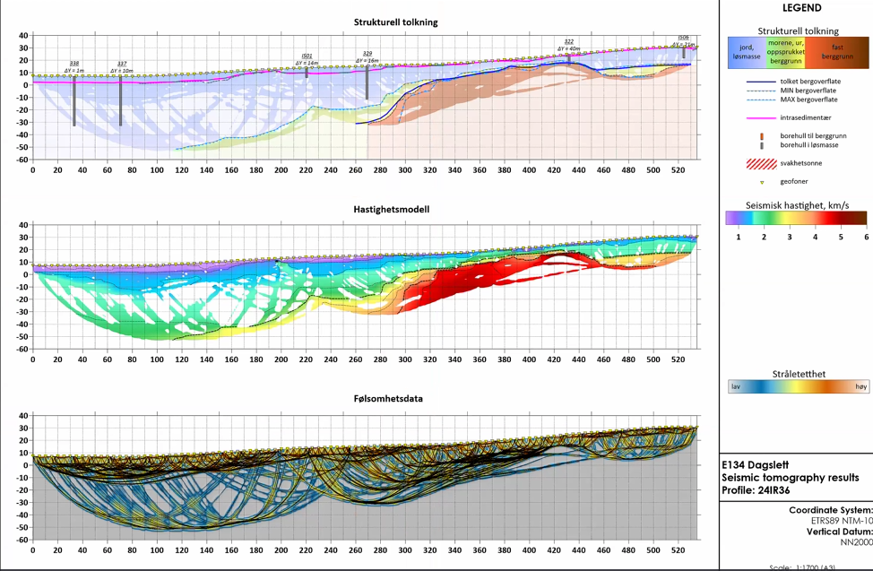
The Middle Visual: Seismic Velocities
Below that sits the technical heart of the final output: seismic velocity data. This is where civil engineers lean in. Velocity values provide insight into rock quality and mechanical properties. Instead of abstract interpretations alone, engineers can evaluate the raw geophysical measurements behind the conclusions. Nothing is hidden. The data remains accessible.
The Bottom Visual: Quality Control
The final layer is a quality control (QC) visualization that shows where data coverage is strong and where it becomes sparse. It communicates confidence levels transparently, highlighting areas of certainty and areas where interpretations are more approximate. This layer is critical because it not only shows what the subsurface likely looks like but also how well it’s known.
Precision at Pinpoint: The Power of Integration
Once the “story” of the profile is established, Alexey ensures it is grounded in real-world measurements. Interpretation is powerful, but it must be anchored in evidence. That’s why Alexey reinforces his subsurface models with precise, ground-truth measurements. Along the profile, he marks the exact depth to bedrock at specific points, giving clients clear, pinpoint values alongside the interpolated surfaces.
These depth markers do more than add numbers to a map. They validate the interpretation. They show where the model aligns with measured data and where conclusions are supported by direct evidence. But Alexey doesn’t stop at subsurface data. He also merges environments—integrating seismic interpretations with LiDAR datasets that include background topography, as well as the elevation of trees and buildings. By layering surface and subsurface information together, he creates a unified visualization.
This integration transforms conversations. Instead of abstract geological discussion, Alexey can tell a client something concrete: in one location, bedrock may sit 60 meters below ground, making excavation expensive and complex. In another area, it may be just 5 meters deep, which is far more feasible for piling or blasting. That clarity moves the project from uncertainty to decision. By connecting measured data, interpreted models, and real-world surface context, Alexey ensures that his visuals showcase what’s happening underground and how it’s actionable.
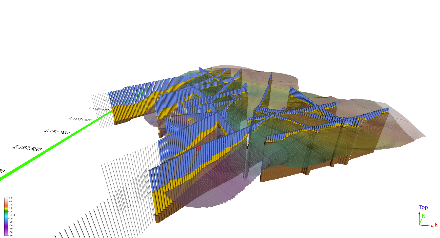
The “Aha!” Moment: Reimagining the Seismic Profile
Even with accurate maps, Alexey constantly looks for easier ways for clients to digest complex results. One of his biggest breakthroughs came after attending a webinar hosted by Surfer Pro Drew Dudley, where Alexey began rethinking how seismic profiles could be visualized.
“I started saying, ‘let’s try to display them in a fancy way in Surfer,” Alexey said.
Because his seismic data points were spaced at regular 5-meter intervals, he began treating each point as if it were a borehole inside Surfer. Instead of presenting a continuous wave of interpretation, he visualized the subsurface as a row of closely spaced boreholes along the profile. The result was a familiar and intuitive structure:
- Blue represented soft clay
- Yellow indicated harder deposits
- Brown marked solid bedrock
Suddenly, the profile looked less like an abstract geophysical diagram and more like something engineers and project managers already understood: a series of ground investigations lined up across a corridor. The impact was immediate.
“The clients were so astonished,” Alexey explained. “They pointed out how it looked so good.”
The visualization felt natural. It translated seismic results into a format that aligned with how professionals already think about the ground. That shift—from abstract waveforms to structured, borehole-style visuals—turned interpretation into clarity. And in high-stakes projects, that clarity can be the difference between hesitation and confident understanding.
Making the Invisible Actionable
From multi-audience visuals to high-quality boreholes, Alexey’s work demonstrates a powerful truth: subsurface data is only understandable when it’s communicated clearly. Throughout his projects, the goal is to translate complex geophysical data into visuals that build trust and reduce uncertainty so stakeholders can make informed decisions.
Whether he’s layering structural interpretation, velocity data, and QC coverage into a single narrative output, grounding models with pinpoint bedrock depths, or transforming seismic profiles into intuitive boreholes, the outcome is the same—insights that stakeholders can understand.
“The final results should look eye-catching, nice, and colorful,” Alexey said. “When it’s nicely mapped, clients are much happier.”
If you’re inspired by how professionals like Alexey are visualizing the subsurface, subscribe to our blog for more real-world stories, technical insights, and visualization strategies that will help you turn complex data into understandable insight.
Was this helpful?
Share This Article:
Leave A Comment
Recent Articles
- Apr 1, 2026|Gabbie Rhodes|10 min
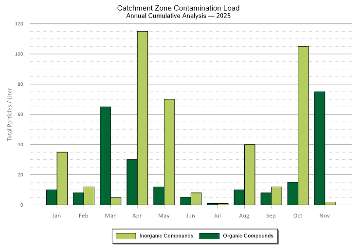
Grouped bar charts offer a distinct and powerful way to compare data. They can bring clarity to differences that might otherwise get buried.
- Apr 1, 2026|Gabbie Rhodes|6 min
From surface to subsurface features, Alexey Shulgin translates geophysical measurements into clear insight to drive stakeholders' decision-making.
- Mar 25, 2026|Gabbie Rhodes|10 min
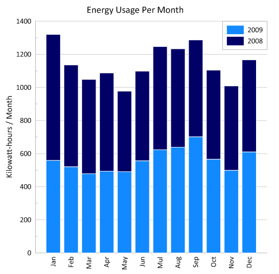
Stacked bar charts are one of those visuals that everyone recognizes but doesn’t always use to their full potential. Discover how to use it effectively.
- Mar 25, 2026|Gabbie Rhodes|11 min
One of the most common choices in scientific data visualization is deciding between a log scale vs. linear scale. Here's how to choose wisely.