
Mapping the Volatile Sands: How Roger Gaspar Visualizes the Thames Estuary

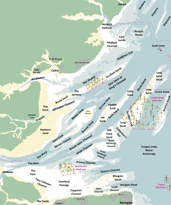
The Thames Estuary is anything but predictable.
Stretching across roughly 1,400 square miles, it’s a shifting intersection where river currents meet the North Sea, sandbanks rise and fall with the tides, and water levels rarely move in perfect sync. From a distance, it can appear wide and calm. Up close, it reveals a restless landscape shaped by the movement of water, sediment, and time itself.
The estuary’s complexity is compounded by two unsynchronized tides: one moving south from the North Sea and another curling north from the English Channel. This creates a unique phenomenon where mariners face seven hours of Flood tide but only five hours of Ebb, despite the regular spin of the moon.
Beneath the surface lies nearly 2,000 years of human activity. Trade routes, naval conflicts, shipbuilding, fishing, and wartime defenses have all left their mark. The seabed holds the remains of countless vessels, debris fields, and submerged hazards. The result is a region that can feel placid and welcoming one moment, and distinctly dangerous the next.
For yachtsmen navigating these waters, safe passage is calculated. That’s where Roger Gaspar comes in.
Roger’s mission is to create detailed passage and tide tables that help mariners understand when and how they can move through the Estuary’s ever-changing channels, known as swatchways. His work translates shifting sandbanks and complex tidal behavior into something actionable: guidance that helps sailors navigate confidently through uncertainty. And nowhere is that uncertainty more concentrated than at the Sunk Sand, a critical bottleneck in the Estuary and a focal point of Roger’s research.
The Disaster at Sunk Sand
In the middle of the Thames Estuary, efficiency matters. For leisure craft, crossing the four major sands—one of which is the Sunk Sand—is strategic. Sailing “round the edges” adds significant miles and exposes vessels to adverse tides that compound time and fuel costs. The more direct route cuts across the sands, saving distance and avoiding the worst of the tidal push.
Some of these crossings have marked channels. The Sunk Sand does not have them.
“Sitting squarely in the heart of the Thames Estuary, the Sunk Sand is known for its volatility,” Roger explained. “In some places, it shifts quickly; in others, its changes unfold more slowly. Decades ago, a series of beacons were placed on the Sunk Sand—reportedly for surveying training—but today, the area is largely absent of reliable navigational marks.”
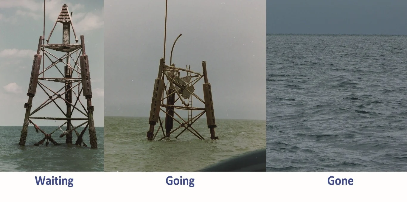
For the most direct route through the Thames Estuary, however, there was one critical reference point: the SW Sunk Beacon.
While completing research for his book, Roger confirmed that by navigating near the SW Sunk Beacon, leisure sailors could find safe water over the sand. He didn’t rely on large survey vessels or expensive equipment to make this discovery. Instead, he used a leisure echo sounder and an old-fashioned lead line, going round and round the area until he was confident in the route. The shortcut was viable.
Then, just as the draft of his book—which showcased this shortcut—was sent to the printers, disaster struck.
“The Port of London Authority reported that the SW Sunk Beacon had collapsed onto the seabed,” Roger said. “The primary navigational mark for the crossing was gone, its wreckage now hidden beneath the surface. Professional surveyors declined to approach the site because of the danger. No vessel could safely pass over the sand to justify the cost of sending a diver. The hazard would remain unmarked and uninvestigated.”
Overnight, the most direct route in Roger’s book became uncertain, and the content required its first amendment.
Without a safe channel across the Sunk Sand, the shortcut would have to be deleted entirely. But instead of removing the route, Roger made a different decision: finding a new channel.
From Crude Sketches to Professional Precision
At the beginning of the next season, Roger sailed back to the Sunk Sand, determined to find a swatchway—safe enough to use, far enough from the hidden wreckage, and still efficient enough to preserve the crucial crossing. After careful sounding, he located a rather indistinct channel about half a nautical mile from the old beacon.
Using a leisure echo sounder, recording latitude and longitude, and verifying depths with a lead line, Roger collected the data he needed. Back on shore, he opened a drawing program—long before “apps” were part of everyday vocabulary—and created what he describes as a rather crude sketch plan. However, that crude sketch plan served its purpose, and readers appreciated the clarity it brought to an otherwise uncertain crossing.
For five years, that swatchway remained viable. Roger improved his equipment, refined his surveying habits, and continued updating his work. But the sketch plans themselves weren’t evolving at the same pace as the data he was gathering.
Then, the sands shifted again.
In 2010, a 14-ton motor yacht following the latest Admiralty chart—which showed 3.7 meters of water at chart datum—suddenly ran aground. At low water, the crew discovered that the sea bottom had been replaced by a sand knoll drying to about 1 meter.
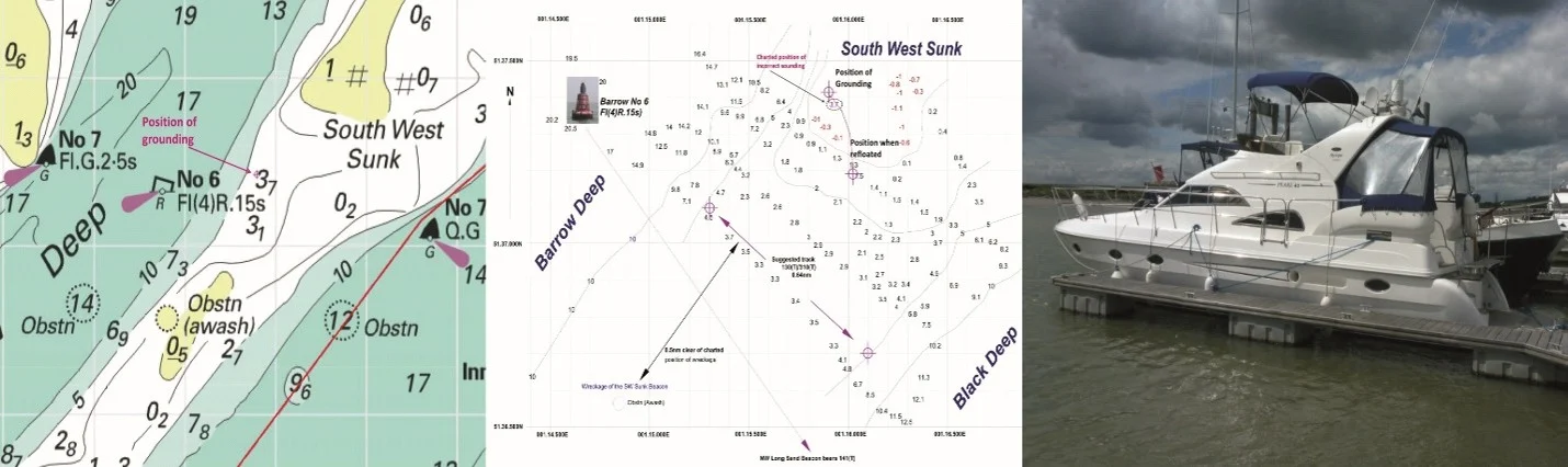
By the time Roger revisited the area in 2014, he found that the previous swatchway had closed completely. However, tracing the edge of the drying sand, he discovered a new, very distinct channel had scoured through the sands with depths starting at 6 meters.
“Where older charts had once shown 3.7 meters at chart datum—water that had later turned to hard, drying sand—the 2014 channel opened with depths of nearly six meters,” Roger explained. “The power of the tide had transformed the seabed, replacing sand with a deep and convenient passage.”
The volatility was staggering. In 2010, the leisure motor yacht relying on an Admiralty chart grounded in what should have been safe water. By 2014, within half a nautical miles, the sand had reshaped itself into a significantly deeper channel.
Roger submitted his 2014 findings to the UK Admiralty. Surprised by the scale of the change, they commissioned the Port of London Authority to conduct a formal survey. The results confirmed his data and prompted a new edition of the official chart.
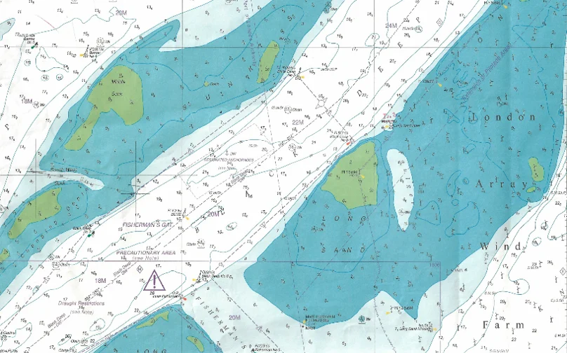
But there was a problem. The Port of London Authority could not re-survey and visualize the swatchway annually. Commercial priorities took precedence, but Roger knew the sands would not sit still simply because a chart had been updated. He also knew sketch plans were no longer enough.
That’s when a turning point arrived. Roger was given a Surfer subscription. For the first time, he could move beyond hand-drawn plans and into professional-grade visualization.
The possibilities now were significant. Instead of approximations, he could generate structured surfaces. Instead of static sketches, he could compare year-on-year changes. Instead of relying on rough outlines, he could demonstrate movement, sometimes as much as 100 meters to the northeast.
With Surfer, the swatchway was modeled. However, mastering that power required something else entirely: rigorous, technically disciplined data collection in one of the most dynamic marine environments in the world. And that challenge would redefine how Roger approached every survey that followed.
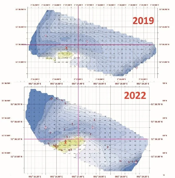
Surveying What You Cannot See
Marine surveying in the Thames Estuary does not start easily. You cannot see the sea bottom. That means every decision depends on data, and maximizing the quality of that data is critical.
Roger begins with what he calls a standing defect: he uses a single-beam echo sounder (SBES), while professional surveyors rely on multi-beam systems (MBES). A multi-beam setup can cost upwards of $40,000—well beyond the reach of most independent operators—so Roger works with the single-beam.
The difference is significant. A multi-beam system collects a wide swath of soundings across and alongside the vessel’s path. A single-beam system typically collects just one depth reading per second directly beneath the boat. As the vessel moves forward, it draws a single line of data.
“If those lines are spaced 200 meters apart, there is no direct information between them,” Roger said. “Any wreckage, rocks, or hazards between those lines could go undetected.”
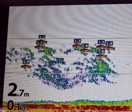
To strengthen his primary system, Roger added a Humminbird depth and fish finder with CHIRP down scan and side scan capabilities. This cost-effective addition proved its value. When the channel shifted, sand exposed the remains of a wreck—identified through side scan imaging.
That discovery reinforced two things: the seabed is constantly changing, and even with limited hardware, careful surveying combined with the right tools can reveal critical detail. It also marked an early moment where Surfer and 3D visualization began playing a larger role in helping Roger understand and communicate what lay beneath the surface.
Seeing the Wreck in 3D
Once Roger began using Surfer’s 3D capabilities, certain features became much easier to interpret. In 3D, it was straightforward to identify the exact position of the wreck exposed by shifting sand. The model showed clearly how the wreck sat on a “shoulder,” interrupting the otherwise smooth side of the swatchway—and that visual clarity mattered.
What had previously required careful interpretation through soundings and sketches could now be seen directly. The relationship between the wreck and the channel edge was immediately apparent in three dimensions.
For Roger, the 3D model helped confirm hazard locations and strengthened his understanding of how the channel was shaped at that moment in time. It also marked another evolution in his process.
Designing Chartlets That Sailors Can Actually Use
While 3D helped Roger better understand what lay beneath the surface, most leisure sailors don’t navigate with 3D models. They rely on chartlets: clear, readable representations that help them make decisions in real time.
Using Surfer, Roger produces chartlets in several forms, primarily with contours, grid values, and post or classed post values. The goal is not to overwhelm the viewer, but to present the most useful information in a format that is practical at sea.
The choice of contour frequency, color, and grid value density is deliberate. The product is designed to provide the best possible information without confusing the inexperienced user.
One particularly important feature is the “stack” of contours. When contours bunch tightly together, they instantly alert the reader to a sharp change in depth. For example, if a yacht were approaching a knoll with wind from the north or north-east and failed to turn away from rapidly falling depths, it could quickly go aground. In such circumstances, a sailing yacht’s engine may not be able to power the vessel clear.
“To prevent these dangerous shifts from catching sailors off guard, 3D also permits further analysis,” Roger explained. “Because the tide will pass through that swatchway each way, the contours, with the 3D image rotated, can immediately identify a natural venturi effect where the flood tide rate accelerates locally. Further, where the accelerated flood tide meets the full weight of the tide of the next main channel, sand is heaped up steeply.”
Over time, Roger has refined contour frequency and color to emphasize key features. He has also worked toward establishing a consistent “house” style, making his chartlets familiar and readable for returning users.
Surfer empowers him to build each chartlet using base, grid, contour, and post (or classed post) maps, turning layers on or off as needed during the review process. This flexibility makes it easier to study early visualizations for “oddities” before finalizing an output.
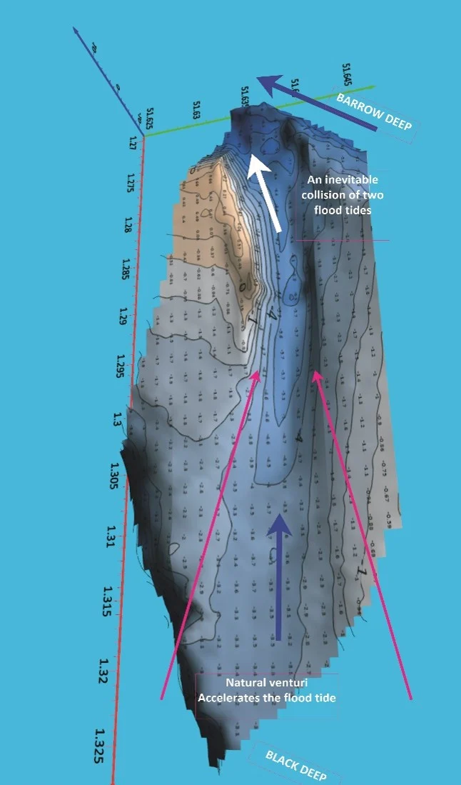
The result is a large-scale chartlet—typically at 1:1850—compared to a standard UK national chart at 1:50,000. The difference in scale alone illustrates the level of detail being provided to leisure boat users navigating some of the most volatile sands in the Thames Estuary.
Removing the Tide: Turning Depth into Chart Datum
Now, it’s time to make something clear: collecting depth soundings is only the beginning of Roger’s process. In tidal waters like the Thames Estuary, the depth recorded by the echo sounder includes the height of tide at that exact moment. Over the course of a three-hour survey, the height of the tide can change by at least 2.5 meters.
To produce a usable chartlet, those depths must be reduced to chart datum.
In very recent years, a more reliable system known as VORF has been developed, but its cost is beyond the resources of an individual surveyor. Instead, Roger relies on established methods.
At the SW Sunk, the closest tide gauge is at Margate, which provides minute-by-minute tide heights online. To reduce depths to chart datum, three things are required:
- The height of the tide
- The range of tide at the survey location compared to the tide gauge
- Whether the tidal wave at the survey location is ahead of or behind the gauge
At SW Sunk, the range factor is 0.98, and conveniently, the tidal wave is in line with Margate, meaning no time adjustment is required. Using a spreadsheet, Roger interpolates the tide height second-by-second and applies the range factor.
However, precision also requires accounting for the boat’s physical behavior under power, specifically “squat”—the tendency of the stern to sink at cruising speeds, which Roger adjusts by approximately 0.1 meters. Furthermore, he addresses “latency,” the timing delay between the XY position data and the Z depth data. By using a single-instrument chart plotter with 0183 NMEA output, he can organize all data into one-second bursts to ensure zero latency, providing a statistically defensible foundation for his models.
“The XY data arrives in degrees and decimal minutes via 0183 NMEA output and is converted in the spreadsheet to decimal degrees for compatibility with Surfer,” Roger said. “Only once these adjustments are made does the depth data represent the seabed itself, independent of the constantly changing tide.”
The overall process may be rooted in long-established methods, but it is essential. Without it, the depths would simply reflect the water level at the moment of collection, not the true form of the sandbanks beneath.
Quality Assurance in Motion
Once depths are reduced to chart datum and prepared for Surfer, the work is not finished. Echo sounder data is naturally subject to error, and quality assurance becomes critical.
Over a typical three-hour survey, Roger may collect around 10,800 soundings from a single system. In some locations, using both primary and secondary systems, that number can exceed 70,000 soundings. Within that volume of data, isolated errors are inevitable.
Common sources of error include:
- Air in the water
- Heavy weed
- Fish passing beneath the transducer
Isolated anomalies can be identified and deleted without harming the overall consistency of the dataset. In some cases, secondary data can be substituted.
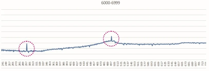
Air-related errors are more persistent and can be spotted in the spreadsheet using a simple graphical visualization. Because each sounding includes an exact position, Roger can call up the corresponding secondary system data for comparison. The value can then be deleted or amended as appropriate.
Surfer itself provides another layer of quality control.
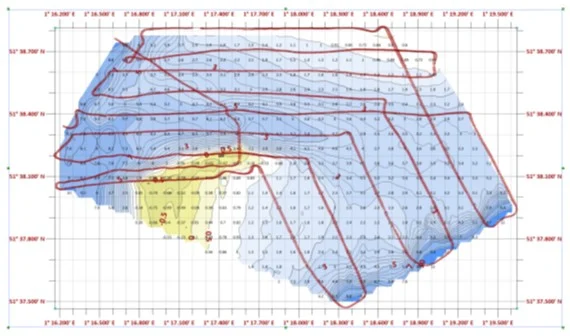
Using a post map, Roger can visualize the exact track along which data was collected. Where the survey plan includes intersecting lateral and vertical runs—particularly in a full grid layout—those intersections serve as a built-in test. Although the intersecting soundings were collected at different times, once reduced to chart datum, they should compare closely if the interpolation and tide reduction process was correct.
To examine this in fine detail, post labels can be reduced in size and displayed to two decimal places, allowing precise comparison at intersections. If values from vertical and lateral runs align, it confirms cohesion between equipment, chart reduction, and extrapolation methods. Any error in XY positioning can also be detected with Surfer.
In this way, quality assurance is not a single step. It is continuous: during collection, in the spreadsheet, and again inside Surfer.
From Data to Waypoints: Safer Passage Through the Estuary
Collecting, correcting, validating, and visualizing thousands of soundings ultimately serves one purpose: helping leisure sailors move safely through changing water.
With Roger’s final outputs, leisure boat sailors get a level of detail that’s not typically available to them. That detail translates into clearer guidance, better decision-making, and safer passage through the Thames Estuary, where sandbanks move, channels close, and wreckage remains hidden beneath the tide.
What began as crude sketches to save a book has become a disciplined process of surveying, verification, and visualization—turning raw marine data into practical navigation advice.
Watch the Supporting Videos
- Surfer Scrapbook SW Sunk Catalyst
- Surfer Scrapbook SW Sunk Comparison
- Surfer Scrapbook SW Sunk Characteristics
Want to provide your thoughts on this story? In the comments below, share the most dynamic or unpredictable landscape you’ve worked in!
2 Comments
Leave A Comment
Recent Articles
- Oct 7, 2026|Gabbie Rhodes|8 min
In the second post of our Visualizing Technical Data series, learn how maps and graphs can showcase your water quality data and uncover insights.
- Oct 7, 2026|Gabbie Rhodes|12 min
Have you ever wondered: what are the causes of a landslide? Discover the answer and how to visualize at-risk areas.
- Sep 29, 2026|Gabbie Rhodes|9 min
When visualizing technical data, a map will reveal certain insights, while a graph will reveal other insights. You need both to get the full picture.
- Sep 29, 2026|Gabbie Rhodes|5 min
Repetition slowing you down? Automation can quicken your high-volume workflow, remove manual steps, and even improve consistency.


Amazing!
I’m so glad you like the article, Eric!