Improving Wildfire Mitigation Through Hazard and Post-Fire Debris Risk Visualization


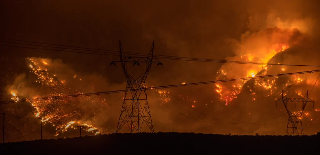
In recent months, communities across Canada and the United States have once again experienced the devastating effects of large wildfires. In Canada, over 900 wildfires were burning simultaneously as of late July 2026, with smoke drifting into the U.S. Northeast and Midwest, prompting air quality warnings across multiple states. At the same time, firefighters battled active blazes while evacuation orders forced thousands of Canadian residents from their homes.
While these immediate impacts often dominate headlines, they’re only part of the story.
Long after a wildfire is contained, the landscape can remain hazardous. Burned hillsides often become vulnerable to secondary threats—including flash flooding, erosion, and debris flows—that continue putting communities, infrastructure, and natural resources at risk.
That’s why effective wildfire mitigation requires more than tracking fire behavior alone. It also demands understanding how the landscape is likely to respond in the weeks, months, and even years that follow. But getting those insights means bringing together multiple datasets and transforming them into visualizations that reveal relationships impossible to see in one map or graph alone.
Unpacking the Data: 6 Variables Driving Wildfire and Post-Fire Visualization
No single dataset tells a wildfire’s complete story. While one indicates where a fire burned, another reveals where vegetation was lost, where steep slopes increase erosion risk, or where future rainfall might trigger debris flows. To understand both the wildfire itself and its long-term impacts, geo-professionals must evaluate multiple datasets together.
That’s where data visualization becomes essential. By overlayering and comparing various data points, experts can identify patterns and communicate risk more clearly to enhance mitigation efforts. With that in mind, here are six types of data that can work in conjunction with each other to provide a complete picture of wildfire behavior and post-fire hazards to inform actionable insights.
Burn severity
Burn severity measures how intensely different parts of a landscape are burned. Rather than showing where a wildfire occurred, it reveals how much damage the fire caused to vegetation, organic matter, and the surrounding environment. Visualizing burn severity helps geo-professionals distinguish between lightly affected areas and locations where ecological damage is much more extensive.
This information supports wildfire mitigation in two key ways:
- It identifies and classifies where vegetation loss and soil damage are most severe
- It helps prioritize restoration efforts by highlighting areas likely to experience the greatest environmental impacts
A good example comes from California’s 2021 Dixie Fire, one of the largest single wildfires in the state’s history, as it burned around 1 million acres and cost $637 million for firefighters to suppress. Researchers used burn severity maps to identify where forest structure and vegetation experienced the greatest damage. Those visualizations continue to support restoration planning while improving researchers’ understanding of how similar landscapes may respond to future wildfires.
Fire perimeter and spread patterns
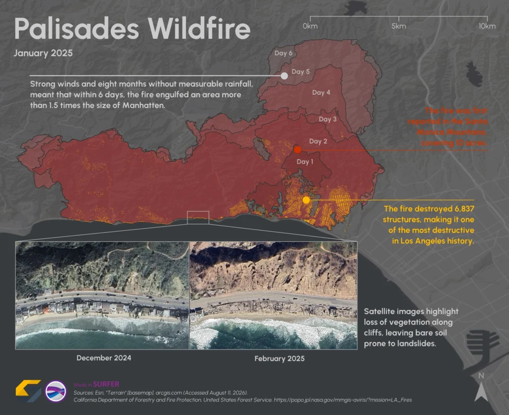
Knowing where a wildfire started is only part of the picture. Mapping the fire perimeter and visualizing how the fire spread across the landscape also provides valuable insight into which communities, ecosystems, and infrastructure were affected, while also revealing how terrain, vegetation, and weather influenced the fire’s movement. On a practical level, this information helps experts identify the full extent of the burned area and support post-fire planning, resource allocation, and long-term recovery efforts.
One example that puts this into perspective is the January 2025 Palisades Fire, which was part of several wildfires in Los Angeles County. Following the event, emergency managers relied on real-time fire perimeter maps and spread modeling to coordinate evacuation orders across affected coastal communities. Once contained, spatial visualizations—specifically CAL FIRE’s Damage Inspection (DINS) mapping and FEMA geospatial dashboards—were deployed to inspect over 6,800 destroyed structures and guide immediate recovery efforts across the burn scar.
Topography and slope
Elevation, terrain steepness, and drainage pathways define the physical framework of a landscape. When fire strips away stabilizing root systems and protective canopy, gravity takes over—making steep slopes inherently vulnerable to slope failure, sheet erosion, and rapid sediment displacement.
Visualizing high-resolution terrain data empowers geo-professionals to map slope gradients, model watershed catchment boundaries, and pinpoint natural choke points where runoff will concentrate.
Taking a look at the 2025 Los Angeles County wildfires again, federal agencies evaluated the steep terrain surrounding the Palisades and Eaton burn scars. By combining topographic basin morphometry with soil burn severity data, USGS Post-Wildfire Debris-Flow Hazard Assessments estimated the likelihood and potential volume of debris flows across burned catchments, helping define the rainfall thresholds needed to trigger hazards across affected watersheds.
Vegetation loss
Vegetation plays an essential role in stabilizing soil, reducing runoff, and protecting landscapes from erosion. Mapping where vegetation has been damaged or removed provides a clearer understanding of which areas have become more vulnerable following a wildfire.
The 2023 Canadian wildfire season—the largest on record—provides an excellent example. Researchers used Sentinel-2 satellite imagery to map vegetation loss across burned forests using cloud-based computing and vegetation indices. Those visualizations helped quantify the extent of damage while identifying areas where reduced vegetation could contribute to increased runoff, erosion, and other post-fire hazards, supporting both recovery planning and future risk assessments.
Rainfall
Rainfall is often the trigger that transforms a burned landscape into an active hazard. Even storms that would normally pose little concern can generate dangerous flooding or debris flows when they occur over recently burned terrain.
That’s why highlighting rainfall patterns is critical. Doing so equips geo-professionals to do the following:
- Monitor precipitation intensity and distribution
- Identify where incoming storms are most likely to trigger flooding or debris flows
After Colorado’s 2020 Cameron Peak Fire—the largest wildfire in state history—forecasters and water managers closely monitored approaching summer storms across the steep Cache La Poudre watershed. Through interagency coordination, the USGS Emergency Assessment of Post-Fire Debris-Flow Hazards and NOAA/NWS early warning systems paired real-time rainfall data with burn severity maps to issue flash flood and debris-flow warnings. These visualizations helped downstream communities prepare for mudslides and empowered municipal utilities to protect drinking water infrastructure before contaminated runoff reached river intakes.
Soil stability
Soil condition ultimately determines how likely a burned landscape is to erode or fail. Wildfires can alter soil properties, making some areas far more susceptible to movement once rainfall occurs. Visualizing soil stability alongside other post-fire datasets helps reveal where those vulnerabilities are greatest.
Following California’s 2017 Thomas Fire, scientists with interagency response teams combined soil burn severity maps with information on erodibility, slope, and expected rainfall thresholds to identify areas susceptible to post-fire debris flows before winter storms arrived. Published by the USGS and state emergency managers, these post-fire debris flow assessments helped local officials establish evacuation zones and prioritize mitigation efforts for communities facing elevated risk.
Best Practices for Creating Actionable Wildfire and Hazard Maps
While it’s clear that visualizing multiple variables is critical for effective wildfire mitigation, that information must be presented in a way that effectively communicates risk, highlights priorities, and helps stakeholders act with confidence. Whether you’re preparing maps for emergency managers, engineers, land managers, or community leaders, the following best practices can make your visualizations more successful.
Combine multiple data layers
The best insights emerge when multiple variables are viewed together. Overlaying burn severity, vegetation loss, topography, soil stability, and rainfall empowers geo-professionals to identify relationships that would be difficult—or impossible—to recognize in isolation. The result is a more complete understanding of where post-fire hazards are most likely to occur and where mitigation efforts should be focused first.
Include infrastructure and community assets
Hazard maps become even more valuable when they show what’s at risk. Showcasing hazard zones along with roads, bridges, utilities, neighborhoods, and other critical infrastructure helps planners and engineers quickly identify vulnerable assets and prioritize protective measures. Rather than simply showing where hazards exist, maps with these elements help answer an equally important question: What will those hazards affect?
Design maps that communicate clearly
Even the most accurate analysis loses value if stakeholders struggle to interpret it. That’s why you should avoid unnecessary visual clutter, use clean legends that are easy to interpret, and choose perceptually uniform color scales that accurately represent changes in severity. Well-designed maps allow both technical and non-technical audiences to understand risk quickly, leading to faster and more confident decision-making during planning and emergency response.
Monitor recovery over time
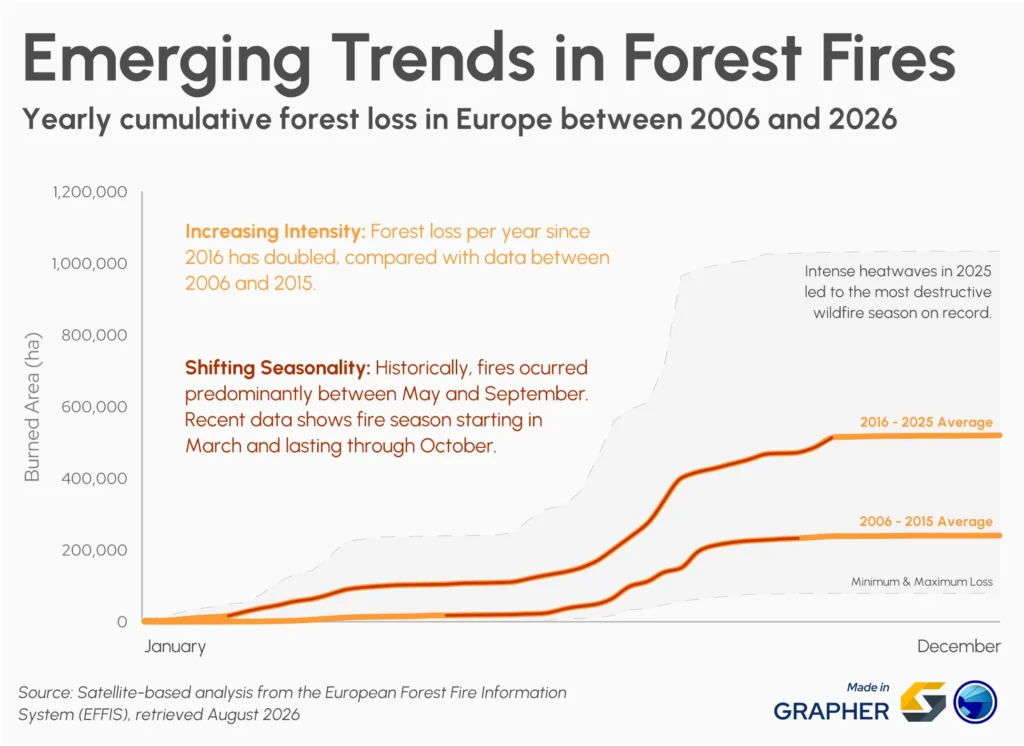
Wildfire mitigation doesn’t end once immediate hazards have been addressed. Landscapes continue to evolve as vegetation regrows, watersheds recover, and erosion risks change. Creating time-series maps and graphs equips stakeholders to monitor these long-term trends, evaluate whether mitigation efforts are working, and identify new areas of concern as conditions change. Comparing data across months or years also provides valuable insight that can improve planning for future wildfire seasons.
Tailor visualizations to your audience
The same dataset may need to be presented differently depending on who will use it. Engineers might need detailed analyses with multiple data layers, while emergency managers, public officials, and community stakeholders benefit from simplified maps that clearly communicate priorities and areas of greatest concern. Designing visualizations with your audience in mind makes it easier for everyone to understand the information and take appropriate action.
Looking Beyond the Burn Scar
Wildfire mitigation doesn’t end when the flames are extinguished. It continues as geo-professionals evaluate how burned landscapes will respond to future weather and identify where new hazards are most likely to emerge. By overlaying variables like burn severity, topography, vegetation loss, rainfall, and soil stability into clear, actionable visualizations, experts can make more informed decisions to effectively approach mitigation efforts.
As wildfires continue to shape communities and landscapes across North America, the ability to transform complex datasets into meaningful insights will become even more important. The more effectively you visualize wildfire impacts and post-fire hazards, the better prepared you’ll be to support recovery efforts, reduce future risk, and build more resilient communities.
What datasets or visualization techniques have you found most valuable for wildfire mitigation or post-fire hazard assessments? Share your experience in the comments below.
Recent Articles
- Oct 14, 2026|Gabbie Rhodes|7 min
Mineral exploration requires you to analyze multiple variables. To do that successfully, you need to rely on both maps and graphs.
- Oct 7, 2026|Gabbie Rhodes|8 min
In the second post of our Visualizing Technical Data series, learn how maps and graphs can showcase your water quality data and uncover insights.
- Oct 7, 2026|Gabbie Rhodes|12 min
Have you ever wondered: what are the causes of a landslide? Discover the answer and how to visualize at-risk areas.
- Sep 29, 2026|Gabbie Rhodes|9 min
When visualizing technical data, a map will reveal certain insights, while a graph will reveal other insights. You need both to get the full picture.