Effectively Reach Your Diverse Audience
Whether you work in hydrology, geology, construction or environmental engineering, interpreting data and telling a story with the results is a critical part of your work. It can be a rewarding process, but it is not without its challenges. Chief among them is the variety and diversity of your potential audience and the need to convey your data in a way that will be valuable and easily absorbed.
Your audience may consist of clients, colleagues, investors, students, grant boards or contract authorities, to name a few, and each group has varying needs and requirements as well as degree of understanding of your industry. While the task of representing your data for such varied situations may seem daunting, it can be accomplished deftly with the right software.
Communicate with your Audience using Mapping
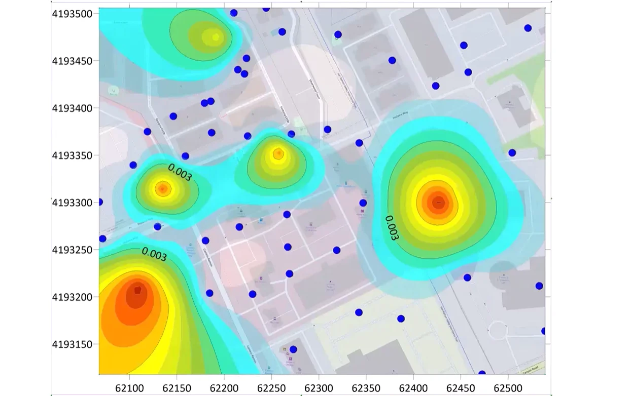
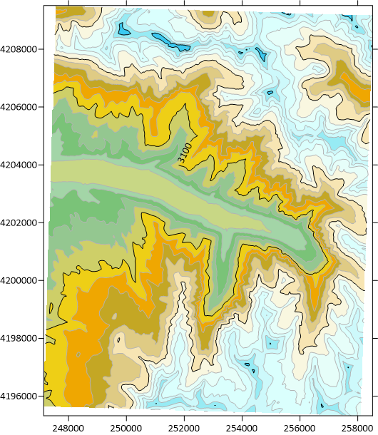
For instance, a mapping software that offers both two- and three-dimensional map options allows the user to share with industry peers a 2D aerial photograph featuring contoured differences in elevation, reflecting a great deal of data in rich detail. However, a stakeholder with limited industry knowledge may be confused by such a map, only seeing it as an indecipherable series of lines. For this type of person, a 3D map could be much more useful. If the software allows, the data could be exported directly from the program to a PDF which can be sent to the stakeholder and opened in Adobe. This would allow them to view the contours and elevational differences in a much more digestible and engaging way than with 2D contour lines, providing a much clearer sense of the landscape

Reach your Audience with Graphing
The same kind of freedom can be found with the right graphing software. If you are working with a dataset from a sampling site, there can be an overwhelming amount of data that can be difficult to communicate on a basic level. While presenting tables upon tables of statistical analyses is good for tech-minded people and industry experts, this approach doesn’t convey message well to a less experienced audience. Look for a software option that can synthesize data into clear, understandable plots with plenty of customization options like color codes, legends, axes, polylines, fit curves and more. Also seek out an abundance of plotting options that will allow you to represent changes over time as a narrative instead of a barrage of raw data.

Step plot with two linear fit curves applied
While extensive customization options are important when creating representations catered to varying audiences, it is equally important that the software be intuitive and user-friendly. The usefulness of abundant features is hindered significantly with a complicated user interface, obscure naming conventions, and limitations on simple functions like copy and paste. Be sure to take advantage of demonstrations and free trials as you research – this will provide a sense of how user-friendly a potential software option actually is and prepare you to present to any audience upon purchase.
If you have questions about mapping or graphing customization, contact Golden Software today.
Recent Articles
- Jun 17, 2026|Gabbie Rhodes|8 min
Both work and family require energy and intentionality. To ensure you approach them effectively, discover tips to balance work and family life.
- Jun 17, 2026|Gabbie Rhodes|11 min
Senior Technical Sales Specialist Drew Dudley hosted a webinar to provide tips for ensuring coordinate systems display accurately and consistently.
- Jun 10, 2026|Gabbie Rhodes|9 min
During peak season, it’s hard to complete high-quality work on time. Fortunately, some practical workplace productivity hacks can help.
- Jun 10, 2026|Gabbie Rhodes|5 min
When it comes to software, the right licensing model matters. A one-time fee and subscription are common options. Which is right for you?