- Jun 25, 2025|Gabbie Rhodes|6 min
When you get new data, it's time to refresh your Grapher plots with the latest insights. The best way to do it? Using the Remap Worksheets tool.
- Jun 25, 2025|Gabbie Rhodes|9 min
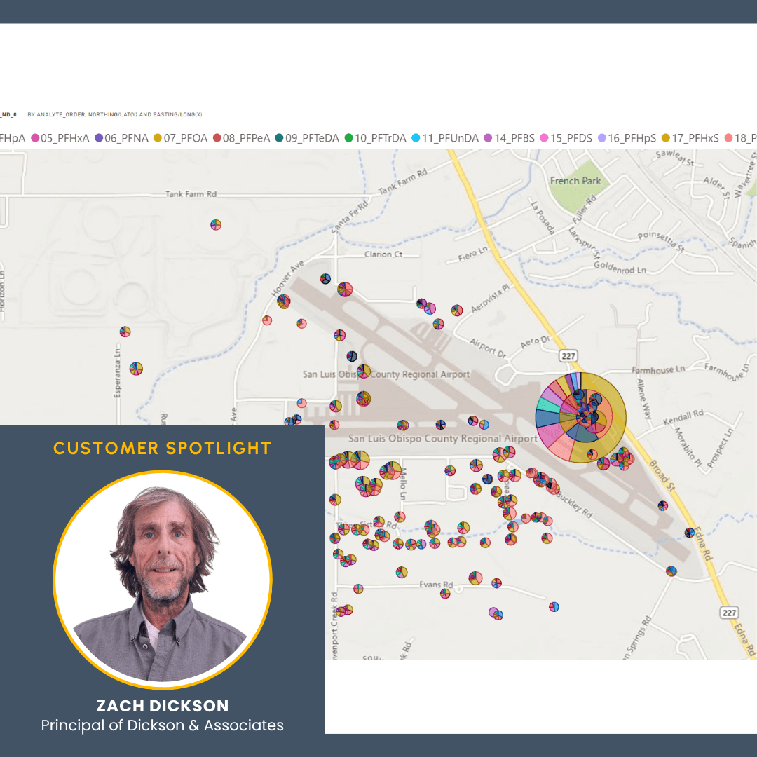
PFAS at California airports are an issue. But how can researchers and the public truly understand the problem? A PFAS model can help.
- Jun 17, 2025|Gabbie Rhodes|8 min
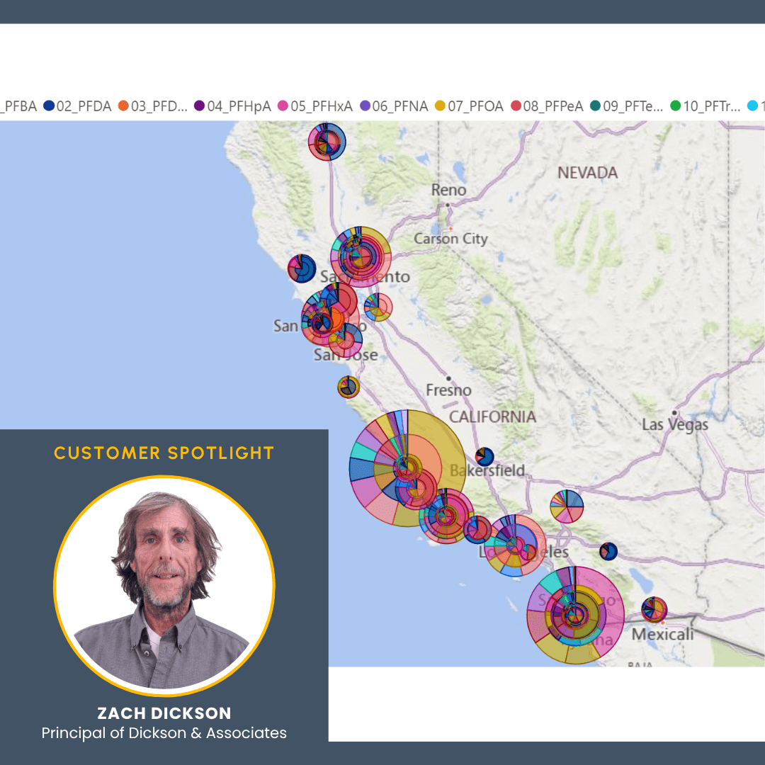
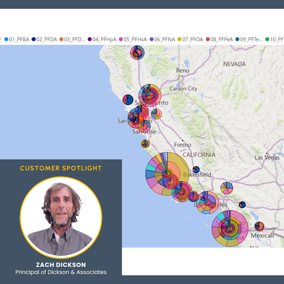
PFAS is a growing concern in California. However, to better understand the situation, Zach Dickson created a model showing PFAS in California.
- Jun 17, 2025|Gabbie Rhodes|8 min
We take your feedback seriously, which is why we don't just collect it - we also have a process for using it to continuously improve our products.
- Jun 10, 2025|Gabbie Rhodes|6 min
As the professor at FGCU's limnology class, Dr. Serge Thomas gives students the tools and practical experience they need to excel. Learn more.
- Jun 10, 2025|Gabbie Rhodes|6 min
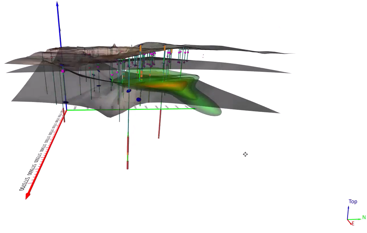
PFAS is a growing concern in Colorado. However, to better understand the situation, an model was created to visualize PFAS in Colorado.
- Jun 3, 2025|Gabbie Rhodes|9 min
It's typical to sift through vast datasets to uncover and visualize insights, but you can save time and deliver better work by filtering data in Grapher.
- Jun 3, 2025|Gabbie Rhodes|8 min
PFAS is an increasingly urgent problem in the U.S., but sometimes, it's hard to understand its impact. Fortunately, new interactive models can help.
- May 29, 2025|Gabbie Rhodes|4 min
Senior Business Development Manager Drew Dudley showed how Surfer empowers users to create great PFAS contamination models. Learn more.
- May 29, 2025|Gabbie Rhodes|4 min
Our team really enjoys building social connections. One way we achieve that goal? Coming together for fun, adventurous team hangouts.
- May 21, 2025|Gabbie Rhodes|7 min
There are many gridding algorithms in Surfer to help you uniquely showcase your data, but there are also common mistakes to avoid.
- May 21, 2025|Gabbie Rhodes|8 min
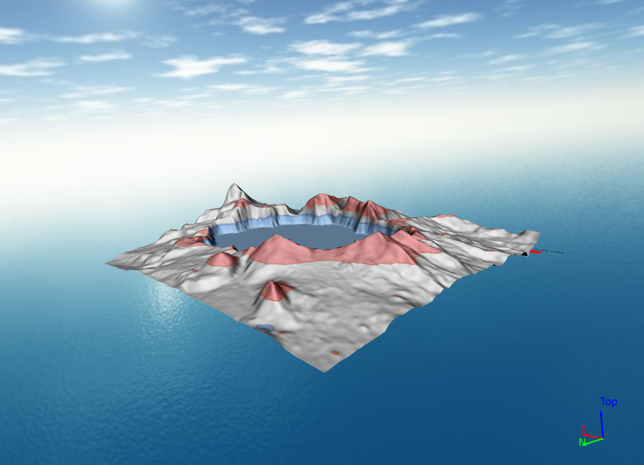
There's nothing wrong with 3D surface maps, but 3D View offers way more options to help you effectively show your data. Learn more.
- May 14, 2025|Gabbie Rhodes|6 min
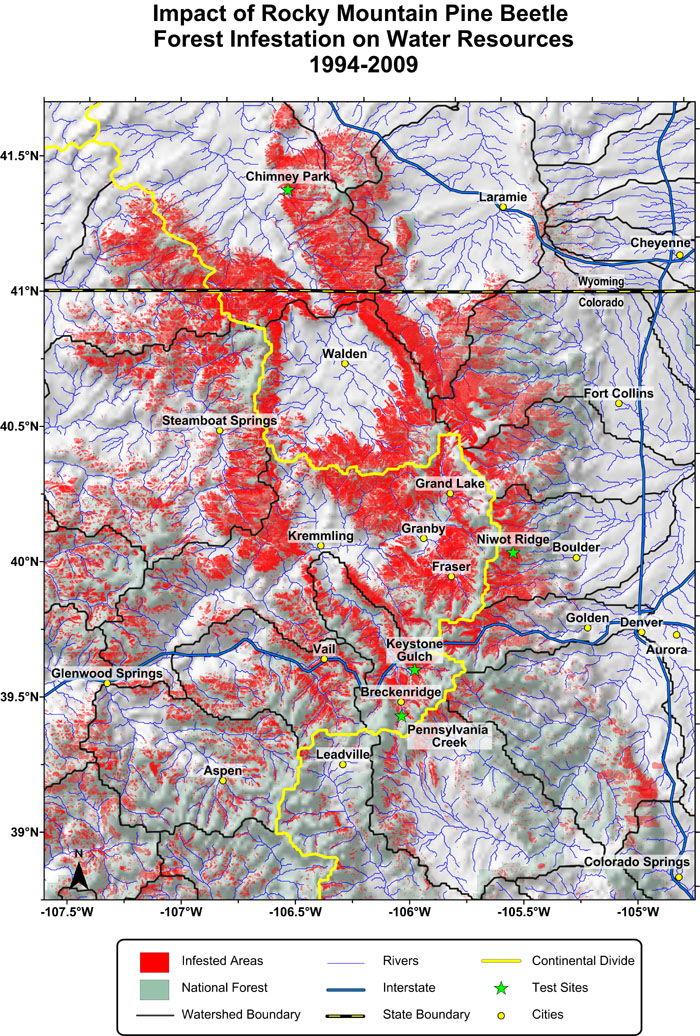
Stakeholders need clear, compelling, and accurate data visualizations to manage water resources. Watershed maps help get the job done.
- May 13, 2025|Gabbie Rhodes|7 min
The latest Grapher release has exciting updates that'll streamline your workflow and help you explore and discover ways to enhance your visuals!
- May 7, 2025|Gabbie Rhodes|4 min
Water availability shifts due to precipitation, runoff, evaporation, and more. How can you visualize the changes? Enter peaks and depressions maps.
- May 7, 2025|Gabbie Rhodes|6 min
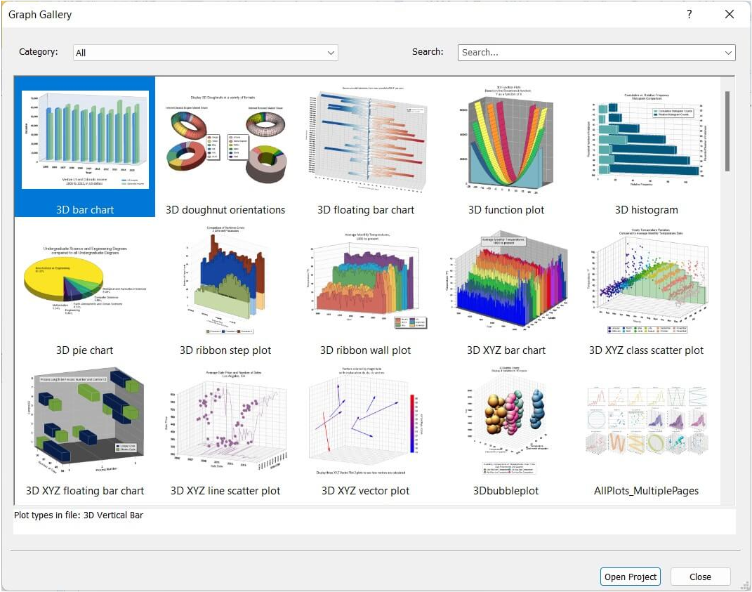
Do you ever need inspiration when creating a new graph? If so, here's good news: you can rely on great examples in Grapher for help.
- Apr 30, 2025|Gabbie Rhodes|7 min
There are multiple benefits of software beta programs, especially the ones at Golden Software. That's why you should participate in them.
- Apr 30, 2025|Gabbie Rhodes|6 min
LiDAR sensors gather high-resolution data, and now point cloud layers in Surfer are helping showcase that data efficiently and clearly.
- Apr 23, 2025|Gabbie Rhodes|11 min
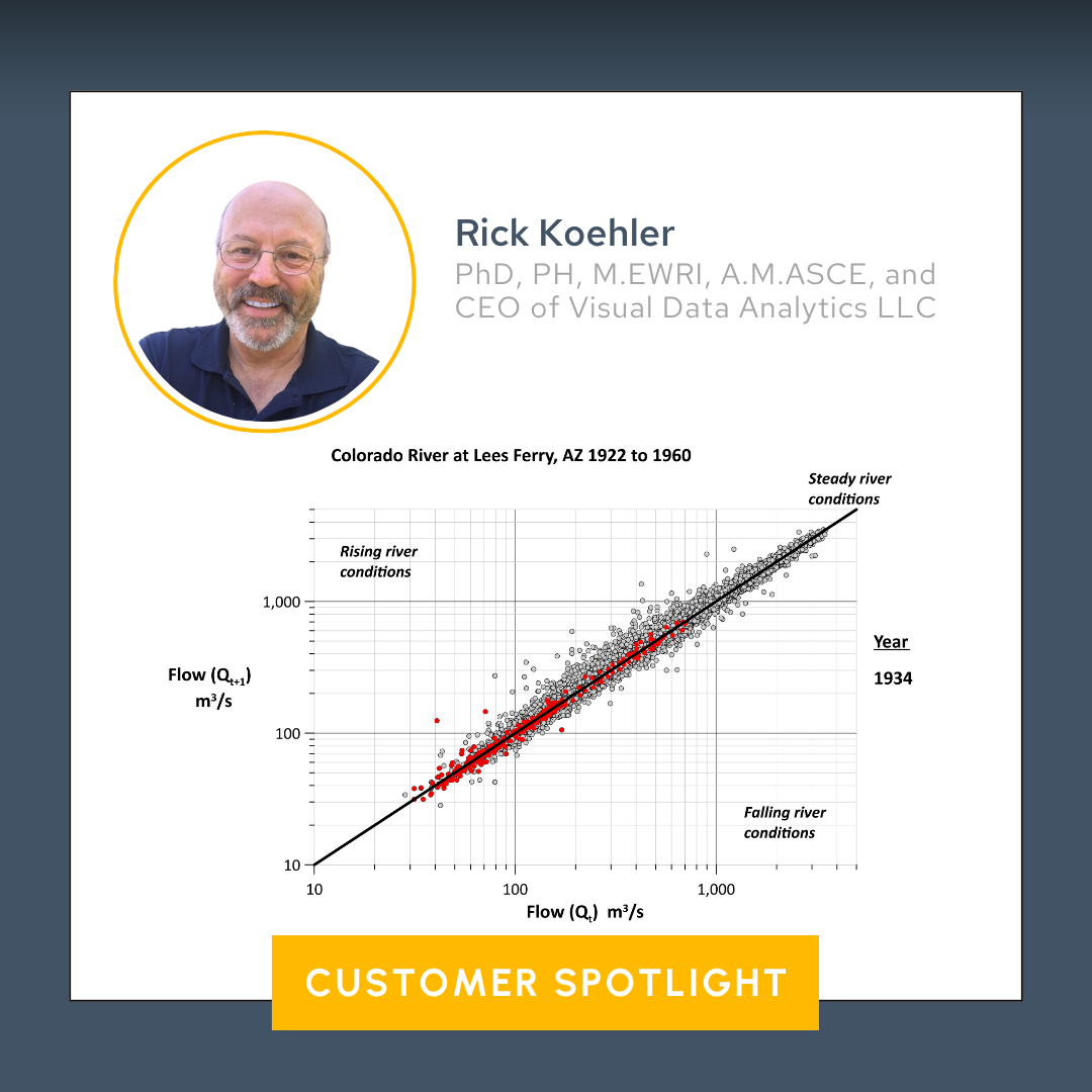
Some data visualizations are so good they stand the test of time. One is a high-profile plot that was created in Surfer and that's still relevant today.
- Apr 23, 2025|Gabbie Rhodes|7 min
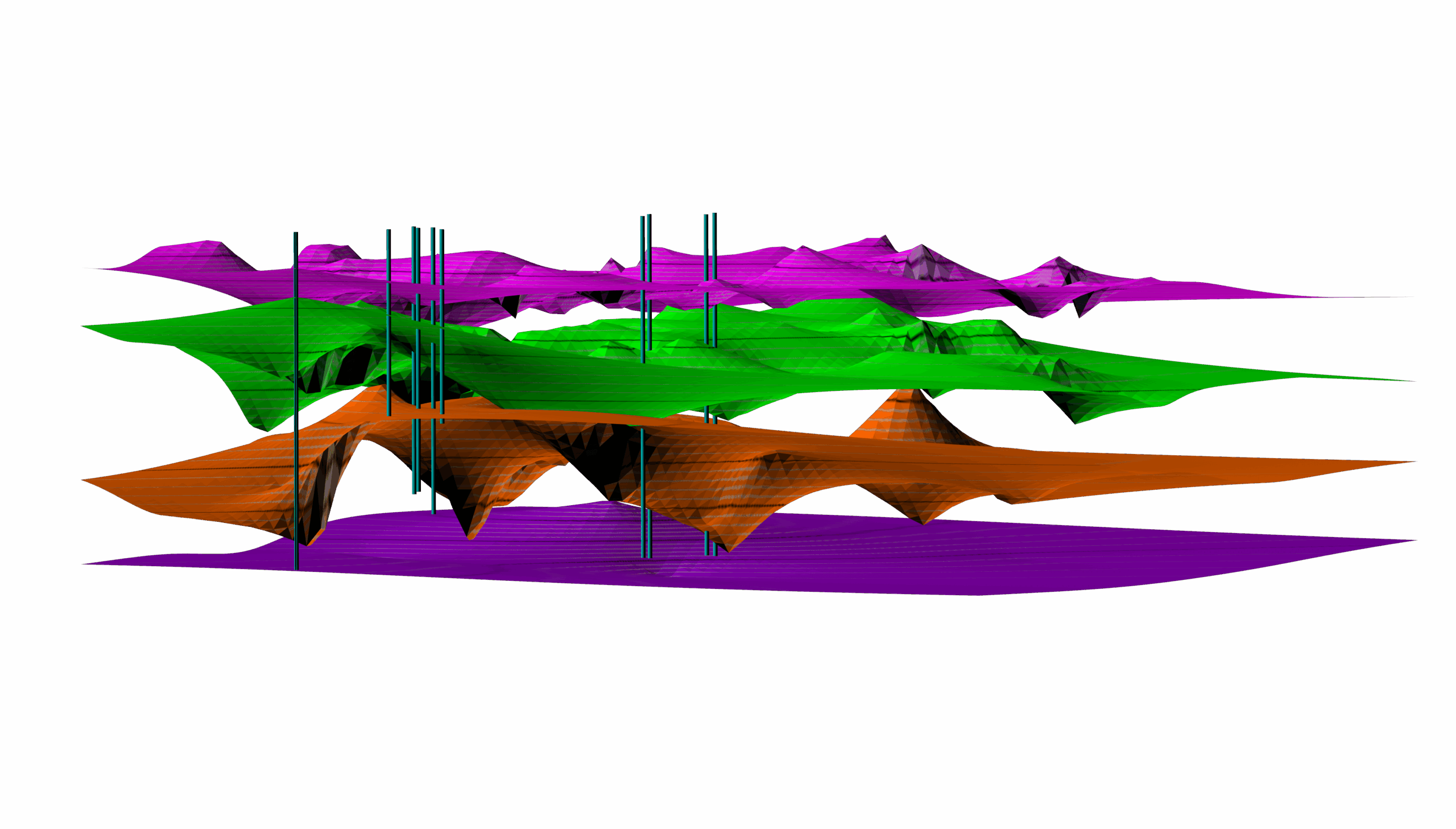
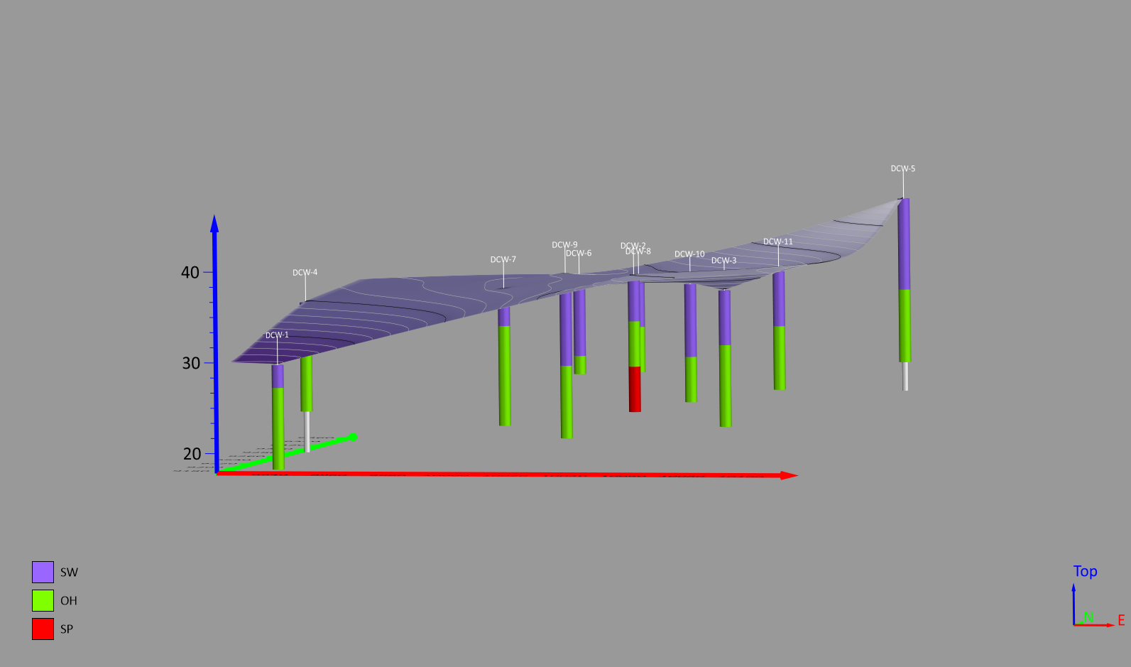
Do you want give stakeholders more insight into the subsurface? There's a specialized map type you should consider using: drillhole maps!