Stacked Bar Chart: Its Purpose, Benefits, & Examples of When to Use It
Stacked bar charts are one of those visuals that everyone recognizes but doesn’t always use to their full potential. At first glance, they look like standard bar charts, which can make it easy to treat them the same way. But stacked bar charts serve a very different analytical purpose, and that’s exactly why they deserve a closer look.
In this blog, we’re walking through the purpose, benefits, and best-fit scenarios for stacked bar charts so you can put them to work effectively in your geoscience and engineering workflows.
What Is a Stacked Bar Chart?
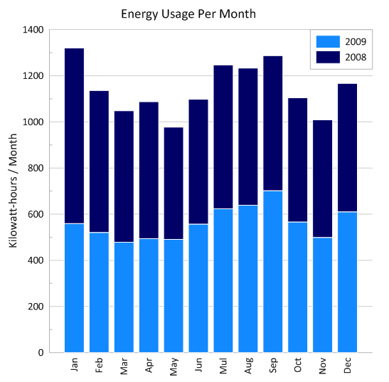
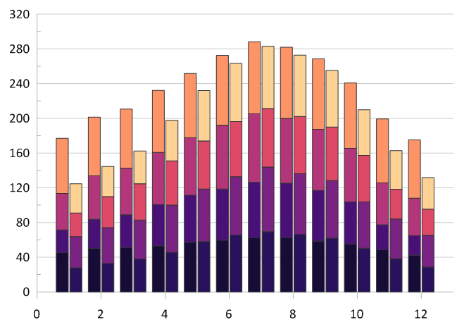
First, what differentiates a stacked bar chart from a standard bar chart? At its simplest, a stacked bar chart is a visual where each bar represents a total value, and that bar is divided into segments, with each segment showing one subcategory that contributes to the whole. Those segments are literally “stacked” on top of one another, giving you a combined view of total magnitude and internal composition in a single visual.
This is different from a grouped (side-by-side) bar chart, where categories are placed adjacent to each other for comparison. Grouped charts help you compare subcategories directly, but they don’t give you a quick sense of the total. Stacked bar charts flip that dynamic: they show the whole first, then reveal how each part fits into it.
Pro Tip: The 100% Stacked Bar Chart
A variation of a stacked bar chart that’s also worth mentioning is a 100% stacked bar chart. In this version, every bar is the same total height, representing 100% of the category. Instead of showing absolute values, the segments represent the relative percentage that each sub-category contributes to the whole. This is particularly useful in geoscience when the “ratio” is more important than the “total mass”—such as comparing soil composition percentages across samples of different sizes or weights.
The Benefits of a Stacked Bar Chart
Given that stacked bar charts have a unique purpose, they also have unique benefits. Below are a few key advantages they offer that make them a great data visualization.
Visualize composition and total magnitude simultaneously
The primary strength of a stacked bar chart is its ability to show the “whole” and its “parts” at once. For example, instead of just seeing that a drillhole has a high mineral yield, stakeholders can immediately see the ratio of gold to copper within that total. This dual layer of information provides a level of detail that a standard bar chart simply can’t match.
Identify trends in sub-category ratios
Because sub-categories are stacked vertically, it’s easier to track how the ratio of components changes across the X-axis. This is essential for identifying whether a specific variable—such as a contaminant type or a cost driver—is increasing or decreasing relative to the other data points.
Consolidate complex data into a single view
Stacked bar charts combine multiple components into a single bar, so they reduce the need for separate visuals. This makes them especially useful in reports, dashboards, or presentations where space is limited and clarity matters. Instead of scattering information across multiple charts, you can tell a more complete story in one compact view.
How to Know If a Stacked Bar Chart Is a Good Fit
While stacked bar charts have advantages, not every dataset is a good candidate for one. Before committing to this visual, it is important to step back and evaluate both the structure of your data and the message you’re trying to communicate. That said, run your dataset through the five criteria below. If these requirements don’t align with your data, another visual might be a better choice.
- Does the “sum” actually matter? The total height of the bar must represent a real-world metric (e.g., total project cost, total contaminant load, or total ion concentration). If the sum of the parts is a meaningless number, do not stack them.
- Is the sub-category list identical across all bars? Stacking works best when every bar contains the same components (e.g., Sand, Silt, and Clay). If Bar A has “Copper” but Bar B has “Zinc,” the visual comparison breaks down.
- Are you prioritizing distribution over precision? With stacked bar charts, it’s critical to keep in mind that the middle and top segments will be harder to measure exactly. So, use this visual when the ratio is the story, not the decimal point. If the distribution (percentage) is the only thing that matters, a 100% stacked bar chart may be your best option.
- Is your segment count low and lean? Having 2–5 segments is best. Once you hit six or more, the chart becomes challenging to decode without a massive legend.
- Do you have a consistent “anchor” segment? The sub-category at the bottom is the only part of your data that can be compared with 100% precision across all bars. Whether you choose your most important metric or your most stable one, this “anchor” serves as the baseline. By keeping this bottom segment consistent, you provide a steady platform that makes it much easier for stakeholders to track the more volatile, “floating” segments stacked above it.
Ultimately, by filtering your data through these criteria, you’ll ensure your visual remains a tool for insight rather than a source of confusion. When these conditions are met, a stacked bar chart is unparalleled at showing how individual parts combine to form a larger, meaningful total.
When a Stacked Bar Chart Is Not the Best Choice
The same way stacked bar charts are effective when certain criteria is met, there are moments when they can introduce more confusion than clarity. Knowing when not to use one is just as important as knowing when it works well, so here are various situations where a stacked bar chart isn’t the right choice.
When comparing “floating” sub-categories across bars
Because only the bottom segment shares a common baseline (zero), it is notoriously difficult to compare the middle or top segments accurately. If your goal is to show that “Mineral X” is slightly higher at Site B than at Site A, a Grouped Bar Chart is superior because it places both segments on the same baseline for a direct “eye-level” comparison.
When the number of sub-categories exceeds five
Stacked bar charts rely on visual distinction. As you add more segments, the bars become “noisy,” colors become harder to differentiate, and the legend becomes overwhelming. For complex compositional data with many variables, a Table or Grouped Bar Chart often provides better clarity.
When tracking high-frequency trends over time
While stacked bars work for annual or monthly snapshots, they are poor at showing fluid, directional patterns. If you need to highlight how values evolve over a continuous timeline, Line Charts or Stacked Area Charts are better suited for making directional trends and rate-of-change immediately visible.
When the “Total” magnitude is irrelevant
When your story is about one specific variable—not the cumulative sum—the “stack” becomes a distraction. If emphasizing a single parameter is the priority, a Standard Bar Chart focusing only on that metric will communicate your message more directly and without the cognitive load of a multi-segment visual.
How Stacked Bar Charts Show Up in Real Work
Now that we’ve covered when you should and shouldn’t use a stacked bar chart, let’s walk through how these principles can apply to real workflows. Below are three scenarios where stacked bar charts would be the most effective for your projects.
Regional Climate and Temperature Distribution
Maybe you’re analyzing seasonal shifts in a study area. A stacked bar chart will help you visualize how specific environmental conditions—like temperature zones—distribute across the year. By stacking categories such as “Low,” “Medium,” and “High” temperature zones for each season, you will immediately see how the composition of the climate profile changes from spring to winter. This equips you to compare the “relative footprint” of each zone at a glance, making it easy to identify long-term trends or seasonal anomalies without getting lost in a sea of individual temperature readings.
Environmental Chemical Composition
Say you’re evaluating groundwater quality where the total concentration is composed of multiple chemical compounds, often referred to as contaminant speciation (e.g., BTEX compounds). A stacked bar chart will show which specific chemicals are driving the total load at each monitoring well. This will help stakeholders see the “fingerprint” of the contamination at each site without needing to parse through separate charts for each compound.
Project Resource and Budget Management
One day, you might need to communicate how various sources add up to a final volume, mass, or cost. In that situation, stacked bar charts provide a clear summary of “contributing factors.” For example, perhaps you’re creating a project budget or resource estimate. With a stacked bar chart, you can show the total project cost while the internal segments reveal the proportion of labor, equipment, and materials, making it easy for reviewers to identify the primary cost drivers.
Key Design Principles for Clear and Effective Stacked Bar Charts
Even when a stacked bar chart is the right choice conceptually, poor design decisions can blur your insights. To ensure you produce a high-quality, professional visual, here are some design principles to use when you’re creating a stacked bar chart.
Limit the number of stacked segments
Stacked bar charts are most effective when the breakdown is simple and intentional. As the number of segments grows, it becomes harder for viewers to visually parse each bar. With that in mind, keep the number of components manageable to help your stakeholders understand how the total is built without feeling overwhelmed.
Keep segment order consistent across all bars
A consistent segment order empowers stakeholders to track patterns effortlessly. When the same components appear in the same position across bars, the eye can move naturally from one category to the next. Changing the order forces viewers to stop and reorient, which disrupts the flow of the chart.
Use color intentionally and consistently
Color should reinforce meaning, not compete for attention. Assign a distinct color to each component and use it consistently across the chart. This makes it easier to recognize recurring patterns and prevents misinterpretation caused by shifting or overly similar colors.
Ensure legends and labels clearly explain the breakdown
A stacked bar chart should explain itself with minimal effort, so use clear legends and well-placed labels. This will help stakeholders quickly understand what each segment represents, equipping them to focus on the insight rather than decoding the visual.
Avoid design choices that obscure the part-to-whole relationship
Heavy gridlines, excessive annotations, or decorative effects can distract from the core message. Focus on maintaining a clean, restrained design that keeps the emphasis where it belongs: on how individual components combine to form a meaningful total.
Choosing Stacked Bar Charts With Confidence
Stacked bar charts are effective when your data tells a story about how individual components come together to form a meaningful total. When used in the right scenarios, they help geoscience and engineering audiences quickly understand both scale and structure without jumping between multiple visuals.
However, the key is intent. Knowing when a stacked bar chart supports your message—and when another chart type would communicate more clearly—empowers you to choose visuals that strengthen your analysis instead of complicating it. Pair that intent with thoughtful design, and stacked bar charts become a reliable way to communicate complex, multi-component data with confidence.
If you found this breakdown of stacked bar charts helpful and want more guidance on choosing, designing, and applying the right visuals in your workflow, subscribe to the Golden Software blog!
FAQ: Stacked Bar Charts
Recent Articles
- Jun 23, 2026|Gabbie Rhodes|10 min
Ever stop and wonder: does AI make mistakes? Before you start using AI tools to create your maps, discover the answer to this key question.
- Jun 23, 2026|Gabbie Rhodes|7 min
What contributions are women making in STEM? Discover eight examples of women in STEM fields and the meaningful impact they’re making.
- Jun 17, 2026|Gabbie Rhodes|8 min
Both work and family require energy and intentionality. To ensure you approach them effectively, discover tips to balance work and family life.
- Jun 17, 2026|Gabbie Rhodes|11 min
Senior Technical Sales Specialist Drew Dudley hosted a webinar to provide tips for ensuring coordinate systems display accurately and consistently.