Grouped Bar Chart: Its Purpose, Benefits, & Examples of When to Use It
Grouped bar charts don’t always get the spotlight. In fact, they’re often confused with—or swapped out for—stacked bar charts without much thought. But these two visuals are not interchangeable.
Grouped bar charts offer a distinct and powerful way to compare data that stacked charts simply can’t replicate. When used correctly, they bring clarity to differences that might otherwise get buried. To get a better idea of how grouped bar charts work and why their value is so unique, let’s dive in to unpack everything to know about these visuals.
What Is a Grouped Bar Chart?
Let’s begin with the basics.
A grouped bar chart is a graph where multiple bars are adjacent within a single grouping, and each bar starts at the same baseline. That shared baseline is what makes this chart so powerful for comparison. Because every bar begins at the same starting point, differences in height are immediately clear and accurate.
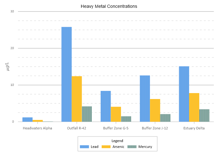
To understand how these charts are structured, it helps to clarify two key terms: groups and categories.
- A group is the larger unit you’re organizing data around. For example, this could be Site A, Site B, and Site C.
- The categories are the variables you’re comparing within each group—such as Lead, Arsenic, and Mercury concentrations.
Within the group “Site A,” you would see three bars placed side by side: one for Lead, one for Arsenic, and one for Mercury. Then that same pattern repeats for Site B and Site C.
This is where the difference between grouped and stacked bar charts becomes especially important. A stacked bar chart is like a multi-story building, where each value sits on top of the one below it, and the total height of the building is what stands out most. A grouped bar chart, on the other hand, is like a row of houses. Each house stands independently, and you’re comparing the height of each one directly. When individual differences matter more than totals, lining the bars up adjacently—on a shared baseline—keeps the comparison clean and precise.
The Benefits of Grouped Bar Charts
The next thing to tackle is why you should choose a grouped bar chart. What benefits does this specific visual offer? There are a few key advantages that make them easy to choose.
Eliminate visual guesswork
In stacked bar charts, only the bottom segment begins at zero. The segments above it “float” on top of other values, which makes them harder to measure accurately by eye. If you’re trying to compare the middle portion of multiple stacks, you’re essentially estimating. Grouped bar charts remove that guesswork. Every bar starts at the same baseline. That shared starting point gives each variable a fair and equal frame of reference, empowering stakeholders to compare heights quickly and confidently.
Spot outliers instantly
The structure that grouped bar charts have make outliers stand out. If one specific variable—say, Arsenic at Site B—spikes dramatically compared to the same variable at other sites, you’ll see it immediately. The difference isn’t buried inside a stack or influenced by surrounding values. It stands independently, which is exactly what you want when identifying anomalies or areas of concern.
Clarity over composition
Ultimately, grouped bar charts prioritize the value of the pieces, not the sum of the pieces. When your goal is to understand how individual variables compare across groups, this format keeps the focus where it belongs: on the distinct measurements themselves. You’re not asking, “What’s the total?” You’re asking, “How do these specific values differ?”
What Types of Data Work Best for a Grouped Bar Chart?
Understanding the benefits of a grouped bar chart naturally leads to another important question: what kind of data actually works well in this format? Not every dataset is a good fit. But when the data aligns, this type of bar chart becomes extremely effective and is a good choice to consider using. For context, here’s the type of data that typically works well for a grouped bar chart.
Discrete categories
Grouped bar charts work best with discrete categories, which is data that has clear, named groupings rather than a continuous progression of numbers. Here are a few examples:
- Sample IDs
- Soil types
- Engineering alloys
These are clearly defined units that can be grouped and compared directly. If your data flows continuously over time or distance, another chart type—like a line chart—is often more appropriate.
Multi-variable snapshots
A grouped bar chart is especially powerful when you’re comparing multiple variables across the same groups. Examples include measuring Lead, Arsenic, and Mercury levels across different well sites. Instead of looking at one variable at a time, you get a “snapshot” of the chemical signature of each site, equipping you to see how the variables move in relation to one another.
Categorical data with subgroups
A grouped bar chart is specifically designed for nested data where your main categories—like “Project Sites”—contain smaller sub-groups, like “Pre-treatment” vs “Post-treatment.” This structure empowers you to maintain the high-level comparison between sites while simultaneously seeing the internal change caused by the treatment.
When Is a Grouped Bar Chart the Right Choice?
Even when you have data that works great for a grouped bar chart, before committing to this type of visual, ask yourself what specific question you’re trying to answer for your stakeholders. Doing so will help you determine whether you should use this visual. If your primary goal aligns with the questions below, a grouped bar chart is the most effective tool for the job.
- How does each variable compare to a control or standard? Because all bars share a common baseline, grouped bar charts are unparalleled for benchmarking. Whether you are comparing field results to a laboratory control or actual performance against a target, the “gap” between the bars makes deviations instantly measurable.
- Which variable is the “winner” or “loser” within this specific group? If you need to identify the highest or lowest concentration at a specific site without the distraction of a total sum, grouping provides the necessary isolation.
- Are there consistent patterns across multiple metrics? If you want to see if Site A consistently outperforms Site B across every parameter (Lead, Zinc, and Copper), the grouped layout allows the eye to scan horizontally across the clusters to identify site-wide trends.
The rule of thumb: If your question is about individual precision and direct benchmarking, use a grouped bar chart. If your question is about cumulative impact or contribution to a total, stick with a stacked bar chart.
Best Design Practices for Grouped Bar Charts
While grouped bar charts are the right choice in certain circumstances, the way you design them still matters. In technical fields, even small design decisions can affect how your data is interpreted, so clarity and integrity should guide every choice. Here are a few best practices to keep your grouped bar charts accurate and professional.
The zero-baseline rule
This is non-negotiable. Because grouped bar charts rely on a shared baseline for accurate comparison, the y-axis must start at zero. Adjusting the axis to begin at a higher number—such as 50 instead of 0—may make differences appear more dramatic, but it also distorts the visual relationship between values.
In geoscience and engineering communities, truncating the y-axis is considered misleading. If the purpose of the chart is to compare magnitude, the baseline must be honest. Starting at zero ensures that what stakeholders see reflects the true scale of the data.
Keep grouping consistent
Consistency builds trust. If “Lead” appears as the first bar in Group A, it must also appear first in Group B and in every group that follows. Switching the order forces viewers to stop and reorient, increasing cognitive load and opening the door to misinterpretation. A predictable structure empowers stakeholders to scan naturally from group to group without recalibrating their understanding each time.
Use a professional color strategy
Color should clarify, not compete. Avoid the “rainbow” effect, where every bar is a different bright color. While it may look dynamic, it can quickly become distracting, especially when multiple groups are involved. Instead, use distinct but professional tones, such as muted blues, greys, and teals. The goal is differentiation without visual noise. When colors are intentional and restrained, the data remains the focus.
Place the legend strategically
Consider where your legend lives. A legend should support interpretation, not interrupt it. Position it where it’s easy to reference—commonly in the top right corner or along the bottom—without pulling attention away from the bars themselves. If stakeholders have to hunt for the legend or repeatedly shift focus, the comparison loses efficiency.
Keep bars per group minimal
Clarity depends on restraint. If you try to include too many bars within a single group—say 15 or 20—the chart quickly becomes crowded and difficult to read. Labels overlap, colors compete, and the visual comparison loses its precision. There’s a practical sweet spot to de-clutter your visual: typically 2–5 bars per group. Within that range, comparisons remain clean and manageable. Beyond that, the visual begins to strain under its own weight.
How Grouped Bar Charts Show Up in Real Work
The decision to use grouped bar charts becomes even clearer when you look at how they function in real geoscience and engineering scenarios. Below are a few real-world examples where this format supports accurate interpretation and better decision-making.
Environmental monitoring
Perhaps you’re monitoring water quality across four river tributaries. For each location, you’re measuring pH, dissolved oxygen, and salinity. A grouped bar chart equips you to compare those three parameters within each tributary and then scan across tributaries to see where conditions shift. If dissolved oxygen drops sharply at one site, it stands out immediately. Nothing is buried inside a stack. Nothing requires estimation. When environmental thresholds are involved, that clarity matters.
Materials testing
Consider a materials lab evaluating five different aluminum alloys. You want to compare the yield strength and ultimate strength for each alloy. Placing those two measurements side by side within each alloy group makes the structural differences obvious. Engineers can quickly see which alloy has the strongest performance profile and whether the gap between yield and ultimate strength is acceptable for the intended application. In this context, precision isn’t optional. It’s foundational to safety and performance.
Model validation
Grouped bar charts are also powerful tools for validating predictive models. Maybe you’re comparing predicted values with observed field data. Placing them adjacently makes deviations between the two immediately measurable. You can see whether the model is overestimating, underestimating, or closely matching reality, providing the precision necessary for rigorous technical verification.
Precision in Plain Sight
Grouped bar charts may not always get the spotlight, but they earn their place in technical work for one simple reason: they make comparisons honest and immediate. When individual values matter more than totals, this format keeps every bar grounded at the same baseline, eliminating visual distortion and guesswork.
But clarity doesn’t happen automatically. Implementing design best practices ensures your chart communicates insights accurately. In geoscience and engineering, misreading data can lead to flawed decisions. Well-designed grouped bar charts reduce that risk by prioritizing direct comparison and visual integrity. When your question is about how values differ—not how they add up—this is the chart that keeps precision in plain sight.
Need more insights on different types of visualizations and best practices for creating them? Subscribe to our blog so you get the tools you need!
FAQ: Grouped Bar Charts
Recent Articles
- Jul 22, 2026|Gabbie Rhodes|6 min
Your team needs to work together effectively. Discover strategies to enhance team collaboration, so projects move forward with greater confidence.
- Jul 22, 2026|Gabbie Rhodes|8 min
You need to produce clear, accurate maps, models, and graphs. Can AI tools for data visualization help? Here's the answer.
- Jul 15, 2026|Gabbie Rhodes|4 min
Technology has advanced, and now, Surfer has taken the lead over Voxler. Learn how to convert your Voxler file to a Surfer file to get better results.
- Jul 15, 2026|Gabbie Rhodes|12 min
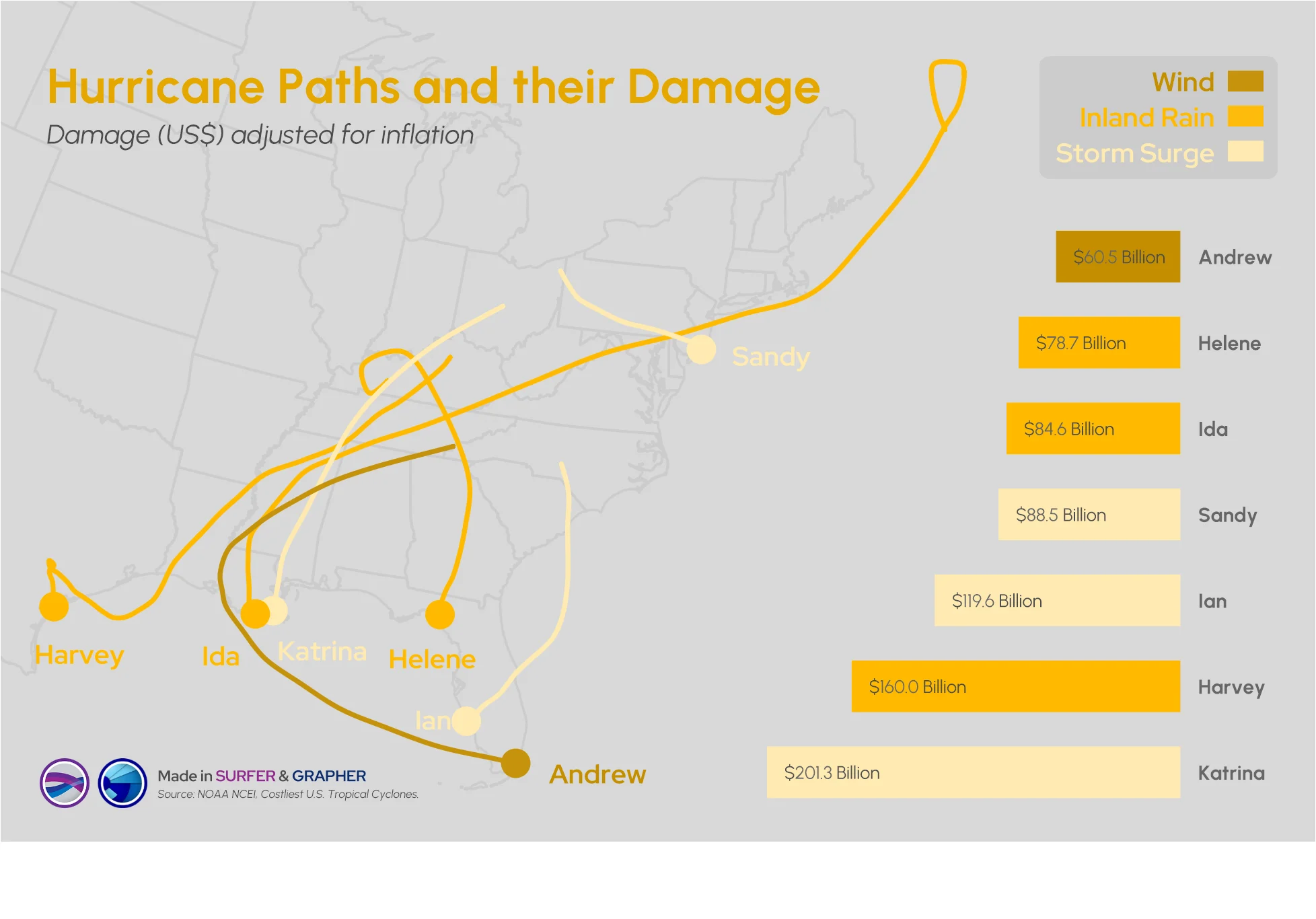
Answering this question isn't easy: what damage can a hurricane cause? Multiple factors come into play, but maps and graphs can provide insight.