Visualize Multivariate Data Using an XYZC Data Structure
Visualizing technical data so insights are clear for stakeholders isn’t easy. If you have multiple variables you need to visualize, the challenge becomes even harder.
Oftentimes, you need to show the relationship between location, measurements, classifications, and other interconnected factors. Doing this typically requires you to choose one of two paths: create multiple visuals to communicate all of the connections, or add tons of complex details to one plot. Both options lead to confusion for stakeholders, preventing them from making informed decisions.
That’s when you need to consider visualizing multivariate data using an XYZC data structure so you can communicate complex relationships on one, easy-to-understand plot.
Unpacking the Basics: What Is Multivariate Data Visualization?
Now, what exactly does it mean to visualize multivariate data using an XYZC structure?
At its core, it means combining numerical, quantitative, and categorical information into a single view, so you can highlight connections between various factors more clearly. Each component in an XYZC data structure represents a different dimension of information. Those dimensions are as follows:
- X and Y represent your standard horizontal and vertical axes. These track primary independent and dependent variables common to graphing, such as date/time, temperature, pressure, or chemical concentration.
- Z represents a third quantitative variable. In a 3D plot, Z provides physical depth to the data points. In a 2D plot, Z can represent a value translated into visual scale, such as symbol size or bubble magnitude.
- C represents an additional variable, such as concentration, time, classification, or another measurement, typically displayed using color.
The power of using an XYZC data format stems from its ability to communicate multiple variables of a single data point simultaneously. Instead of navigating complicated visuals or flipping between several separate plots to showcase relationships, you can clearly share those connections in a single chart. Your stakeholders can evaluate location, magnitude, and an additional layer of information at the same time and with greater understanding.
Put It Into Practice: 3 Real-World Geoscience Examples
We’ve unpacked the ins and outs of using an XYZC data structure to visualize multivariate data, but what does it look like in practice? Below are examples that illustrate how combining spatial, quantitative, and categorical variables into a single visualization can communicate insights more effectively. (Disclaimer: these examples apply specifically to workflows that are possible in Grapher.)
Earthquake Monitoring & Seismic Hazard Mapping
When monitoring seismic activity, seismologists often need to understand not only where earthquakes occur, but also how their magnitude and depth vary across a region.
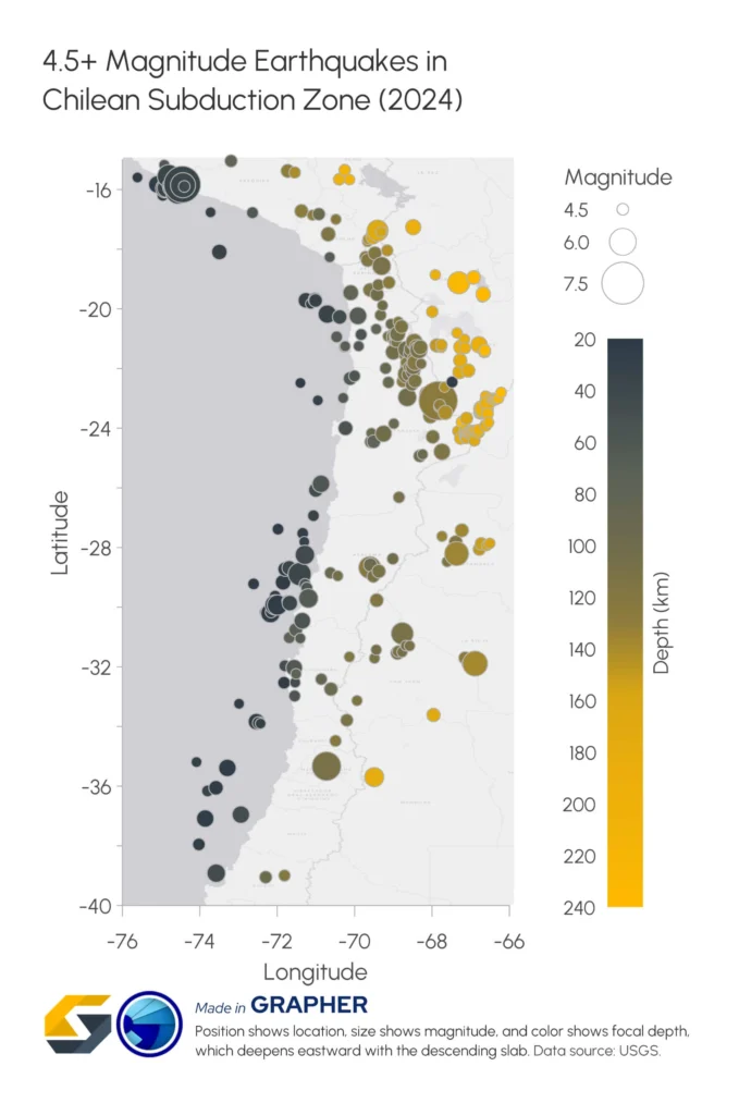
An advanced bubble plot makes these variables easy to visualize—in a single graph—when the data structure is as follows:
- X and Y represent the geographic coordinates of each earthquake epicenter
- Z is for bubble size and represents earthquake magnitude, with larger bubbles indicating stronger events
- C represents the depth of the earthquake’s focus, with different colors corresponding to shallow or deep events
By combining all four variables onto a single, intuitive plot, seismologists can quickly communicate insights that may be difficult to highlight otherwise. For example, they can showcase how shallow earthquakes gradually transition into deeper earthquakes along subduction zones, helping reveal fault geometry and tectonic processes beneath the Earth’s surface.
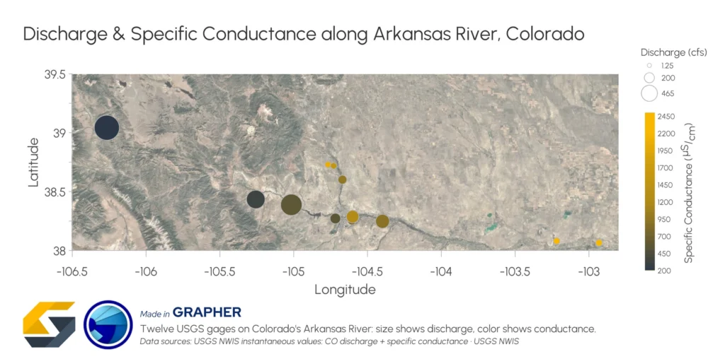
Hydrological Modeling & Watershed Health
Hydrologists are often tasked with evaluating both water movement and water quality across an entire watershed.
A multi-attribute bubble plot provides an effective way to visualize those relationships simultaneously by organizing the data with this structure:
- X and Y represent water sampling station locations throughout a river network
- Z represents water flow rate or discharge volume
- C represents water quality metrics, such as pH levels or contaminant concentrations
This format equips hydrologists to showcase how water quality conditions relate to flow dynamics throughout the watershed. For instance, elevated contaminant concentrations may appear very differently depending on whether they occur in slow-moving water or in high-flow regions capable of transporting contaminants downstream. Seeing all the variables together provides a more complete picture of watershed health and potential environmental risk.
Mineral Exploration & Subsurface Resource Management
Resource exploration projects often generate large volumes of borehole data containing multiple mineral measurements across varying depths.
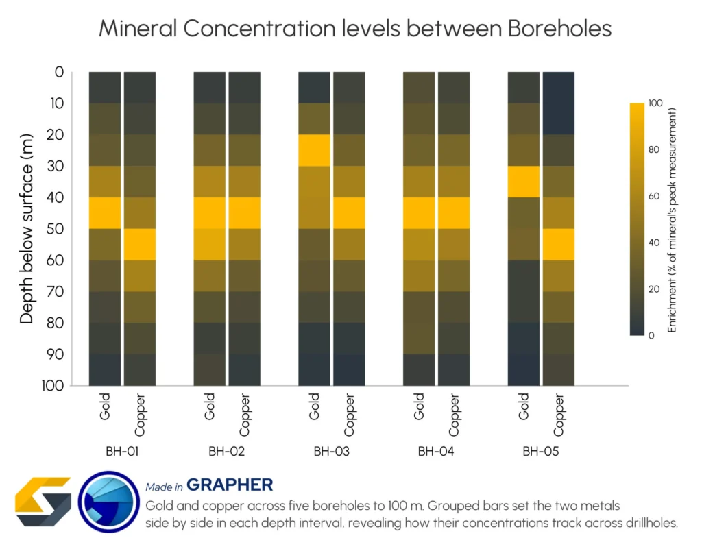
A grouped, multi-colored bar chart can empower geologists to clearly showcase various mineral measurements simultaneously when their data structure is the following:
- X represents individual borehole locations
- Y represents borehole depth or sampling intervals
- C is for the color, with shades representing mineral concentration levels
- Grouped bars allow multiple minerals, such as copper and gold, to be compared within the same depth interval
This structure makes it easier for geologists to highlight relationships between mineral concentrations across multiple drillholes and depths. Instead of creating and walking through separate charts for each mineral or borehole, teams can communicate multiple variables simultaneously and share insights that support more accurate geological interpretation, resource estimation, and 3D modeling efforts.
One Graph Can Tell a Better Story
Many visualization challenges come from trying to force complex relationships into formats that weren’t designed to show them. When multiple variables influence the insights, separating them across various charts or adding complexity to one plot makes it significantly harder for stakeholders to see the connections that matter.
Visualizing multivariate data with an XYZC structure provides another option. It empowers you to bring various relationships together into a clear, single view, helping patterns emerge more naturally and making complex findings easier to communicate.
Now we’d love to hear from you: What’s a multivariate relationship you’ve struggled to communicate in a graph? Leave a comment below and tell us about the challenge.
Recent Articles
- Sep 16, 2026|Gabbie Rhodes|7 min
The latest Surfer release delivers smarter 3D modeling, cleaner maps, and faster workflows. Unlock these benefits by discovering the top features.
- Sep 9, 2026|Gabbie Rhodes|4 min
Explore how Submara Survey bridged the gap between terrestrial elevation data and underwater bathymetry to guide costal development in Norway.
- Sep 9, 2026|Gabbie Rhodes|10 min
In a recent webinar, John Vanderlaan, founder and owner of Prism GeoImaging, Inc., explored how to visualize geophysical data effectively.
- Sep 2, 2026|Gabbie Rhodes|8 min
Effective wildfire mitigation requires more than tracking fire behavior alone. You have to monitor multiple variables, and visualizations can help.