How Earthquake Visualization Strengthens Infrastructure Resilience

Earthquakes can’t be prevented—but the damage they cause can be better prepared for and potentially reduced. The recent dual 7.2 and 7.5 magnitude earthquakes in Venezuela made that reality clear. Decades of underinvestment, systemic corruption, and fragile utility infrastructure left communities exposed, turning a natural event into a widespread infrastructure crisis.
That raises an important question for geo-professionals: how do you design infrastructure that can withstand what you cannot stop?
The answer begins with collecting seismic data, including raw fault lines, historical datasets, and ground motion models. However, this complex data is nearly impossible to interpret in isolation. To truly help safeguard communities, that data must be translated into clear, actionable visual insights.
That’s why data visualization is essential; it transforms raw numbers into insights for infrastructure resilience. By converting complex datasets into intuitive maps, models, and graphs, geo-professionals can clearly see how seismic forces will interact with the built environment, equipping engineers and planners to design infrastructure that can better withstand an earthquake.
Why Infrastructure Resilience Depends on Understanding Earthquake Risk
If data visualization is the tool that helps facilitate infrastructure resilience, then mapping and graphing the sheer complexity of earthquake risk is the necessary first step.
At its core, infrastructure resilience is a system’s ability to withstand, adapt to, and recover from earthquakes while continuing to provide essential services. This applies across the built environment, from transportation networks, bridges, and dams to utilities, pipelines, buildings, and water infrastructure. These systems are deeply interconnected, and when one fails, the effects can ripple across entire regions.
Earthquakes present a uniquely complex challenge compared to other natural hazards. They occur with little to no warning, leaving minimal time for immediate response. They also generate multiple hazards at once. A single seismic event can trigger structural failure, ground deformation, liquefaction, landslides, and widespread utility disruption—all while interrupting transportation networks and limiting access for emergency response.
Just as importantly, earthquakes don’t only affect what’s visible on the surface. Subsurface conditions—such as soil composition, groundwater levels, and fault structures—play a major role in how damage unfolds. Two areas experiencing the same magnitude event can see drastically different outcomes depending on these underlying factors.
Because of this complexity, infrastructure resilience isn’t just about knowing where earthquakes are likely to occur but also understanding how seismic forces interact with the built environment, including how ground conditions amplify shaking, how structures respond to stress, and where cascading failures are most likely to happen.
The more clearly these complex relationships are visualized, the more effectively infrastructure can be planned, designed, and maintained.
From Seismic Data to Insight: What to Analyze and How to Visualize It
Understanding overlapping earthquake hazards in theory is a great start, but turning raw data into stronger infrastructure requires a practical set of visual tools. As the introduction made clear, looking at raw data files in isolation doesn’t provide enough context. Instead, geo-professionals must pair specific seismic measurements with dedicated maps and graphs to make hidden risks obvious.
Below is a breakdown of the core earthquake datasets and the precise visualizations that transform them into actionable engineering insights.
Earthquake Magnitude → Magnitude Distribution Graphs
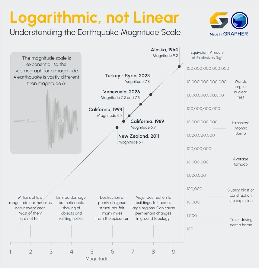
Earthquake magnitude measures the total energy released during a seismic event. It’s one of the most widely recognized indicators of earthquake strength, but its true value comes from how it’s analyzed across multiple events rather than in isolation.
A single high-magnitude earthquake can cause catastrophic damage, but a region’s overall seismic risk is better understood by examining the range and frequency of magnitudes it experiences over time. Some regions may experience frequent moderate earthquakes, while others may be prone to rare but extreme events; both scenarios require different engineering approaches.
To visualize magnitude effectively, a strong starting point is a magnitude distribution graph, which shows how often earthquakes of varying magnitudes occur within a region.
With this view, technical experts have the means to achieve these goals:
- Spot patterns in seismic intensity across time
- Evaluate the range of forces infrastructure must withstand
- Design and retrofit structures to account for both frequent and extreme events
This transforms magnitude from a single measurement into a long-term design input.
Earthquake Depth → Depth Distribution Graphs
Earthquake depth indicates where a seismic event originates beneath the Earth’s surface, typically measured in kilometers.
Depth plays a critical role in how seismic energy is transferred to the surface. Shallow earthquakes tend to produce more intense ground shaking in localized areas, while deeper earthquakes may distribute energy across a broader region with less concentrated force. This makes depth an essential variable when evaluating potential damage.
To bring depth data into clearer focus, depth distribution graphs illustrate how earthquakes are spread across different depths and how frequently those depths occur.
Using this type of visualization, project teams are better equipped to take these steps:
- Identify areas more likely to experience strong surface shaking
- Understand how seismic energy behaves in different geological settings
- Refine risk assessments for surface and subsurface infrastructure
When combined with magnitude, depth provides a more complete understanding of how seismic events translate into real-world impact.
Earthquake Frequency → Time-Series Graphs
Earthquake frequency tracks how often seismic events occur within a region over time.
While magnitude and depth describe individual events, frequency reveals patterns of activity. Some regions experience consistent low-level seismic movement, while others remain quiet for long periods before experiencing sudden, high-impact events. In both cases, frequency helps define the rhythm of seismic risk.
To visualize these patterns, time-series graphs plot earthquake occurrences over time, making it easier to identify trends, clusters, and aftershock sequences.
This perspective empowers geo-professionals to do the following:
- Detect periods of increased seismic activity
- Recognize recurring patterns or clusters of earthquakes
- Prioritize inspections, maintenance, and monitoring following active periods
Seeing how activity evolves over time helps shift decision-making from reactive to proactive.
Fault Lines → Seismic Hazard Maps
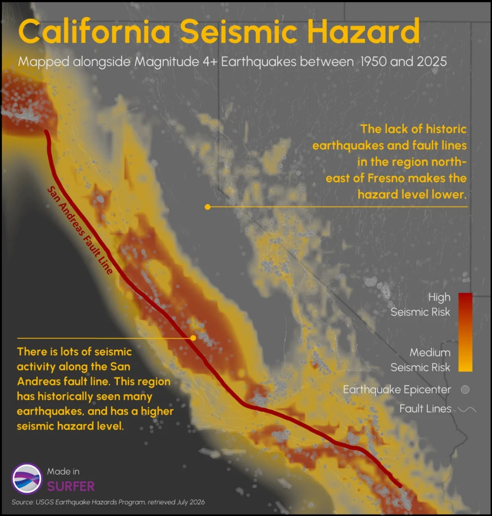
Fault lines represent fractures in the Earth’s crust where tectonic movement is most likely to occur. These zones are the primary sources of earthquakes, making them one of the most critical datasets for infrastructure planning. However, fault lines alone don’t tell the full story. Their significance increases when combined with historical seismic activity and modeled hazard zones.
To translate this data into something actionable, seismic hazard maps combine fault locations with earthquake occurrence and risk modeling to show where seismic impacts are most likely and how severe they may be.
With this spatial understanding, planners and engineers can tackle these objectives:
- Identify high-risk zones before infrastructure is built
- Guide site selection and land-use planning
- Apply targeted engineering and mitigation strategies
These maps turn complex geological data into clear geographic guidance for decision-making.
Ground Displacement → Displacement Maps
Ground displacement measures how the Earth’s surface physically moves during an earthquake. This movement can include horizontal shifting, vertical uplift or subsidence, and complex deformation patterns.
Unlike ground shaking alone, displacement directly alters the position and stability of the ground itself, making it especially dangerous for infrastructure that depends on alignment, such as pipelines, roads, and bridges.
To capture this movement visually, displacement maps show how much the ground has shifted and in what direction across a region.
From this visualization, project teams can do the following:
- Pinpoint areas prone to significant ground movement
- Assess how infrastructure may shift, crack, or fail
- Design systems that can better absorb or adapt to deformation
This makes displacement data essential for understanding not just if damage will occur, but how it will occur.
Aftershock Distribution → Time-Based Spatial Maps
Aftershock distribution shows how seismic activity continues after the main earthquake event.
Aftershocks can persist for days, weeks, or even months, often affecting infrastructure that has already been weakened. While individual aftershocks may be smaller than the main event, their cumulative impact can significantly complicate recovery efforts.
To understand how this risk evolves, time-based spatial maps layer aftershock activity across both location and time, showing where continued seismic stress is occurring.
These maps empower geo-professionals to complete these three tasks:
- Identify areas where risk remains elevated after the main event
- Prioritize inspections and repairs in vulnerable locations
- Improve response planning while seismic conditions are still changing
By combining spatial and temporal insight, this approach ensures recovery efforts are guided by ongoing risk—not just initial damage.
Why This Integration Matters
Individually, each dataset offers valuable insight. But when combined—and visualized together—they create a far more powerful understanding of seismic risk.
Instead of asking:
- Where do earthquakes happen?
You can answer:
- Where will infrastructure experience the greatest stress?
- Which systems are most vulnerable and why?
- What should we prioritize before the next event occurs?
This is the difference between analyzing data and building resilience. By aligning the right data with the right visualizations, geo-professionals can move beyond interpretation and toward confident, informed decision-making that strengthens infrastructure before disaster strikes.
Real-World Examples of Earthquake Risk and Infrastructure Impact
Aligning the right data with the right visualizations moves teams past abstract interpretation and toward confident decision-making. But how do these specific maps and graphs function practically?
When looking at historic earthquake disasters, the relationship between structural failure and the necessity of visual modeling becomes undeniable. Here’s how specific visualization assets can directly address cascading infrastructure risks.
Bridge and Transportation Failures
Earthquakes can severely disrupt transportation systems by collapsing bridges, damaging highway overpasses, cracking roadways, and isolating entire communities.
The 1994 Northridge earthquake in Los Angeles is a clear example. Multiple freeway overpasses collapsed, bringing major transportation corridors to a standstill. These failures not only disrupted daily travel but also delayed emergency response efforts at a time when rapid access was critical.
Transportation networks are particularly vulnerable because they depend on structural continuity. When even a single bridge or interchange fails, entire routes can become unusable, cutting off access to hospitals, emergency services, and supply chains.
How visualization helps foster infrastructure resilience in similar scenarios: By overlaying regional transportation networks directly onto Seismic Hazard Maps, transit authorities can visually pinpoint exactly where critical lifelines intersect active fault zones. Seeing these spatial intersections clearly allows agencies to move past guesswork and prioritize seismic retrofit budgets for the specific bridges and overpasses exposed to the highest hazard zones.
Building Damage and Structural Failure
Strong ground shaking can compromise the structural integrity of buildings, leading to cracked foundations, partial collapses, or total structural failure.
The 2023 Kahramanmaraş Türkiye–Syria earthquakes demonstrated this at scale. Widespread building collapse and severe structural damage revealed how differences in construction practices, local ground conditions, and seismic design directly influence outcomes. According to the Global Rapid Post-Disaster Damage Estimation (GRADE) report released by the World Bank, direct physical damages in Türkiye alone totaled an estimated $34.2 billion—with over half of that destruction concentrated entirely within residential structural failures.
These events highlight a critical reality: not all structures respond to seismic forces the same way. Factors such as building materials, design standards, soil conditions, and construction quality all play a role in determining whether a structure withstands shaking or fails under pressure.
How visualization helps foster infrastructure resilience in similar scenarios: Structural engineers can use Magnitude and Depth Distribution Graphs to translate past regional disasters into a visual baseline of structural demand. By graphing the exact patterns of historical energy release alongside depth profiles, code-enforcement teams can visually assess what specific forces a neighborhood’s soil type will amplify. This insight could empower municipalities to update local building codes and design foundations that match real-world seismic behavior.
Utility and Pipeline Disruptions
Much of a region’s critical infrastructure lies underground—and earthquakes can disrupt these systems just as significantly as above-ground structures. Water mains, sewer systems, natural gas pipelines, electrical infrastructure, and communication networks are all vulnerable to seismic activity.
During the 1989 Loma Prieta earthquake, damage to gas, water, electrical, and communication systems contributed to prolonged service disruptions across the San Francisco Bay region. More than 1,200 water-main and service-line breaks were repaired, 13 miles of gas-distribution lines required replacement, and telephone networks experienced significant congestion following the earthquake. These failures illustrate how damage to utility systems can create secondary challenges, including fires from broken gas lines, reduced firefighting capability when water systems are compromised, and communication disruptions that hinder emergency response. What begins as a seismic event can quickly evolve into a broader infrastructure crisis.
How visualization helps foster infrastructure resilience in similar scenarios: Because subterranean utility networks are hidden from view, project teams can rely on Displacement Maps to render subsurface shearing risks visible. Mapping complex utility corridors over visual models of horizontal and vertical ground shifts shows utility providers exactly where pipelines cross high-deformation zones. This tells technicians precisely where to install flexible, segmented joints that can warp without rupturing.
Ground Failure and Landslides
In many cases, the most damaging effects of an earthquake don’t come directly from shaking but from what the shaking triggers. Landslides, liquefaction, slope failures, and ground settlement can all damage infrastructure, even when buildings themselves remain intact.
The 2011 Christchurch, New Zealand earthquake is a powerful example of this dynamic. Severe ground shaking triggered widespread soil liquefaction across a third of the city, causing loose, water-saturated sand and silt to behave like a liquid. As a result, the ground lost its strength entirely—undermining building foundations, triggering massive landslides in the surrounding hills, splitting roadways, and destroying roughly 80% of the central city’s old clay pipes.
These hazards are especially dangerous because they fundamentally alter the structural capacity of the earth itself. Soil may lose strength, slopes may collapse, and entire sections of land can shift unexpectedly, leaving infrastructure vulnerable to sudden displacement.
How visualization helps foster infrastructure resilience in similar scenarios: Geo-professionals can address this by layering topography, soil saturation models, and historical earthquake frequencies into unified Time-Based Spatial Maps. Visually tracking how a landscape responds to repeated seismic stress over time highlights unstable hillsides and liquefaction-prone basins before development begins, giving city planners the clarity needed to enforce safe building setbacks or design protective earthworks.
Building Resilience Starts With Seeing Risk Clearly
Earthquakes can’t be predicted or prevented, but their risks can be better understood. When seismic data is visualized clearly, it becomes far more than a collection of numbers. It becomes a decision-making tool. Engineers and planners can identify where infrastructure is most vulnerable, understand how seismic forces may interact with the built environment, and determine how systems should be designed, strengthened, or maintained over time.
Strong infrastructure resilience doesn’t begin after an earthquake—it begins long before, with a clear understanding of risk. And that understanding is only possible when complex seismic data is translated into visuals that reveal patterns, relationships, and potential impacts.
That’s the role of earthquake visualization: turning uncertainty into insight, and insight into action that supports safer, more resilient communities.
Now we’d love to hear from you: how is your organization using maps or graphs to improve infrastructure resilience? Leave a comment and share your experience.
Recent Articles
- Sep 23, 2026|Gabbie Rhodes|8 min
The best 3D data visualizations depend on the quality of your underlying grid. To achieve a great result, sometimes you need to use 3D grid filters.
- Sep 23, 2026|Gabbie Rhodes|11 min
When you're working with complex data, you need to communicate clearly. Graphs can help, especially when you follow design best practices.
- Sep 16, 2026|Gabbie Rhodes|7 min
The latest Surfer release delivers smarter 3D modeling, cleaner maps, and faster workflows. Unlock these benefits by discovering the top features.
- Sep 9, 2026|Gabbie Rhodes|4 min
Explore how Submara Survey bridged the gap between terrestrial elevation data and underwater bathymetry to guide costal development in Norway.