How to Communicate Complex Data More Clearly Through Your Graphs
You rarely work with simple datasets. More often, you’re analyzing information that spans multiple variables, measurement types, locations, time periods, or categories, all of which contribute to a more complete understanding of the problem you’re trying to solve.
However, the challenge begins when you need to share your complex data with someone else. A graph that makes perfect sense to you can quickly become overwhelming for a project manager, client, regulator, or other stakeholder, especially if they don’t have the same technical expertise.
Fortunately, communicating complex data clearly is easier than you think. With thoughtful graph design, you can preserve the richness of your data while making information easy to understand.
How to Make Complex Data Intuitive
First, it’s important to ensure one thing is clear: there’s no single trick for making complex data easier to understand. Instead, effective communication comes from a series of intentional choices about what information to show, how to organize multiple variables, how to use color, and what context to provide through legends, labels, and annotations.
The seven strategies below—all of which you can implement in Grapher—are great ways to transform technical data into information your stakeholders can understand. Let’s dive into each one so your plots communicate complex data more clearly and smoothly.
1. Start by clarifying the question your graph will answer
Before deciding what your graph should look like, start with what you need it to answer. Complex datasets often contain more information than your audience actually needs, and without a clear question guiding the visualization, it’s easy to include too many variables or emphasize details that distract from the insight you’re trying to communicate.
To narrow down the question your graph should answer, ask yourself:
- What decision will this visualization help them make?
- What does my audience need to understand to move forward?
- Which relationships or patterns matter most to the project outcome?
Your answers should influence everything from the graph type you choose to the variables you include, the colors you apply, and the annotations you add.
For example, imagine a hydrogeologist analyzing groundwater elevation, precipitation, pumping rates, contaminant concentrations, and more that’s collected over the same period. Rather than plotting every available measurement simply because it’s available, they should first determine the question the graph needs to answer. If that question is, “How is pumping influencing contaminant concentrations,” the core focus should remain on pumping rates, contaminant levels, precipitation, and groundwater elevation data. General parameters like pH, temperature, and dissolved oxygen can be omitted or moved to a supporting appendix to keep the primary plot clear and focused.
2. Visualize multiple variables without overwhelming the audience
Multivariate visualizations simplify complex technical data by unifying related dimensions into a single, cohesive plot rather than forcing stakeholders to cross-reference separate graphs.
A foundational way to structure these visuals is through an XYZC data framework, where each letter represents a distinct visual dimension assigned to a specific variable:
- X and Y: Represent your standard horizontal and vertical axes such as geographic coordinates (latitude/longitude), sampling station locations, distance along a cross-section, or primary measurements like time and pressure.
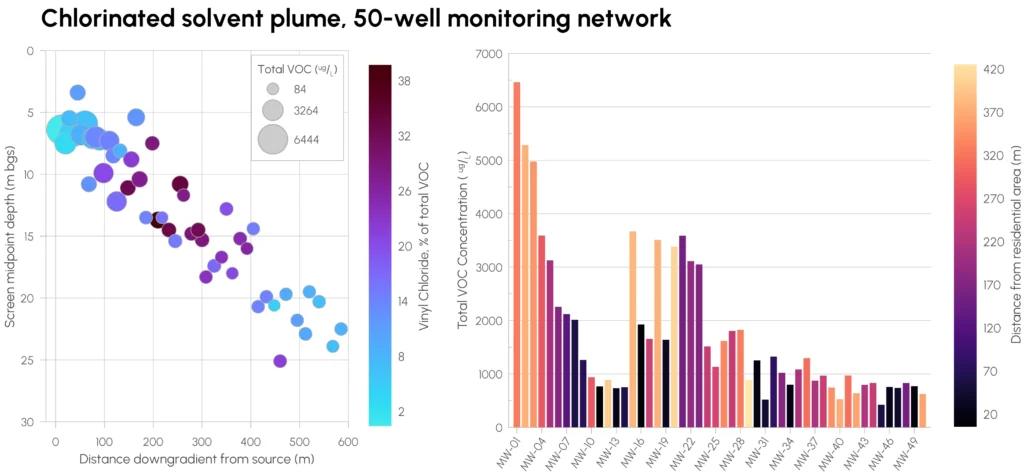
- Z (Depth or Scale): Adds a third quantitative dimension. In 3D space, Z provides physical depth or elevation. In a 2D plot, Z is translated into visual scale, such as symbol size or bubble magnitude.
- C (Color): Introduces an additional continuous or categorical variable—such as focal depth, flow rate, lithology, or assay grade—communicated via a colormap gradient or discrete color table.
Fusing these dimensions into an XYZC format equips you to communicate multi-layered geological and environmental stories simultaneously. Here are just a few examples of what this looks like in practice:
- Seismic Hazard Mapping: Seismologists can plot earthquake locations (X/Y), magnitude (Z via bubble size), and focal depth (C via color) on a single map. By color-coding earthquakes from shallow to deep, this format reveals the 3D geometry of a descending tectonic slab—a view that historically required a separate cross-section to visualize.
- Watershed Health: Hydrologists can plot sampling stations (X/Y), discharge (Z via bubble size), and contaminant concentrations (C via color gradient) on a single plot. Because discharge x concentration = total contaminant load, combining these dimensions reveals insights neither variable can provide on its own. For instance, a small, dark bubble represents a high concentration at low flow (a typical local spike), whereas a large, dark bubble highlights a high concentration that fails to dilute even at high flow rates, instantly pointing to a persistent, high-volume pollution source in that reach.
- Mineral Exploration: Exploration geologists can organize borehole locations (X), depth below surface (Y), sampling intervals (Z via block height), and mineral concentration (C via color gradient). Setting grouped bars side by side for each borehole helps track how gold and copper concentrations vary together across 10-meter depth intervals at a glance.
Combining variables, however, requires clear intentionality. Every added dimension should contribute directly to the central question you are answering. Adding another color scale, symbol type, or axis simply because the data exists creates visual clutter. But if you thoughtfully assign variables across an XYZC structure, you transform multivariate data into a single, intuitive narrative that empowers stakeholders to evaluate various measurements simultaneously, leading to faster insights and more confident decisions.
3. Use colormaps to reveal patterns in numeric data
The next strategy to keep in mind centers around color, as it can become a critical layer of information. Rather than serving as decoration, color can function as a dynamic dataset—particularly for multivariate visualizations—helping stakeholders recognize subtle trends they might otherwise overlook.
When a graph already communicates information through position or size, applying a numeric colormap allows continuous data to drive the fill color of individual bars or bubbles. Whether you’re applying a gradient fill to a bar chart to highlight contaminant levels across sampling stations or using color to emphasize performance categories in a bubble plot, this additional dimension helps stakeholders:
- Recognize shifts in magnitude across specialized plots
- Identify spatial or depth-dependent clusters
- Compare values across disparate observations without adding extra axes
- Quickly spot unusually high or low measurements (such as peak mineralization zones)
Choosing the right colormap is also just as important as deciding to use one, and the best choice depends on the type of data you’re communicating. Here are a few options to consider:
- Sequential Colormaps are good for continuous values progressing smoothly from low to high.
- Perceptually Uniform Colormaps (like Viridis or Cividis) help ensure equal visual steps across values and maintain readability for stakeholders with color vision deficiencies.
- Diverging Colormaps use two contrasting colors extending from a neutral center (like a Red-White-Blue scheme) to highlight data centered around a critical baseline, such as water table fluctuations, mean sea level, or thermal anomalies.
- Distinct Categorical Color Tables are helpful for grouping discrete classifications like lithology or soil types.
Thoughtfully applied colormaps transform color from a passive design element into an active analytical tool. By going a step further to match the colormap structure to the nature of your data, you make complex multivariable relationships immediately accessible, guiding your audience directly to the patterns, trends, and anomalies that matter most.
4. Start with professional, polished templates when appropriate
Clearly communicating complex data doesn’t require designing every plot from scratch. In many cases, professionally designed templates provide a proven visual framework that lets you spend less time building layouts and more time interpreting your results.
That’s because the best graphing templates incorporate design best practices and domain conventions that are already familiar to your target audience, while still giving you the flexibility to customize them to fit your stakeholders’ needs. Depending on your specialty, these templates might include:
- Boring and Well Log Template: Combines lithology, soil descriptions, field measurements, and well construction details into a single depth-aligned visualization to connect subsurface conditions directly to installation design.
- Hydrogeochemical Piper Diagram: Brings two ternary diagrams with a central diamond plot together to classify groundwater chemistry, using color-coded zones to distinguish fresh groundwater, seawater intrusion, and transitional water types.
- Geological Classification Ternary Diagram: Uses standardized frameworks—such as USDA Soil Texture or IUGS Ultramafic Classifications—with pre-defined boundary lines, labels, and color-coded regions to classify samples accurately.
Ultimately, templates give you a head start without locking you into a one-size-fits-all visualization. By starting with a proven structure and tailoring it to your data, you can create clear, professional plots that stakeholders understand (and bonus: you can do it more efficiently).
5. Make legends work harder on complex graphs
As data grows more complex, legends play a crucial role in preventing confusion. A well-designed legend equips stakeholders to interpret insights quickly so they can make informed decisions faster.
This becomes especially important with multivariate graphs, where your audience may need to interpret multiple colors, categories, or factors at once. In these cases, a couple of simple legend choices can make complex information much easier to navigate:
- Use Representative Gradient Swatches: For continuous variables using colormaps or variable-colored lines, ensure the legend displays a full multi-color gradient swatch or a representative sample bar rather than a single static symbol. This gives readers an immediate, accurate reference for how colors correspond to numeric values.
- Eliminate Empty Classes: Filtered datasets or custom classification definitions often leave unused categories in a legend. Automatically hiding or removing these empty entries eliminates visual clutter and keeps attention focused exclusively on active data.
With complex data, an effective legend actively streamlines interpretation. By providing accurate color references and removing unused categories, you reduce the mental effort required to read your chart, allowing stakeholders to focus on what the data actually means.
6. Use precise annotations to add context the data cannot provide alone
Even the best-designed graph can’t explain why an anomaly occurs. Labels and custom annotations are what provide the spatial and geological context that transform raw data into actionable insight.
That said, start by ensuring basic map and plot elements are explicit. Use clear axis titles, units of measurement, variable names, timeframes, and reference thresholds. From there, include targeted annotations to highlight key features, such as the following:
- Technical Boundaries: Outlining contamination plumes, delineating stratigraphic layers, or drawing groundwater tables directly across a profile.
- Key Events and Anomalies: Labeling storm events on a hydrograph, marking fault intersections, or calling out clusters of high-magnitude events.
Keep in mind that precision is critical when drawing custom technical annotations. When outlining a plume or defining a stratigraphic boundary, line nodes and polygon vertices should snap directly to data points, axes, or existing plot objects. Dynamic snap to vertex accuracy ensures your custom visual elements align perfectly with the underlying data, delivering clear presentation-ready plots that stakeholders can trust.
Additionally, to keep your overall annotations effective, ensure text is concise, use simple leader arrows, and choose callout styling that contrasts clearly with background data. When a feature or dense cluster of points is too localized to annotate directly on the primary plot, use a Magnifier tool. This creates an enlarged inset box of a targeted area, equipping you to highlight fine-scale details—like a micro-spike in a long-term hydrograph or a dense cluster of localized events—without cluttering the main graph layout.
7. Review the graph from your audience’s perspective
Before considering a graph complete, take one final step: evaluate it as though you’re seeing it for the first time.
A useful review begins by asking questions such as:
- Is the primary takeaway immediately apparent?
- Can I understand what every color, symbol, and axis represents?
- Is it clear how the variables relate to one another?
- Do the annotations clarify the graph rather than clutter it?
- Could any design decision unintentionally exaggerate or minimize a pattern?
- Is there enough context for someone to interpret the graph without me explaining it?
Whenever possible, ask a colleague—or someone closer to the intended audience—to review the visualization as well. Technical familiarity can create blind spots. After spending time analyzing a dataset, it’s easy to assume certain relationships or abbreviations are obvious when they aren’t super clear. However, a fresh perspective often reveals opportunities to improve clarity before the graph reaches clients, regulators, project managers, or other stakeholders.
Turn Complex Data Into Clearer Insights
Complex data doesn’t have to result in confusing graphs. With thoughtful design, you can organize multiple variables, highlight meaningful patterns, and provide the context your audience needs to understand what the data is saying. The goal isn’t to remove the technical detail that makes your analysis valuable but to present that detail in a way stakeholders can interpret with confidence and use to make informed decisions.
Every design choice, from selecting the right variables and graph type to using color, annotations, legends, and templates intentionally, helps move your visualization closer to that goal. The more purposefully those elements work together, the easier it becomes to communicate even the most data-rich analyses clearly.
Now we’d love to hear from you: what techniques do you use to make complex datasets easier for stakeholders to understand? Share your approach in the comments below!
Recent Articles
- Sep 23, 2026|Gabbie Rhodes|8 min
The best 3D data visualizations depend on the quality of your underlying grid. To achieve a great result, sometimes you need to use 3D grid filters.
- Sep 23, 2026|Gabbie Rhodes|11 min
When you're working with complex data, you need to communicate clearly. Graphs can help, especially when you follow design best practices.
- Sep 16, 2026|Gabbie Rhodes|7 min
The latest Surfer release delivers smarter 3D modeling, cleaner maps, and faster workflows. Unlock these benefits by discovering the top features.
- Sep 9, 2026|Gabbie Rhodes|4 min
Explore how Submara Survey bridged the gap between terrestrial elevation data and underwater bathymetry to guide costal development in Norway.