Visualizing Seawater Intrusion: How Piper Plots Reveal Changes in Groundwater Chemistry
Freshwater is one of our most valuable natural resources, yet coastal aquifers that supply it are increasingly threatened by seawater intrusion. A recent global study of approximately 480,000 coastal groundwater monitoring locations found that declining groundwater levels—which increase vulnerability to seawater intrusion—have become more common in recent years. On top of that, a NASA-led study projects that seawater intrusion could affect roughly three out of every four coastal regions worldwide by 2100.
As seawater migrates into freshwater aquifers, it can degrade drinking water supplies, damage agricultural resources, and create long-term challenges for communities that depend on groundwater. Protecting these water resources requires more than simply collecting groundwater samples. Hydrogeologists must also identify subtle changes in groundwater chemistry across large areas, often by analyzing complex laboratory results. But those results can be difficult to interpret when presented as rows of ion concentrations or lengthy data tables.
That’s why it’s critical to turn groundwater chemistry data into something you can easily interpret and communicate. That’s where one of hydrogeology’s most trusted visualization tools enters the picture: the Piper plot.
Understanding How a Piper Plot Works
A Piper plot is a well-known visual in scientific fields, but let’s still take a closer look at what it actually is and why it’s become one of the most trusted tools for interpreting groundwater chemistry.
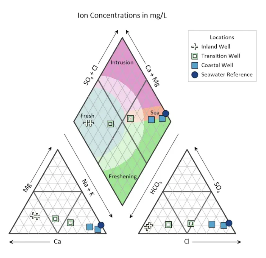
Rather than displaying groundwater chemistry as rows of laboratory measurements, a Piper plot organizes the data into a single visual that makes relationships between water samples much easier to identify. It does this by combining three connected diagrams, each revealing a different aspect of the water’s chemical composition.
The left ternary diagram plots the relative percentages of the major cations:
- Calcium (Ca²⁺)
- Magnesium (Mg²⁺)
- Sodium + Potassium (Na⁺ + K⁺)
The right ternary diagram performs the same function for the major anions:
- Bicarbonate (HCO₃⁻)
- Sulfate (SO₄²⁻)
- Chloride (Cl⁻)
The information from both ternary diagrams is then projected into the central diamond, where the combined chemistry of each sample is displayed. This equips hydrogeologists to quickly identify a sample’s hydrochemical facies—or water type—making it much easier to compare groundwater samples and recognize similarities or differences in their chemical composition.
Once raw laboratory measurements (typically reported in mg/L) are converted into milliequivalents per liter (meq/L) in Excel, a Piper plot normalizes these concentrations into relative percentages. This means samples can be compared accurately even when their overall salinity levels differ significantly. Instead of being influenced by the total amount of dissolved material in the water, the visualization emphasizes the relative balance of major ions, making changes in groundwater chemistry much easier to recognize.
Key Consideration for Hydrogeologists
Because normalization removes the absolute concentration, two samples with wildly different Total Dissolved Solids (TDS) can plot in the exact same spot if their ion ratios match. While a Piper plot excels at revealing water type, hydrogeologists typically track parameters like chloride (Cl⁻) or TDS alongside it—or scale the symbol sizes on the plot by TDS—to maintain a complete picture of total salinity when making water management decisions.
How Piper Plots Reveal the Shift from Freshwater to Seawater
Understanding how a Piper plot is constructed is only part of the story. Its real value lies in helping geo-professionals recognize how groundwater chemistry changes over time and across a landscape. By comparing where samples fall on the diagram, they can identify the chemical progression from freshwater to seawater and pinpoint areas where intrusion is actively occurring.
Freshwater: The Starting Point
Inland groundwater that has experienced little or no seawater influence is typically dominated by calcium-bicarbonate (Ca-HCO₃) chemistry. These freshwater samples often represent natural recharge areas where precipitation infiltrates the ground and replenishes aquifers. When plotted on a Piper plot, samples with this hydrochemical signature tend to cluster together, establishing a useful baseline for evaluating future changes in groundwater chemistry.
Seawater: The Saline End of the Spectrum
At the opposite end of the hydrochemical spectrum is groundwater dominated by sodium-chloride (Na-Cl) chemistry. This signature is characteristic of seawater and often indicates that marine water has become the dominant influence within an aquifer. As groundwater samples shift toward this region of the Piper plot, it provides a strong indication that seawater intrusion is increasing and freshwater resources may be at greater risk.
Identifying the Mixing Zone
In many cases, groundwater isn’t purely fresh or purely saline. Instead, samples fall between the two end members, revealing areas where freshwater and seawater are actively mixing.
These intermediate samples are especially important because they can highlight the early stages of seawater intrusion before an aquifer becomes fully saline. Rather than relying on individual laboratory measurements to detect these subtle chemical changes, hydrogeologists can quickly recognize the transition by observing how samples move across the Piper plot.
Visualizing the Advance of Seawater
Understanding individual groundwater samples is valuable, but seawater intrusion rarely affects just one monitoring well. To understand how intrusion is progressing across an aquifer, hydrogeologists must compare groundwater chemistry from multiple locations. That’s where the Piper plot becomes especially powerful.
One of this visual’s greatest strengths is its ability to compare samples from many monitoring locations at once. For example, plotting groundwater samples from inland wells, transition-zone wells, and coastal wells empowers teams to visualize how groundwater chemistry changes across an aquifer.
Instead of reviewing each monitoring well independently, they can see the progression from calcium-bicarbonate signatures in inland recharge areas, through mixed water types in the transition zone, and finally to sodium-chloride signatures closer to the coast. This makes it much easier to trace the inland movement of seawater and identify where freshwater resources may require additional monitoring or management.
Diagnose Aquifer Health at a Glance with Color-Coded Zones
While a traditional Piper plot is already a powerful tool for interpreting groundwater chemistry, adding color-coded zones to the central diamond makes it even more intuitive. Instead of asking stakeholders to interpret every point individually, the colored regions provide immediate context about what each water sample may indicate, allowing patterns to stand out almost instantly. The Piper plot template for monitoring seawater intrusion illustrates how this approach can transform a technical graph into a visual assessment tool.
Fresh Zone
The blue Fresh zone represents groundwater dominated by freshwater chemistry and is typically associated with healthy inland aquifers used for drinking water supplies. Samples that fall within this area generally indicate little to no influence from seawater intrusion.
In the example, the Inland Well samples cluster within the Fresh zone, reinforcing that these monitoring locations continue to exhibit the calcium-bicarbonate chemistry expected in protected recharge areas.
Intrusion Zone
The pink Intrusion zone serves as an early warning area where groundwater chemistry begins shifting away from freshwater conditions and toward seawater influence. As seawater advances into an aquifer, sodium from the intruding water displaces calcium held on the surrounding sediments, releasing calcium into solution and giving the water a characteristic calcium-chloride (Ca-Cl) signature.
That exchange is why intrusion plots in its own region of the diamond rather than along the straight line between fresh and seawater, and why a sample entering this zone strongly suggests that marine water is actively encroaching, increasing salinity and changing the overall hydrochemical composition.
Because this zone highlights groundwater in transition, it often becomes one of the most important areas for ongoing monitoring and groundwater management.
Sea Zone
The orange Sea zone represents groundwater whose chemistry closely resembles seawater. Samples that plot here are dominated by sodium-chloride signatures and indicate that seawater has become the primary influence on groundwater chemistry. Notice how the Coastal Well samples straddle the boundary between the Sea and Freshening zones. This visual immediately communicates that groundwater conditions are influenced by seawater.
Freshening Zone
Not every aquifer is becoming more saline. In some cases, groundwater management efforts or natural recharge allow freshwater to gradually reclaim areas previously affected by seawater intrusion.
The green Freshening zone represents this recovery process, indicating groundwater chemistry that is shifting back toward freshwater conditions. Tracking samples that migrate into this region over time can help demonstrate the effectiveness of aquifer recharge projects, groundwater management strategies, or reduced pumping rates.
Notice again on the Piper plot template that the Coastal Well samples fall on the boundary between the Sea and Freshening zones rather than deep within the active Intrusion area. This can inspire further investigation. While the static snapshot reveals that the groundwater is influenced by seawater at some level, hydrogeologists can evaluate more data points collected across multiple time periods to determine which way the water chemistry is trending—toward recovery or a deeper intrusion of seawater.
How Clear Visualization Leads to Better Groundwater Management
Identifying seawater intrusion is only valuable if it leads to informed action. Here are several practical ways a Piper plot—and specifically, the Piper plot template for monitoring seawater intrusion—can protect freshwater resources, support remediation efforts, and guide long-term groundwater management.
Protecting Public Water Supplies
For municipal water utilities, protecting drinking water is a top priority. Piper plots help operators monitor production wells over time so they can recognize early signs of seawater intrusion before water quality declines significantly.
For example, imagine a coastal production well that has historically plotted within the Fresh zone. If subsequent sampling events show the well gradually shifting toward the Intrusion or Sea zones, operators can immediately recognize that seawater is beginning to influence the aquifer. With that insight, they may choose to adjust pumping rates, redistribute groundwater production across the well field, or implement other management strategies to reduce the risk of drawing additional saltwater into the public water supply.
Determining the Source of Salinity
Elevated groundwater salinity doesn’t always point to seawater intrusion. In some cases, it may result from fertilizer runoff, wastewater releases, or other contamination sources.
Piper plots help environmental consultants distinguish between these possibilities by revealing the hydrochemical signature of groundwater samples. If transition wells align with the Intrusion or Sea zones, the data provides strong evidence that seawater is influencing groundwater chemistry rather than another source of contamination.
That distinction is critical when developing remediation strategies, preparing technical reports, or supporting environmental investigations where identifying the source of contamination can influence both project decisions and liability.
Evaluating Long-Term Aquifer Health
Hydrogeologists often monitor aquifers over years—or even decades—to understand how groundwater systems respond to pumping, recharge, and changing environmental conditions.
Piper plots provide an effective way to visualize those long-term changes. As groundwater samples shift across the diagram over time, hydrogeologists can evaluate whether an aquifer is becoming more saline or beginning to recover. For example, samples that gradually migrate into the Freshening zone may indicate that artificial recharge projects, reduced groundwater pumping, or other management strategies are successfully flushing saltwater from the aquifer.
Turning Technical Data into Actionable Decisions
Beyond supporting technical analysis, Piper plots also make groundwater chemistry easier to communicate to people who may not have a hydrogeology background. Rather than presenting pages of laboratory results or complex spreadsheets, a technical expert can use a single visualization to show how groundwater conditions are changing and where intervention may be needed.
That clarity helps build confidence in high-stakes decisions that regulators, city councils, and other stakeholders have to make. When they can easily see how groundwater chemistry changes across an aquifer, discussions become more productive, decisions become easier to justify, and efforts to protect freshwater resources become more effective.
Protect Freshwater Resources with Clear Groundwater Visualizations
Managing seawater intrusion requires far more than collecting groundwater samples and reviewing laboratory reports. The real challenge is uncovering the spatial story hidden within the data so changes in groundwater chemistry can be identified, understood, and communicated before they threaten freshwater resources.
Piper plots make that possible. By transforming complex hydrochemical measurements into an intuitive visual, they help hydrogeologists move beyond reactive troubleshooting and toward proactive aquifer management. Whether they’re monitoring municipal wells, evaluating contamination pathways, or measuring the success of aquifer restoration efforts, a Piper plot provides the clarity needed to foster informed, defensible decisions with confidence.
Now we’d love to hear from you: How have you used Piper plots—or other groundwater visualizations—to better understand groundwater chemistry or communicate your findings? Leave a comment below and join the conversation.
Recent Articles
- Sep 16, 2026|Gabbie Rhodes|7 min
The latest Surfer release delivers smarter 3D modeling, cleaner maps, and faster workflows. Unlock these benefits by discovering the top features.
- Sep 9, 2026|Gabbie Rhodes|4 min
Explore how Submara Survey bridged the gap between terrestrial elevation data and underwater bathymetry to guide costal development in Norway.
- Sep 9, 2026|Gabbie Rhodes|10 min
In a recent webinar, John Vanderlaan, founder and owner of Prism GeoImaging, Inc., explored how to visualize geophysical data effectively.
- Sep 2, 2026|Gabbie Rhodes|8 min
Effective wildfire mitigation requires more than tracking fire behavior alone. You have to monitor multiple variables, and visualizations can help.