Winning the 10-Second Window: Information Design for Posters at Large Conferences
At large conferences, posters not only inform but also compete. They contend with each other and the many sessions running at the same time, trying to get attendees’ attention as they decide where to focus. In this environment, even the strongest research can be overlooked if it isn’t presented clearly and strategically—and Rick Koehler, Ph.D., PH, CEO of Visual Data Analytics, LLC, understands this well.
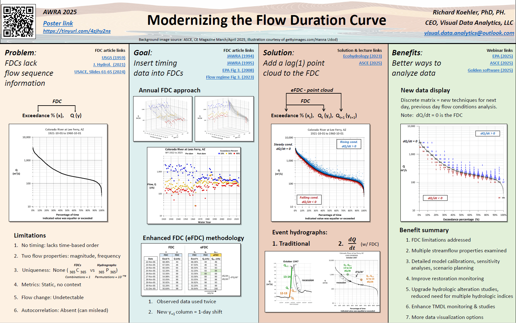
When he presented at a recent conference, his poster wasn’t just an overview of modernizing the flow duration curve. It was an intentional design that drew people in and clearly communicated insights within seconds to ensure his research didn’t get lost in all the noise. How did he pull it off? Rick’s approach has a name: information design.
What Is Information Design?
What exactly is information design? At its heart, information design is about making information easy to understand and use. While there’s a focus on arranging text and visuals to be appealing, the ultimate goal is to provide clarity by guiding viewers through complexity so they can understand and act on information with minimal effort.
In practice, this means thinking beyond aesthetics to consider how people perceive and process information. Good information design anticipates the audience’s needs—what they expect to see first, what questions they might ask, and where they might get confused—and structures content to reduce ambiguity and cognitive load. In doing so, presenters can guide viewers’ attention through content in a way that feels intuitive so they understand and use information successfully.
Why Good Information Design Matters at Conferences
If information design is about guiding attention, nowhere is that more critical than at large conferences. As Rick shared, “There are hundreds of posters at large conferences. That means you literally have 10 seconds to catch someone’s attention as they walk by.”
That constraint requires geoscientists and engineers to create posters that attract attention and clearly communicate insights. But unfortunately, many posters fall short. Most are full of dense text with small graphics squeezed into disconnected corners. Some are covered in tiny fonts that leave viewers squinting. Others are packed with dozens of figures competing for space. In one case, Rick even saw a presenter simply thumbtack standard letter-sized sheets onto a board without alignment or visual structure.
“This tells me that we have very bright technical people with little experience in visual design,” Rick admitted.
How to Approach Information Design for an Effective Poster
To create posters that attract and inform attendees at large conferences, Rick emphasizes a few practical information design best practices that any geoscientist or engineer can implement. One is simple: make the title easy to read and clear, so people can see it at a glance. Another is just as straightforward: make the content on the poster visible.
“You want people to see the poster from at least 10 feet away,” Rick said. “Only about 75% of people have 20/20 vision with correction, so most people have to get close to see tiny text, but they won’t do that if it’s crowded.”
Formatting the content so it’s visually appealing is also critical. For Rick’s most recent poster, he organized the content into large, clearly labeled sections with bulleted information rather than overwhelming attendees with dense paragraphs. If someone spent only five seconds at the poster, they would see the title and section headers with no time wasted. If they paused longer, they could scan the bulleted points and visuals in each section to see important insights, and they could do it in a way that felt natural because the content was formatted to guide the eye from left to right, so nothing felt disjointed.
Blank space also plays an equally important role in information design. Instead of filling every inch with content, it’s best to use blank space intentionally to prevent visual overload. When Rick did this, his poster was approachable and easy to scan rather than exhausting. Even smaller details—like the link leading to an article explaining his research and the time of his session—were more noticeable because there wasn’t much information surrounding it to drown it out.
On top of all these best practices, Rick recommends thinking digitally. For example, rather than handing out paper copies of his poster, Rick included a QR code and a shortened URL that linked directly to the full digital poster. If someone took a photo or scanned the QR code, they instantly had access to a high-quality PDF they could zoom into and share. And because the visuals on the PDF were created as vector-based graphics—not pixelated screenshots—they remained sharp at any scale.
The main takeaway? Information design requires intentionality and an understanding that your content needs to be concise and approachable in-person and online. As Rick puts it: “I’m not here to give you my dissertation. I’m here to give you an elevator talk.”
Design That Gets Noticed and Remembered
At a conference filled with hundreds of posters, information design is a strategic advantage. And as Rick’s expertise shows, it’s not a hard one to gain. With a clear title, visible text, structured sections, intentional blank space, and digital access, you can create posters that attract attention and provide the value people need to understand and act.
“I was blown away because people were actually taking pictures of my poster because the flow of information was so easy to discern,” Rick shared when explaining the results he noticed from implementing good information design. “My poster was addressing the needs of the quick walk-by, the person who wants a bit more, and the person who wants the full references.”
Want more best practices from experts in data visualization and geoscience? Subscribe to our blog so you don’t miss an article!
FAQ: Information Design
Information design is the practice of organizing and presenting content so it’s easy to understand and use. Rather than focusing only on how something looks, information design prioritizes clarity, structure, and usability to help viewers quickly grasp key messages without feeling overwhelmed.
Graphic design often emphasizes aesthetics and visual appeal, while information design focuses on effective communication. The goal isn’t just to make something look good. It’s to make complex information easier to interpret, evaluate, and act on.
At conferences, attendees make quick decisions about where to spend their attention. A well-designed poster must communicate value within seconds. Strong information design ensures your title is readable, your layout is structured, and your key insights are easy to scan, making it more likely people will stop, engage, and start a conversation.
A technical poster should function like an “elevator talk,” not a dissertation. It should provide a clear summary, highlight key insights, and invite deeper discussion rather than attempt to communicate every detail.
Common issues include overcrowded layouts, small unreadable text, inconsistent formatting, too many graphics competing for attention, and a lack of clear visual hierarchy. These design choices increase cognitive load and make it harder for viewers to understand the work quickly.
Incorporating a QR code or short URL that links to a digital version of your poster gives attendees a way to access, view, and share your work instantly. Using high-quality, vector-based graphics ensures your visuals remain sharp when viewed on different devices.
Yes. Information design best practices apply to dashboards, reports, presentations, infographics, and any situation where complex information needs to be communicated clearly. Anytime your audience must process technical data quickly, information design plays a critical role.
Recent Articles
- Jul 8, 2026|Gabbie Rhodes|14 min
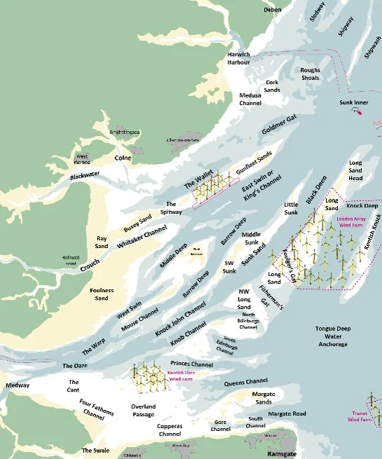
Roger creates passage and tide tables that help mariners understand when and how they can move through the Thames Estuary’s swatchways.
- Jul 8, 2026|Gabbie Rhodes|10 min
Effective data communication is about making your maps and models easy to understand, and there are ways to achieve that goal. Discover the tips!
- Jul 1, 2026|Gabbie Rhodes|7 min
Geoscience projects are built on collaboration, but even the strongest teams can struggle with communication silos. Learn how to overcome them.
- Jul 1, 2026|Gabbie Rhodes|7 min
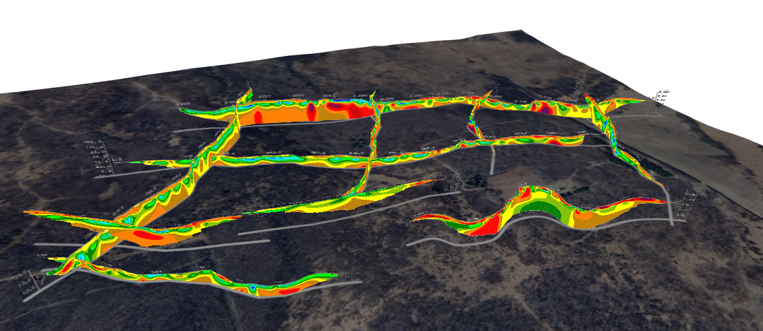
See how 3D visualization transforms geophysical data by connecting profiles with terrain, boreholes, and other datasets for better interpretation.