AI for Data Visualization: Common Graphing Mistakes and Why Specialized Tools Still Matter
AI for data visualization is quickly becoming an acceptable solution for turning raw datasets into polished graphs. All it requires is providing a data file, writing a prompt describing the desired visual, clicking a button, and out comes a seemingly nice chart. For simple datasets, that speed is impactful. For geo-professionals, speed alone isn’t enough.
When you’re working with complex spatial data, layered variables, or measurements that directly influence environmental, financial, or safety decisions, you need accuracy. A graph is a basis for action. And while many AI-generated graphs look professional at first glance, they can misrepresent your data.
That’s where caution is required.
Common Graphing Mistakes AI Makes
To understand why caution is necessary when using AI for data visualization, it helps to see exactly how it makes mistakes with real graphs. That said, here are some of the most common graphing errors AI makes and why they matter.
1. Misapplied curve fitting and statistical defaults
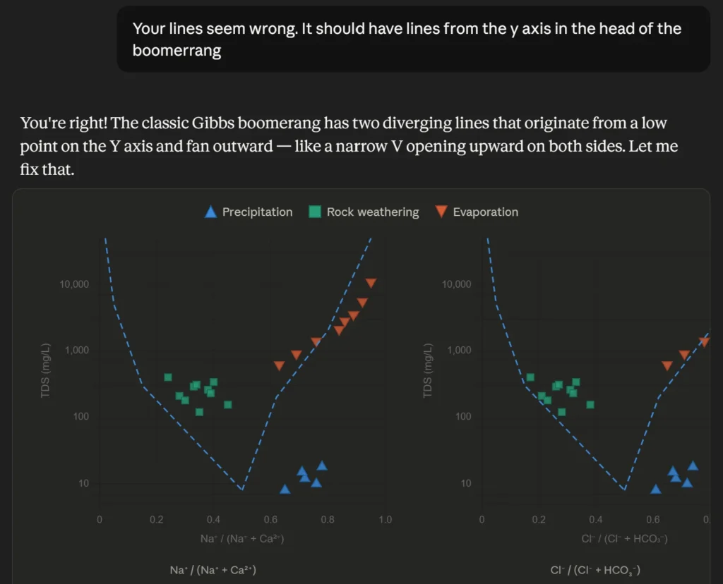
AI tools often apply statistical enhancements automatically, adding fit curves, generating bins, or applying smoothing to make the data look cleaner. While AI treats these decisions as simple cosmetic upgrades, they’re actually significant methodological changes that can alter the scientific meaning of your data.
AI may do the following:
- Select curve types (linear, exponential, polynomial) based purely on mathematical fit
- Prioritize a high R² value over physical reality, applying complex polynomial curves that ‘wiggle’ through data points in ways that are geologically or mechanically impossible
- Choose arbitrary bin sizes in histograms
- Smooth time-series data without evaluating the impact on interpretation
- Interpolate between sparse points or extrapolate beyond the dataset as if continuity and future trends are guaranteed
At first glance, these outputs look sophisticated. A fitted curve suggests predictive power. A clean histogram indicates a structured distribution. A smooth line points to stable progression.
However, in scientific workflows, curve fitting and binning require domain knowledge. For example, selecting a polynomial curve because it produces the highest R² value doesn’t mean it reflects physical reality. A statistically strong fit can still be scientifically meaningless if it contradicts known system behavior. Similarly, inappropriate bin sizes in a histogram can exaggerate or conceal distribution patterns, leading to false assumptions about variability or skew.
2. Incorrect axis scaling
Typically, AI tools automatically select axis ranges based on the data provided. While that may seem efficient, it can significantly distort perception.
Automatically selected scales can exaggerate small differences and compress meaningful variation. For example, imagine a bar chart comparing contaminant levels at several sites. If the y-axis begins at 90 instead of 0, minor differences between sites can appear dramatically larger than they actually are in reality. The chart may be mathematically correct, but the visual emphasis tells a different story.
While specialized graphing tools also use default scaling to generate an initial plot, they at least equip you with the overrides to instantly change those ranges. Standard AI tools, by contrast, rarely offer the customizability needed to correct these distortive defaults.
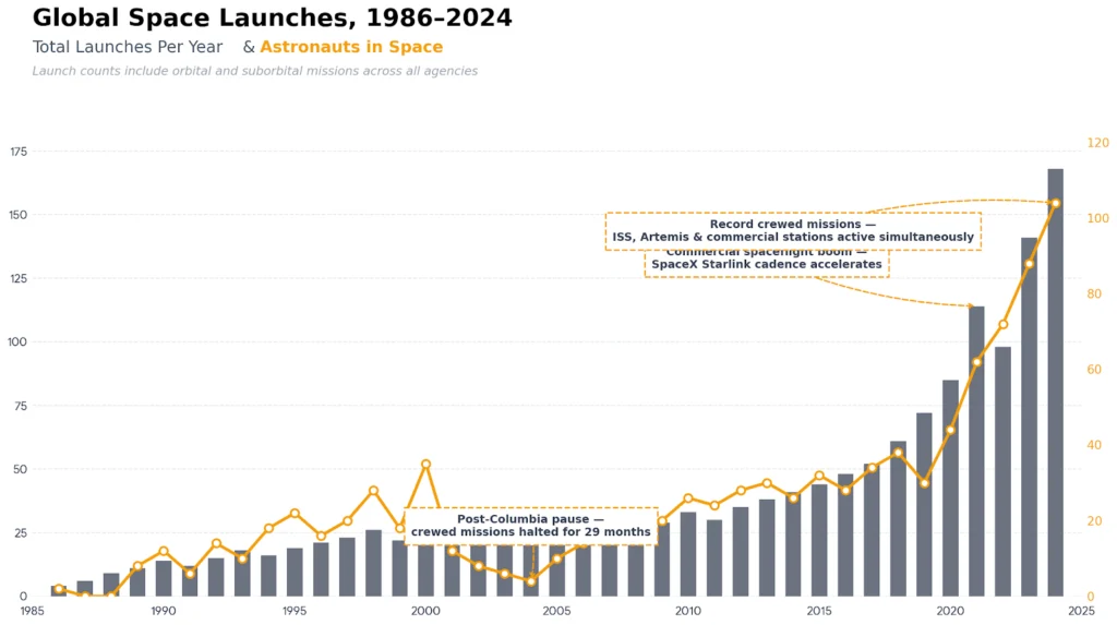
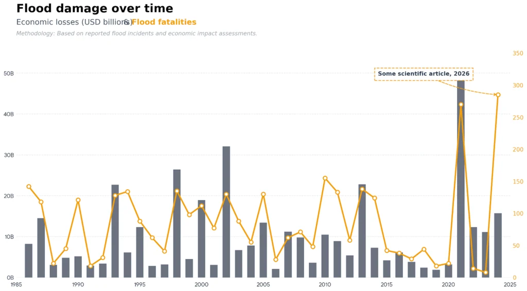
This issue is compounded when AI manages dual-axis charts. When plotting two different variables—like rainfall and groundwater levels—AI often scales the primary and secondary Y-axes independently to make both lines “fit” the frame. This can create a false visual correlation between datasets that have vastly different magnitudes.
3. Erasure of critical signals (over-smoothing and averaging)
AI visualization tools are inherently optimized to prioritize broad trends over localized anomalies. In an effort to present a clean, easily digestible graphic, AI frequently aggregates data, averages values that should remain isolated, or strips away short-term fluctuations. In technical disciplines, however, the “noise” is often exactly where the vital information lives.
AI may compromise your data by:
- Over-Averaging Regional Data: Combining localized tracking wells or sensors into a single, uniform regional average.
- Erasing Outliers and Anomalies: Filtering out sudden data spikes or drops under the assumption that they are statistical errors rather than real-world events.
- Flattening Short-Term Variability: Smoothing time-series charts to make a trend look stable and predictable.
Consider a dataset tracking groundwater levels across a field site that happens to capture a massive, localized contamination spike or a sudden pressure drop. A standard AI tool will often over-smooth or aggregate this data into a stable, uneventful trendline, completely masking the risk. In geosciences and engineering, localized variation matters far more than a clean summary. A single anomaly can signal an emerging environmental liability, structural instability, or a reservoir shift—critical insights that are completely erased by automated smoothing.
4. Lack of an interactive property audit trail
Technical visualizations must be entirely auditable. When you present a graph to a client, auditor, or regulatory body, you must be able to verify every calculation and design constraint. While standard AI tools can often show you the raw programming code they generated to build a chart, they lack a persistent, unified project framework.
Common traceability-driven issues include:
- Ephemeral Sessions: AI data visualizations exist within a single chat session. Once that session closes or expires, the dynamic link between your data settings and the visual output is broken, leaving you with a static image file that is difficult to recreate or modify precisely months later.
- Disconnected Modeling Layers: Because AI tools operate via standalone data processing scripts rather than a dedicated property manager, there is no permanent, central “state” where you can verify that data filters or coordinate systems were applied correctly across a collection of visuals.
- Lack of Professional Intentionality: AI can show you what script it executed, but it cannot justify its choices based on engineering standards or site history.
Specialized graphing software explicitly anchors your data, math models, and layout choices into a single interactive project file. Every parameter remains fully editable and transparent. AI platforms, by contrast, treat chart generation as a transactional output, leaving you without a persistent, centralized audit trail to defend your methodological choices during a peer review or regulatory audit.
5. Fabrication of precision (filling gaps in sparse datasets)
Field data is rarely perfectly even or complete; it is frequently defined by sparse sampling intervals, spatial gaps, and measurement uncertainty. Because AI visualization models are programmed to make graphics look complete, they often invent visual structure where it doesn’t statistically exist, drawing confident lines through data voids.
AI tools often fail to account for the following:
- Sparse datasets
- Uneven or irregular sampling intervals
- High measurement uncertainty and margin of error
While specialized graphing software natively leaves data gaps blank or equips you to manually display data breaks, AI platforms hate leaving blanks. To make a plot “look good,” an AI tool will blindly interpolate between widely scattered points or extrapolate beyond the dataset, mathematically fabricating continuity.
This creates a dangerous, misleading sense of precision. For example, if an AI tool encounters sparse mineral or oil sampling data, it may generate beautifully smooth, highly confident contour maps that show high resource density where there is insufficient field evidence. Relying on these over-polished visuals can introduce risk, leading teams to drill or mine in areas where actual volumes are far lower than the graphic implies, or causing companies to miscalculate remediation boundaries.
6. Poor labeling and missing context
Labels, units, and legends empower accurate interpretation. Without them, stakeholders are left guessing. AI-generated graphs sometimes omit or oversimplify critical contextual elements in the interest of speed.
Common issues include:
- Missing or incomplete axis labels
- Unclear or absent units of measurement
- Legends that do not clearly distinguish between variables
- Ambiguous titles that fail to define scope or timeframe
Say, for instance, an AI tool creates a multi-series line graph. It may display several colored lines without a clearly defined legend. Another scenario is that an axis may show numerical values without specifying whether they represent meters, feet, milligrams per liter, or parts per million. The graph looks polished, but the meaning is uncertain.
Of course, specialized graphing software doesn’t automatically know your project’s context or units either, but it does provide straightforward, dedicated tools to add and adjust them easily.
7. Over-reliance on default styling
AI-generated visuals often rely on default styling choices and don’t give you adequate control to make adjustments. While these defaults may look modern or visually striking, they are rarely tailored to the specific demands of technical communication.
Common default-driven issues include:
- Generic or overly saturated color schemes
- Inconsistent scales between related visuals
- High-contrast palettes that exaggerate minor variation
While specialized tools also apply default styles to an initial chart, they empower you to customize every visual element to match your project’s needs. Standard AI platforms, on the other hand, often lock you into their specific styles and make it hard to customize, leaving you with very few options to adjust the design manually.
These issues lead to multiple consequences. Subtle shifts in hue or contrast can influence how risk, intensity, or magnitude is perceived. If styling exaggerates variation, stakeholders may interpret minor changes as major concerns. If scales are inconsistent across visuals, comparisons become unreliable.
Why Specialized Graphing Tools Are Still Necessary
To achieve a graph that’s both polished and accurate, specialized graphing tools are still absolutely necessary. Unlike general-purpose AI visualization tools, specialized software like Grapher is built specifically for technical analysis and scientific fields, empowering you to get the exact final output you need. In fact, here are several ways specialized graphing tools outperform AI for data visualization.
Total control over visual and analytical settings
When you want to create a polished, precise graph, you need total control over the settings that shape its interpretation. Specialized tools provide the explicit flexibility to override every single setting. This ensures each visual and its details are a deliberate choice tailored to your project’s specific needs. Here’s more insight into what that means.
Precision in Presentation
Specialized tools equip you to manage the visual framework that guides a stakeholder’s perception. By fine-tuning the presentation, you ensure the layout supports—rather than distorts—the data. This includes:
- Exact axis scaling and starting values to prevent the exaggeration of minor variations
- Consistent units and labeling conventions to maintain technical clarity across related visuals
- Legend formatting and placement to ensure the interpretive framework is intuitive
- Color scales aligned with data meaning rather than generic aesthetic palettes
Integrity in Analysis
Beyond the visual layout, specialized software provides the manual overrides necessary to protect the mathematical logic of your data. This ensures that the patterns shown on the screen are scientifically defensible. For example, you can:
- Choose appropriate regression models based on physical reality rather than just a high R² value
- Adjust bin widths and smoothing parameters intentionally to avoid masking critical signals or anomalies
- Evaluate curve-fit statistics critically to understand the confidence of your trends
- Preserve outliers when they represent meaningful events like contamination spikes or structural shifts
Ultimately, this control matters because visualizations often drive modeling decisions, risk evaluations, and resource allocation. When both the analytical and visual settings are intentional, the resulting graph becomes a reliable basis for action that you can confidently stand behind.
Support for complex, multi-variable datasets
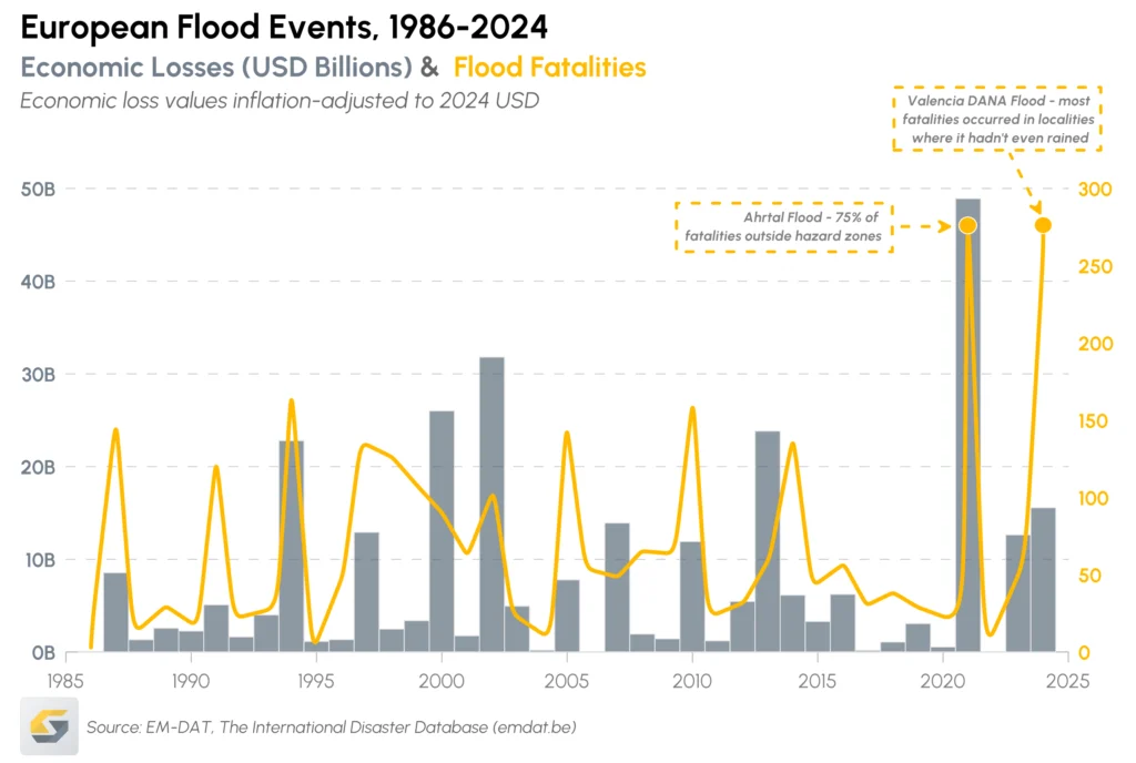
Technical data is rarely simple; it often involves overlapping variables, temporal shifts, and depth-related measurements. While AI tends to oversimplify these to keep the visual ‘clean,’ specialized software provides data filters and multi-axis controls. This empowers you to layer multiple datasets in a single view without losing the granular detail required for an accurate interpretation.
The right graph type for the right question
AI tools typically default to generic chart types like bar charts and scatter plots. However, scientific disciplines require specialized formats—such as Ternary plots for soil classification or Polar plots for wind direction—that communicate specific physical relationships.
Fortunately, with specialized graphing tools like Grapher, you get access to the following:
- Domain-specific graph types
- 2D and 3D visual formats
- Configurable statistical plots
This flexibility equips you to choose a layout that truly fits your data, rather than forcing your insights into a generic format.
Accountability and defensibility
Perhaps most importantly, specialized tools support accountability. When you manually define scaling, regression type, bin size, smoothing parameters, and styling decisions, you understand exactly how the graph was constructed. You can explain, defend, and justify it to stakeholders.
AI can generate a graph in seconds, but it cannot defend its methodological choices. In technical environments where decisions affect safety, budgets, environmental impact, and long-term planning, defensibility matters.
The Right Approach: Combine AI with Specialized Tools
While specialized software is critical for graphing workflows, the takeaway of this article isn’t that AI has no place in data visualization. Instead, AI should support specialized tools.
When used strategically, AI can improve efficiency without compromising analytical integrity. The key is assigning the right tool to the right task. Here’s insight on how to achieve that goal.
Use specialized tools for final outputs
When it comes to interpretation, reporting, and decision-making, precision matters too much to rely on AI.
Specialized graphing tools should be used when you need to achieve these goals:
- Handle complex, multi-variable datasets
- Maintain deliberate control over scaling, regression models, binning, and formatting
- Preserve meaningful variability and outliers
- Ensure consistency across related visuals
- Produce publication-ready, defensible outputs
These tools help you define analytical parameters intentionally rather than accepting defaults. You determine the curve type. You define the axis scale. You choose how uncertainty is represented.
That level of control ensures your final visualizations are scientifically defensible and stakeholder-ready. When a graph is included in a report, presented to regulators, or used to guide decisions, it must withstand scrutiny. Specialized tools make that possible.
Use AI for grunt work and idea generation
AI is most valuable when it removes repetitive, low-value tasks that consume time but don’t require deep analytical judgment.
It can be highly effective in quickly completing these tasks:
- Cleaning and organizing raw datasets
- Reformatting data for graphing (such as restructuring columns or converting units)
- Suggesting basic chart types to explore
- Identifying simple patterns or correlations worth investigating further
At this stage, AI acts as an accelerator. It speeds up exploration, reduces manual effort, and empowers you to move quickly from raw data to preliminary insight. Instead of spending hours restructuring spreadsheets or performing initial formatting, you can focus on interpreting the results.
Expertise Still Sets the Standard
When it comes to data visualization, AI can ultimately speed up your workflow, but specialized software is what ensures your results are defensible. In technical fields like geoscience and engineering, the most effective approach is using AI for data pre-processing and exploration, while relying on specialized software that delivers the control you need to apply professional standards to final outputs. By integrating these tools, you will quickly transform raw data into a precise visual you can stand behind with total confidence.
Now, we want to get your thoughts: how are you balancing AI tools with specialized graphing software in your workflow? Leave a comment to share your perspective!
Recent Articles
- Sep 9, 2026|Gabbie Rhodes|4 min
Explore how Submara Survey bridged the gap between terrestrial elevation data and underwater bathymetry to guide costal development in Norway.
- Sep 9, 2026|Gabbie Rhodes|10 min
In a recent webinar, John Vanderlaan, founder and owner of Prism GeoImaging, Inc., explored how to visualize geophysical data effectively.
- Sep 2, 2026|Gabbie Rhodes|8 min
Effective wildfire mitigation requires more than tracking fire behavior alone. You have to monitor multiple variables, and visualizations can help.
- Sep 2, 2026|Gabbie Rhodes|6 min
Promising mineral deposits are rarely identified by a single variable. That's why multivariate data visualization is essential to mineral exploration.