From Colormaps to Precise Annotations: Explore the Latest Version of Grapher

The latest version of Grapher is here—and its new features are designed to help you work more efficiently while creating data visualizations that communicate your insights with greater clarity and impact!
Whether you’re analyzing hydrological, engineering, environmental, earth or life science, or even general business data, this release introduces enhancements that simplify your workflow while giving you even more control over how your graphs look. The result? A faster path from raw data to polished, publication-ready visualizations that meet your audience’s exact needs.
“With this release, our focus was on helping users create high-quality visualizations more efficiently and effectively,” Product Manager Ruth Rodman explained. “From new templates to multivariate visualization capabilities, we’ve introduced tools to give users quicker workflows and greater flexibility to customize and create the precise plots they need to communicate insights with confidence.”
What exactly are those tools? Here’s a look at the key features and enhancements that’ll help you build clearer, highly customized graphs in less time.
Apply Colormaps to Bubble and Bar Charts
Sometimes a graph needs to communicate more than two or three variables at once. In those situations, color becomes another critical layer of information.
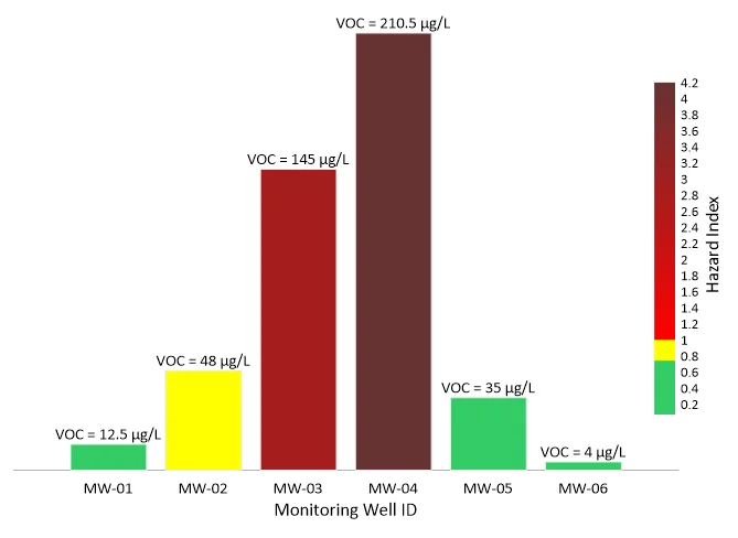

With the latest version of Grapher, you can now apply colormaps to bubble plots (including ternary plots) and various types of bar charts using numeric data. Instead of assigning a single fill color to every bubble or bar, Grapher can automatically color each one based on another variable in your dataset.
This makes it much easier to visualize multivariate data within a single graph. Whether you’re highlighting contaminant concentrations with colored bars or using color to emphasize performance categories in a bubble plot, you can reveal patterns and relationships that might otherwise require multiple charts to explain.
Create Cleaner, More Informative Legends
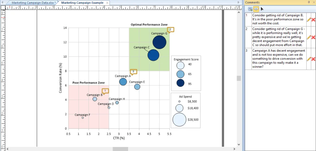
As your visualizations grow more complex, a well-organized legend ensures stakeholders aren’t left guessing what colors or symbols represent. That’s why the latest version of Grapher introduces two key legend improvements that make it easy for viewers to understand your data.
First, legends now automatically generate multi-color swatches for variable-colored plots. It doesn’t matter if you’re using a gradient colormap, a color table, or a variable-colored line; Grapher pulls representative sample colors—or the full gradient—directly into the legend entry. This eliminates manual workarounds and gives stakeholders an immediate, accurate visual reference for how colors correspond to your data.
The release also introduces the opportunity to hide empty classes in a legend with a single click. Empty classes often appear when data has been filtered or when you’re using the same custom class definitions across multiple datasets. Instead of manually removing unused entries, Grapher can automatically hide them, resulting in a cleaner legend that keeps the focus on the information that matters.
Snap to Vertex for More Precise Annotations
Sometimes the most important part of a graph is the custom annotations that give the data context. Whether you’re delineating stratigraphic layers, outlining a contamination plume, or drawing a precise groundwater table boundary across a profile, those elements require exact alignment.
With the new version of Grapher, you can now snap to a vertex across existing objects, axes, and data points dynamically as you draw polylines and polygons. Instead of zooming in and manually tweaking nodes to get shapes to align, Grapher automatically locks your vertices directly to relevant plot elements and axis locations.
This enhancement gives you the freedom to create custom, highly tailored visual elements in a fraction of the time. That means you achieve a faster workflow and perfectly aligned, presentation-ready annotations that make complex data easy for stakeholders to understand.
New Templates for Technical Workflows
The latest Grapher release also expands the Golden Gallery with new and updated templates that help you create industry-standard visualizations faster. Instead of building layouts from scratch, you can start with professionally designed templates and customize them to fit your own data and reporting requirements. Here are some of the new and recently enhanced templates you can use.
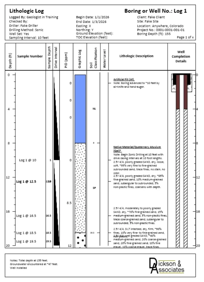
Dickson & Associates Boring and Well Log
Developed by Zachary Dickson of Dickson & Associates, LLC, this template not only brings a significant level of automation to the creation of single- and multi-page boring and well logs but also takes into account the variability and complexity of well log and boring data. It combines lithology, soil descriptions, field measurements, and well construction details into a single depth-aligned visualization, making it easy to relate subsurface conditions to installation design. The outcome is a clearer, more efficient way to document geotechnical, environmental, and hydrogeologic investigations.
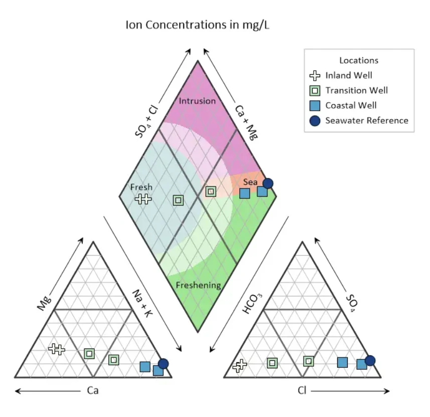
Monitoring Seawater Intrusion in a Coastal Aquifer
This ready-to-use Piper diagram simplifies the analysis of groundwater chemistry by combining two ternary diagrams with a central diamond plot. Color-coded zones quickly distinguish fresh groundwater, seawater intrusion, and transitional water types, helping hydrogeologists, environmental consultants, and water utilities monitor aquifer health and identify contamination pathways more efficiently.
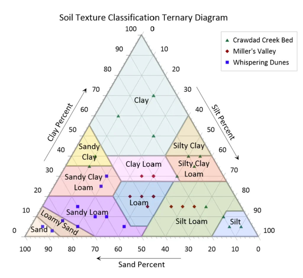
Soil Texture Classification Ternary Diagram
Rebuilt using Grapher’s new snap-to-vertex functionality, this updated template delivers even greater precision when classifying soil textures. Samples are plotted against USDA soil texture classes, while labels, colored backgrounds, and classification boundaries can be toggled on or off with a single click. This flexibility makes it easy to tailor the visualization for reports, presentations, or publications.
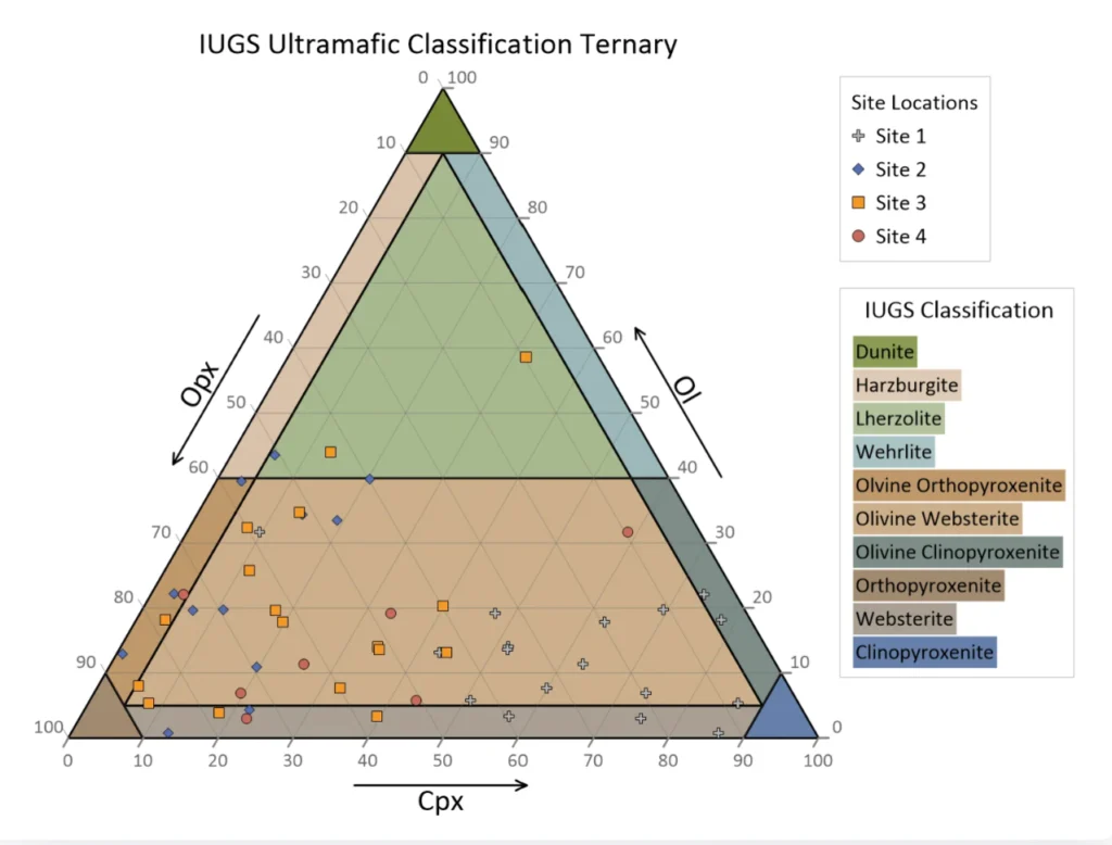
IUGS Ultramafic Classification Ternary Diagram
Also updated with the new snap-to-vertex capabilities, this template provides a precise framework for classifying ultramafic rocks based on the relative proportions of olivine, clinopyroxene, and orthopyroxene. Users can easily customize classification boundaries, labels, colors, and legends to create publication-ready figures that meet the needs of geology, petrology, and geochemistry projects.
Complete the Story with Graphs and Maps
With all the new tools, templates, and design capabilities in Grapher, there’s never been a better time to start using it alongside Surfer, an industry-leading mapping and modeling software that transforms complex data into high-quality visuals.
Maps and models are powerful for showing where something is happening, but graphs explain why it’s happening and how conditions change over time. Together, they provide a more complete story of your data, which is why Grapher is a natural complement if you’re already using Surfer.
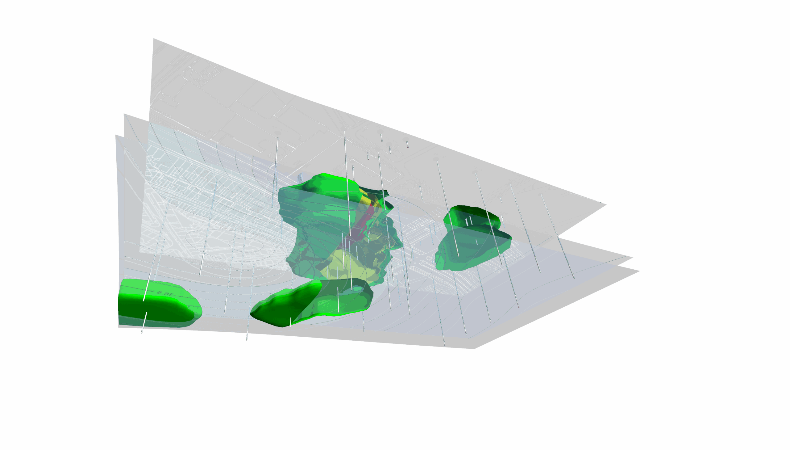
Consider a large-scale hydrodynamic and water quality modeling project spanning thousands of kilometers across a major river delta. To communicate a comprehensive story of the project data, each software package could handle the dimension of the data it does best:
- Surfer can provide the spatial outputs: You can render the geographic domain—mapping water level isolines, nutrient concentration plumes (phosphorus and nitrogen), biochemical oxygen demand, and hydrodynamic circulation vectors across the entire landscape.
- Grapher can deliver temporal and analytical depth: You can track time-series data from monitoring stations across that same domain, plotting hydrographs and specialized charts like current velocity ellipses (comparing east-west versus north-south flow components).
Additionally, instead of relying on static, uneditable graphics generated by raw modeling code, using Grapher alongside Surfer gives you a “live,” fully customizable post-processing environment. Every map and chart remains entirely editable, making it easy to refine visual elements and perform further analysis directly within the software to deliver publication-ready visuals that tell a cohesive story.
Also, if you want those visuals side by side, the latest Grapher release makes sharing files between the two seamless. With new DWG and DXF import and export support, you can easily bridge your graphics between platforms. Whether you want to export a map from Surfer and import it into Grapher, or bring a Grapher plot directly into a Surfer layout, this new compatibility makes displaying maps and graphs side-by-side straightforward.
Ultimately, complex projects demand more than just maps or graphs. By integrating Grapher alongside Surfer, you can seamlessly connect spatial patterns with analytical depth to deliver a complete data-driven story that gives stakeholders total confidence.
Start Creating Better Graphs Today
The latest version of Grapher is built to help you work faster while communicating your data more effectively. Whether you’re using colormaps to visualize multiple variables, creating clearer legends, accelerating your workflow with new templates, or adding precise annotations with snap-to-vertex drawing, every enhancement is designed to help you create polished final outputs efficiently.
If you’re ready to design professional, publication-ready graphs with greater speed and flexibility, download the latest version of Grapher today. With these new features at your fingertips, you can communicate your data with more clarity, confidence, and impact.
Recent Articles
- Sep 29, 2026|Gabbie Rhodes|9 min
When visualizing technical data, a map will reveal certain insights, while a graph will reveal other insights. You need both to get the full picture.
- Sep 29, 2026|Gabbie Rhodes|5 min
Repetition slowing you down? Automation can quicken your high-volume workflow, remove manual steps, and even improve consistency.
- Sep 23, 2026|Gabbie Rhodes|8 min
The best 3D data visualizations depend on the quality of your underlying grid. To achieve a great result, sometimes you need to use 3D grid filters.
- Sep 23, 2026|Gabbie Rhodes|11 min
When you're working with complex data, you need to communicate clearly. Graphs can help, especially when you follow design best practices.