Webinar Recap: An Expert’s Approach to Modeling Geophysical Survey Data in Surfer


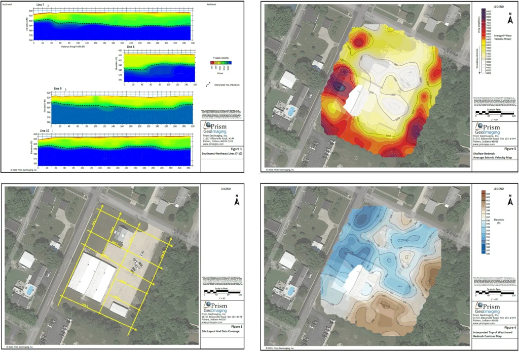
Collecting geophysical data is only the first step in understanding what’s happening beneath the surface. The real challenge lies in visualizing the data, interpreting the measurements, and translating the results into recommendations stakeholders can confidently act on.
That’s exactly what Golden Software’s Drew Dudley and John Vanderlaan, founder and owner of Prism GeoImaging, Inc., explored during the recent webinar, Environmental Insights: An Expert’s Approach to Modeling Geophysical Survey Data in Surfer. Drawing from a real-world environmental investigation, John demonstrated how he transformed electrical resistivity measurements into clear 2D and 3D visualizations that made complex subsurface conditions easier to understand.
If you missed the live session, don’t worry. We’re diving into some of the biggest insights and practical takeaways from the presentation.
The Project Challenge
Before John walked through his workflow in Surfer, he first introduced the challenge that prompted the entire project: helping a growing community identify better locations to drill for water wells.
The project centered on a small town whose demand for water was increasing because of population growth and industrial development. Its existing well field was no longer producing enough water to meet that demand, so the community wanted to expand the system by drilling additional wells. The challenge, however, was determining where those wells were most likely to be successful before investing in expensive drilling operations.
John first investigated the site in 2025 before returning in 2026 to evaluate additional areas. He had to work within the boundaries of land the town owned or could access through agreements with private landowners, adding a layer of complexity to the project. With that constraint in mind, John turned to electrical resistivity surveys to narrow the search. Rather than looking directly for groundwater, he looked for geological conditions that suggested groundwater was more likely to be present.
The first target was the overburden, the unconsolidated material above the bedrock. Sand and gravel generally have relatively high electrical resistivity and often make productive aquifer materials because they allow water to move and be stored more easily. Clay and silt, on the other hand, typically have low resistivity and are much less favorable for producing high-yield wells. Identifying higher-resistivity zones in the overburden therefore helped John pinpoint areas where sand and gravel—and potentially groundwater—were more likely to occur.
His second target was the underlying limestone bedrock. While intact limestone is typically quite resistive, fractured or faulted limestone often exhibits lower electrical resistivity because those fractures can contain more soil, pore space, and water. Finding lower-resistivity zones within the bedrock could therefore reveal areas with greater groundwater potential.
Even with those targets in mind, John emphasized an important distinction: electrical resistivity doesn’t directly detect groundwater. During the webinar, he compared the process to tracking an animal by its footprints. The footprints don’t guarantee the animal is still nearby, but they provide valuable clues about where it has been. In the same way, electrical resistivity identifies geological conditions associated with a greater likelihood of finding groundwater. The objective wasn’t to guarantee a successful well but to make drilling decisions much more informed before anyone broke ground.
Data Collection With Electrical Resistivity Tomography
With the project goals clearly defined, John explained how he collected the subsurface data that would eventually become the 2D and 3D models showcased throughout the webinar.
To investigate the site, John used electrical resistivity tomography (ERT), a geophysical method that measures how strongly different parts of the subsurface resist the flow of electrical current. Because materials like sand, gravel, clay, and fractured limestone each respond differently to electricity, those measurements can reveal changes in geology that aren’t visible from the surface.
For the survey, John explained that steel electrodes were placed in the ground and connected by a multiconductor cable to an AGI SuperSting R8 resistivity meter. The instrument introduced electrical current through selected electrodes while measuring voltage across others. By repeating that process hundreds of times along each survey line, John collected the measurements needed to build a picture of the subsurface.
For the 2025 investigation, John used survey lines containing 112 electrodes. When he returned to investigate additional areas in 2026, the number of electrodes varied depending on the space available at each location. He also explained that he typically uses a dipole-dipole array for this type of groundwater investigation, although pole-dipole arrays can provide greater investigation depth when available survey space is more limited.
Turning Field Measurements Into a Subsurface Model
Before John could visualize the data he collected, the electrical measurements first needed to be converted into a model that represented subsurface resistivity. That’s because the field measurements initially produced what’s known as an apparent resistivity pseudo-section.
John had to import that information into separate inversion software, which began with a theoretical model of the subsurface. The software then calculated what electrical measurements that model would produce, compared those results to John’s actual field measurements, and repeatedly adjusted the model until the calculated values closely matched what he had observed in the field.
However, John admitted that he faced one obstacle. During the project, a challenge came from pipelines running alongside nearby roads, which introduced electrical interference into some of the raw measurements. Simply avoiding those areas wasn’t an option because they were located within the portions of the site the town wanted investigated.
To work around this issue, John decided to filter the affected data and adjust the inversion-modeling parameters. By addressing this early in his workflow, John could bring clean, reliable XYZ data into Surfer for visualization and interpretation.
Visualizing the Subsurface in Surfer
With the subsurface model complete, John was ready to do what many attendees were waiting to see: transform thousands of electrical resistivity measurements into visualizations that revealed where the most promising drilling targets might be located. Here’s a brief look at how he brought his data to life.
Grid the electrical resistivity data
John began by importing the XYZ data into Surfer and interpolating it into a grid. For this project’s dense electrical resistivity dataset, he used the Minimum Curvature gridding method because it produces smooth surfaces well suited for closely spaced measurements.
He also adjusted the grid spacing to reflect the fact that electrical resistivity surveys usually contain much denser measurements horizontally than vertically. Matching the grid spacing to the data density helped preserve important subsurface features while avoiding unnecessary interpolation.
Because Minimum Curvature naturally extrapolates beyond the measured data, John then blanked the grid so it matched the trapezoidal shape of the actual resistivity survey. This ensured the visualization represented only areas supported by measurements rather than creating the impression that data existed where none had been collected.
Although Minimum Curvature worked well for this project, John emphasized that there isn’t one universally “best” gridding method or tactic. Depending on the dataset and the story he’s trying to communicate, he may instead use:
- Natural Neighbor when he wants a method that doesn’t extrapolate beyond the measured data
- Kriging when working with more widely spaced datasets, such as points used to model the bedrock surface
- Alpha shapes to automatically blank grids with complex or irregular boundaries
- Grid filtering when additional smoothing improves interpretation
His advice was simple: if one gridding method isn’t communicating the geological features clearly, don’t hesitate to try another.
Start with the map
Once the resistivity data was gridded, John began his interpretation with a map.
The map established where each survey line was collected and showed how the different datasets related spatially across the site. It also provided important context by illustrating how the additional 2026 investigation expanded upon the original 2025 survey.
Before stakeholders could understand what was happening beneath the surface, they first needed to understand where each profile fit within the overall investigation.
Interpret the cross-sections
With the survey locations established, John shifted to the individual resistivity cross-sections, where the geological interpretation really began. This was the stage where he identified the subsurface features most relevant to the investigation and determined which locations showed the greatest potential for future groundwater wells.
During the webinar, John showed that the cross-sections were displayed by depth rather than elevation, an intentional decision he made because the site was relatively flat, where small topographic differences were insignificant compared to the roughly 300-foot investigation depth. Displaying the sections by elevation would have added complexity without providing additional insight.
More importantly, depth was more useful to the people acting on the results. Drilling contractors needed to know how deep to drill because it directly affected equipment selection, drill string requirements, water needs, and other logistical considerations. For this project, a depth-based view better supported those decisions.
John also demonstrated an effective technique for presenting multiple investigations together. Rather than combining the 2025 and 2026 surveys into one continuous model—which would have been inappropriate because the surveys used different geometries and electrode configurations—he kept the datasets separate. The older cross-sections were displayed with increased transparency, providing valuable context without competing visually with the newer results.
That approach also reinforced an important conclusion from the investigation. The 2026 survey didn’t fundamentally change John’s interpretation of the site. The area remained challenging for locating productive groundwater, but the additional data refined the search enough to identify three promising drilling locations, compared to two identified during the original investigation.
Bring everything together in 3D
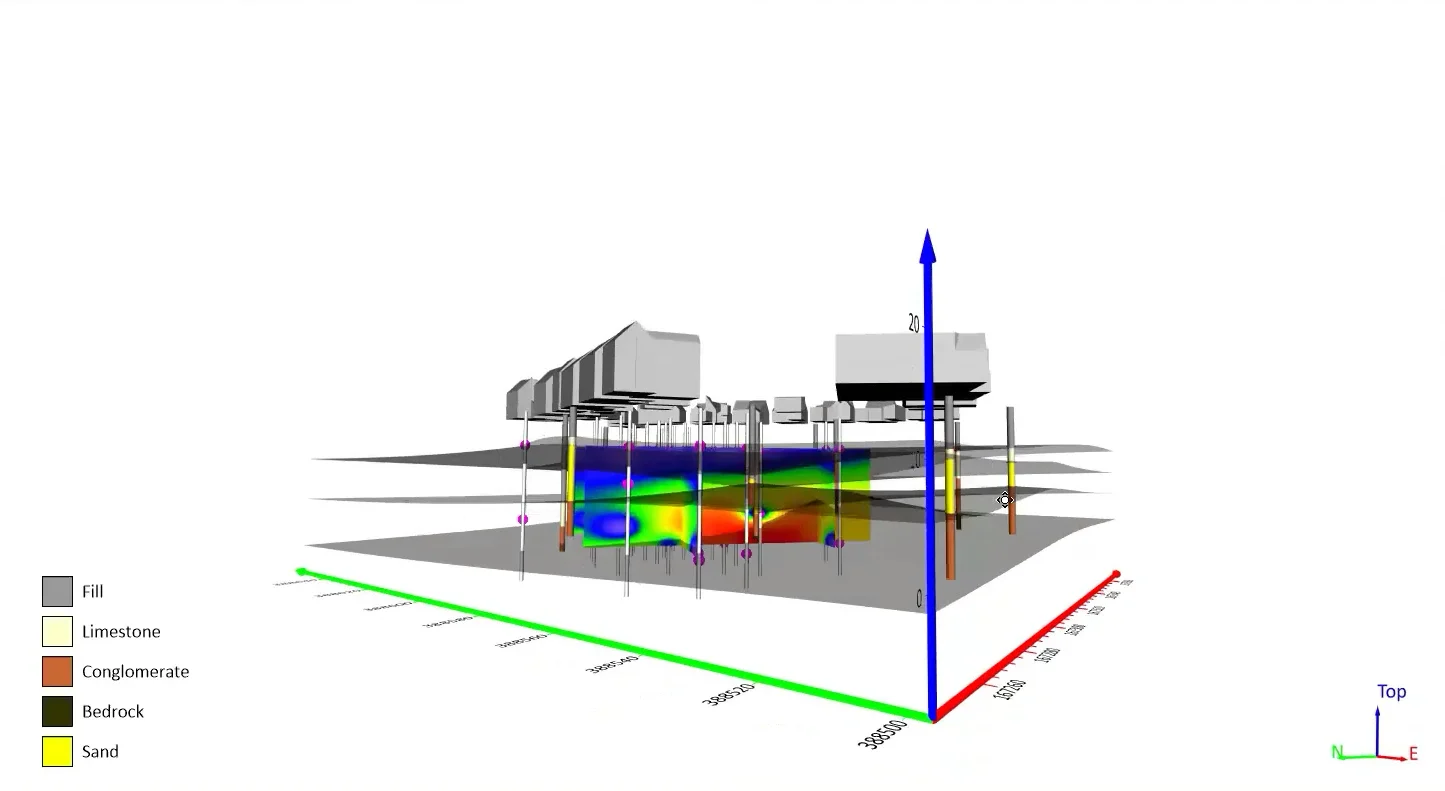
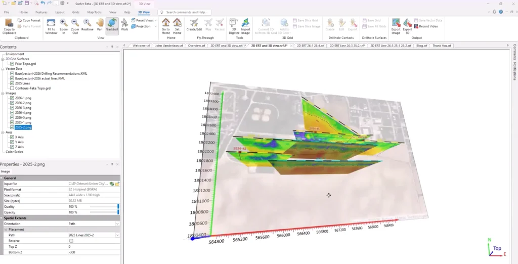
The final step was combining the interpreted cross-sections into a single 3D model. To do this, John exported each interpreted profile as a PNG or JPEG image before placing them along their actual survey paths within Surfer’s 3D View. Instead of viewing each cross-section independently, the profiles could now be understood within their correct spatial relationships.
John explained that this approach is especially valuable for non-technical stakeholders. While geoscientists may be comfortable mentally connecting a plan-view map with several separate cross-sections, many clients are not. The 3D visual decreases confusion by presenting the information as one cohesive model.
As John put it during the webinar, the 3D visualization helps “put the whole picture together,” making complex geophysical interpretations much easier for clients and decision-makers to understand.

The Result: Three Better Places to Investigate
After collecting the data, interpreting the geology, and visualizing the results, John’s investigation ultimately answered the question that started the entire project: where should the town focus its drilling efforts?
The answer wasn’t as simple as finding a perfect location. In fact, one of the project’s biggest takeaways was that the site proved to be a challenging place to find productive groundwater. Rather than revealing abundant opportunities, the geophysical investigation helped John narrow a large search area down to three locations from the 2026 survey that appeared to offer the greatest potential for future test wells.
Just as importantly, the investigation showed where the town was unlikely to find success. Based on John’s interpretation, he estimated that roughly 90% of the investigated area had a very low likelihood of producing groundwater. That insight was just as valuable as identifying the three promising locations because it helped the town avoid investing additional time and money in areas that were poor candidates for drilling.
From Geophysical Data to Better Decisions
John’s project demonstrated that the true value of geophysical investigations is transforming data into visualizations that support better decisions. By combining thoughtful data collection, careful interpretation, and clear 2D and 3D visualizations in Surfer, he helped his stakeholders narrow a large search area down to three promising drilling locations while eliminating much of the site from further consideration. The result was a more focused, informed approach to groundwater exploration before the first test well was ever drilled.
Of course, this recap only scratches the surface of everything John shared during the webinar. Watch the full session, Environmental Insights: An Expert’s Approach to Modeling Geophysical Survey Data in Surfer, to see his complete workflow, hear additional insights, and see the entire visualization process unfold from field data to final drilling recommendations.
Recent Articles
- Oct 21, 2026|Gabbie Rhodes|7 min
Want your subsurface data to tell a clear story to stakeholders? Learn how to visualize it in 2D and 3D so your data clearly shares key insights.
- Oct 21, 2026|Gabbie Rhodes|10 min
With climate change data, you need to visualize where temperature, precipitation, and other variables occur and change over time. Learn how.
- Oct 14, 2026|Gabbie Rhodes|7 min
Mineral exploration requires you to analyze multiple variables. To do that successfully, you need to rely on both maps and graphs.
- Oct 7, 2026|Gabbie Rhodes|8 min
In the second post of our Visualizing Technical Data series, learn how maps and graphs can showcase your water quality data and uncover insights.