Visualizing Technical Data (Part 1): Why Combining Maps and Graphs Improves Analysis and Visual Quality



Technical datasets rarely tell a one-dimensional story. They may include geographic location, elevation, depth, measurements collected over time, environmental conditions, chemical concentrations, and countless other variables. What becomes challenging is choosing the visualization that’ll uncover and clearly communicate critical relationships in these datasets, especially since no single visualization answers every question.
A map can reveal an important spatial pattern but leave you wondering how conditions changed over time. A graph can expose a clear trend while providing little indication of where those measurements were collected. When each visualization tells only part of the story, important insights can be easy to miss.
So, what’s the solution? Rather than relying on one type of visualization to do everything, creating maps and graphs using specialized tools can bring your data to life from multiple perspectives.
Why Technical Data Need Maps and Graphs
Let’s start by getting clearer on why data calls for more than one type of visual. Sometimes, technical datasets must answer multiple questions, each requiring a different way of looking at the same information.
Consider an environmental monitoring project. After collecting samples from dozens of monitoring locations over several months or years, you might need to determine:
- Where are contaminant concentrations highest?
- How have those concentrations changed over time?
- Which monitoring locations exhibit similar or different trends?
- How do measurements compare against regulatory thresholds?
All of these questions are important, but they’re best answered with different visualizations. Trying to tackle each one solely with maps or only with graphs can make important answers harder to recognize. That’s why combining different visuals—like maps and graphs—is ideal. Each highlights a different dimension of the same dataset, making it easier to uncover insights during analysis and clearly communicate those findings to stakeholders.
Maps Show You Where: Understanding the Spatial Side of Technical Data
Now that we’ve established why technical data can require more than one type of visualization, it’s time to dive into a critical question: what role should maps play in your workflow?
Maps are valuable when location and spatial relationships are central to your analysis. Rather than simply displaying where data was collected, maps help reveal how conditions are distributed across an area and how they relate spatially to surrounding features such as geology, terrain, infrastructure, or other sampling locations. Here’s a deeper look at what that means.
What maps answer
When working with technical data, maps can help answer questions like:
- Where are the highest and lowest values?
- How does a measurement change across an area?
- Are there spatial clusters, anomalies, or boundaries?
- How do measurements relate to geology, terrain, infrastructure, sampling locations, or other spatial features?
- What is happening beneath the surface?
By answering these types of questions, maps provide the geographic context needed to understand where conditions occur and how they relate to the world around them.
Technical data that benefits from mapping
Various types of technical data become much easier to interpret when viewed spatially. Common examples include:
- contaminant concentrations across a remediation site
- groundwater elevations across monitoring wells
- geophysical measurements collected along survey lines
- mineral concentrations across an exploration area
- elevation and terrain data
- borehole and other subsurface datasets
Mapping these datasets connects individual measurements to their location, making it easier to see how conditions vary across a site, follow spatial trends, and understand how features above and below the surface relate to one another.
Graphs Show You What the Data Is Doing: Revealing Trends and Relationships
While maps excel at revealing where conditions occur and how they’re distributed across a project area, not every important question is spatial. You also need to understand how measurements change over time, how values compare, and whether variables exhibit meaningful trends or relationships. That’s where graphs become invaluable.
By transforming technical measurements into clear visual comparisons, graphs make it easier to identify trends, relationships, thresholds, and outliers that may be difficult to recognize from spatial patterns alone.
What graphs answer
When working with technical data, graphs can help answer questions like:
- How has a measurement changed over time?
- Is a variable increasing, decreasing, or remaining stable?
- How do multiple monitoring locations compare?
- Is there a relationship between two variables?
- Are measurements exceeding a particular threshold?
- Are there outliers or unusual patterns in the dataset?
By answering these types of questions, graphs help reveal how your data behaves so you can interpret changes, compare results, and identify meaningful relationships.
Technical data that benefits from graphing
Multiple types of technical data are easier to understand when viewed as graphs. Common examples include:
- groundwater levels over time
- contaminant concentrations by sampling date
- water-quality or water chemistry measurements
- rainfall versus streamflow
- particle-size distributions
- engineering or laboratory measurements
Graphing these datasets turns individual measurements into trends, comparisons, and relationships, equipping you to see how conditions change over time, how values differ across observations, and where meaningful patterns or anomalies emerge.
Why Maps and Graphs Are Stronger Together
At this point, it’s clear that maps and graphs answer different but complementary questions about your data. When used together, they reveal insights that’d be difficult to uncover with only one type of visualization. To put that into greater perspective, here are three examples of how maps and graphs work collaboratively to provide a more complete view of your data.
Environmental consulting: tracking contaminant plumes and concentration trends
Maybe you’re monitoring groundwater conditions at a remediation site when routine sampling reveals a sharp increase in benzene concentrations at a downgradient monitoring well. You need to understand not only what’s happening at that particular well, but what the change could mean for the rest of the site.
A time-series graph can plot benzene concentrations at the well over time, revealing when the increase began, how quickly concentrations are changing, and whether measurements have crossed relevant regulatory thresholds. This gives you a clear picture of what’s happening within the monitoring data.
An interpolated plume map adds the spatial perspective. By visualizing contaminant concentrations across the site, you can evaluate the plume’s estimated extent and its proximity to nearby features such as surface water, private drinking-water wells, and other monitoring locations.
Together, the graph reveals a concerning concentration trend at a specific well, while the map shows where elevated concentrations occur across the site and their proximity to sensitive receptors. With both perspectives, you have stronger information for deciding where additional monitoring, investigation, or remediation may be needed
Mineral exploration: evaluating multi-element assay data across drillholes
Consider a project where you’re evaluating assay results from a newly drilled deposit. Copper and gold concentrations both appear elevated in portions of the dataset, but you need to determine whether those elements are related and where that relationship occurs within the deposit.
A scatter plot or cross-plot can compare copper assay grades against gold grades across samples. Adding a regression line or other statistical analysis helps quantify the relationship between the two elements, revealing whether higher copper grades tend to occur alongside higher gold grades.
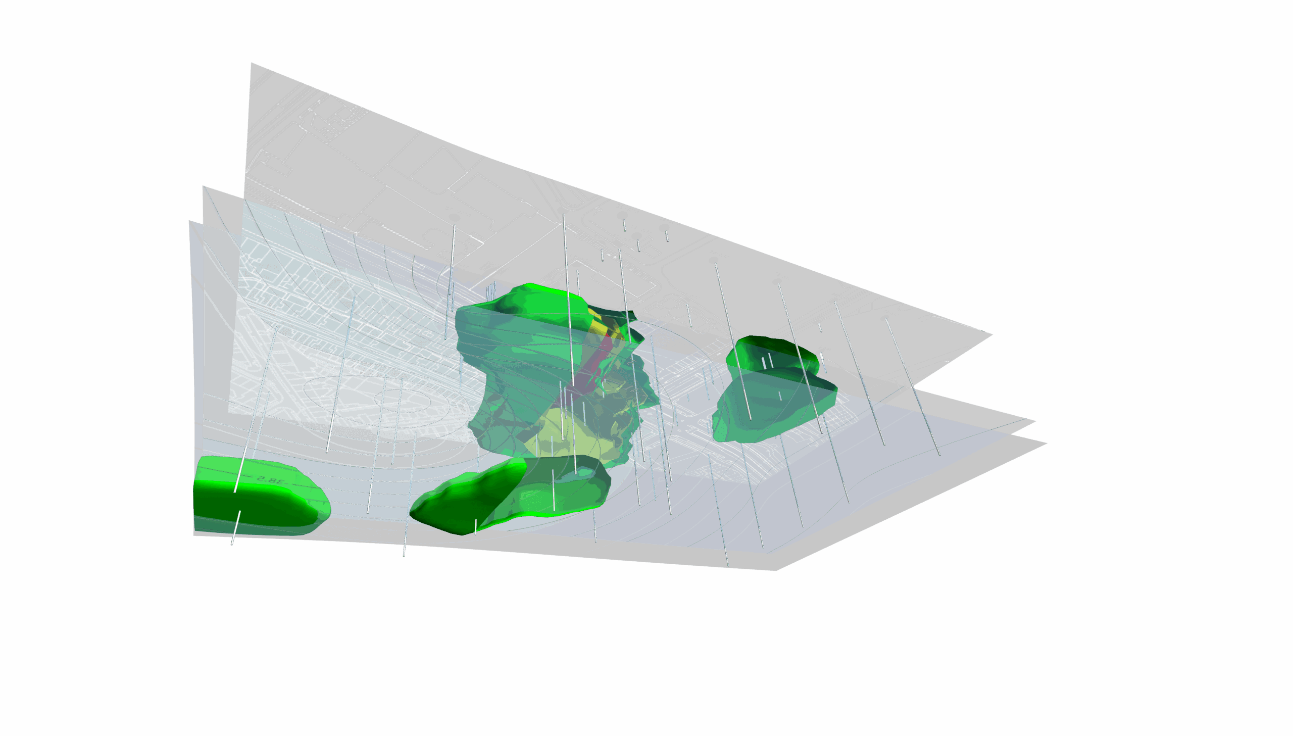
A 3D borehole visualization or cross-section can then place those assay results back into their spatial and geological context. By displaying multi-element data along drillhole traces and alongside relevant stratigraphy or structures, you can see where elevated grades occur beneath the surface.
Together, the graph may reveal a relationship between copper and gold concentrations, while the borehole visualization shows whether that enrichment is concentrated within a particular depth interval, stratigraphic unit, or geological structure. Now you can move from identifying a relationship in the assay data to understanding where that relationship occurs, providing valuable context when planning additional drilling.
Water resources: analyzing watershed response to extreme rainfall
Perhaps you’re a water resources engineer assessing flood risk for a community located downstream of a major river basin. You need to understand how the river could respond to an extreme rainfall event—not only when conditions may become most critical, but which areas could be affected as a result.
A modeled hydrograph can show how river discharge is expected to change over time under a specific rainfall scenario, helping you identify when discharge may begin rising, when it could peak, and how long elevated flows may persist.
A color-relief elevation and inundation map can provide the spatial side of the analysis. By visualizing modeled inundation across local topography, roads, bridges, buildings, and other infrastructure, you can identify which low-lying areas may be exposed as water levels rise.
Ultimately, the hydrograph shows when peak river conditions are expected under the modeled scenario, while the inundation map shows where flooding could occur. With both perspectives, you can give emergency managers and other stakeholders a clearer picture of the potential timing and geographic extent of the hazard to support decisions around road closures, evacuation routes, and other preparedness measures.
Why Specialized Tools Matter for Technical Data Visualization
While maps and graphs undoubtedly work well together, it’s important to note that you need the right tools to transform your technical data into visuals that effectively showcase and communicate insights.
General-purpose software can certainly produce maps and graphs, but technical workflows often require capabilities designed specifically for spatial analysis, subsurface visualization, specialized plots, coordinate systems, and complex scientific datasets. That’s where purpose-built mapping and graphing software can provide an advantage: you can have tools with capabilities that match the complex questions you’re trying to answer.
That distinction reflects what we’ve heard from customers who regularly use both Surfer and Grapher. They rely on Surfer to explore spatial questions through maps, contours, surfaces, and plumes, while Grapher helps them investigate non-spatial questions through time-series graphs, chemistry plots, and statistical comparisons.
When working with different types of technical data, our customers believe both specialized tools are essential for getting the capabilities needed to have a more complete understanding of information.
Give Every Dimension of Your Technical Data the Right View
Complex data rarely fits neatly into one type of visualization. The more questions you ask of your data, the more important it becomes to view it from multiple perspectives.
Maps help reveal where conditions occur across a project area, while graphs uncover patterns, trends, comparisons, and relationships within the measurements themselves. By combining both visuals together, you can analyze your data more effectively and deliver clearer insights to stakeholders.
But there’s much more to explore when it comes to putting this concept into practice, so this article is just the beginning. We’re launching a new blog series called “Visualizing Technical Data,” where we’ll explore how maps and graphs can help you answer real-world questions, communicate findings more effectively, and gain deeper insights from your data in various scenarios.
How do maps and graphs complement one another in your workflow? Share your thoughts and experiences in the comments below!
Recent Articles
- Sep 29, 2026|Gabbie Rhodes|9 min
When visualizing technical data, a map will reveal certain insights, while a graph will reveal other insights. You need both to get the full picture.
- Sep 29, 2026|Gabbie Rhodes|5 min
Repetition slowing you down? Automation can quicken your high-volume workflow, remove manual steps, and even improve consistency.
- Sep 23, 2026|Gabbie Rhodes|8 min
The best 3D data visualizations depend on the quality of your underlying grid. To achieve a great result, sometimes you need to use 3D grid filters.
- Sep 23, 2026|Gabbie Rhodes|11 min
When you're working with complex data, you need to communicate clearly. Graphs can help, especially when you follow design best practices.