- May 29, 2025|Gabbie Rhodes|4 min read
Senior Business Development Manager Drew Dudley showed how Surfer empowers users to create great PFAS contamination models. Learn more.
About Golden Software
Since 1983, Golden Software has been at the forefront of scientific data visualization.
Today, we empower professionals to solve real-world problems by transforming complex data into clear, impactful visual stories through our industry-leading software and legendary customer support.
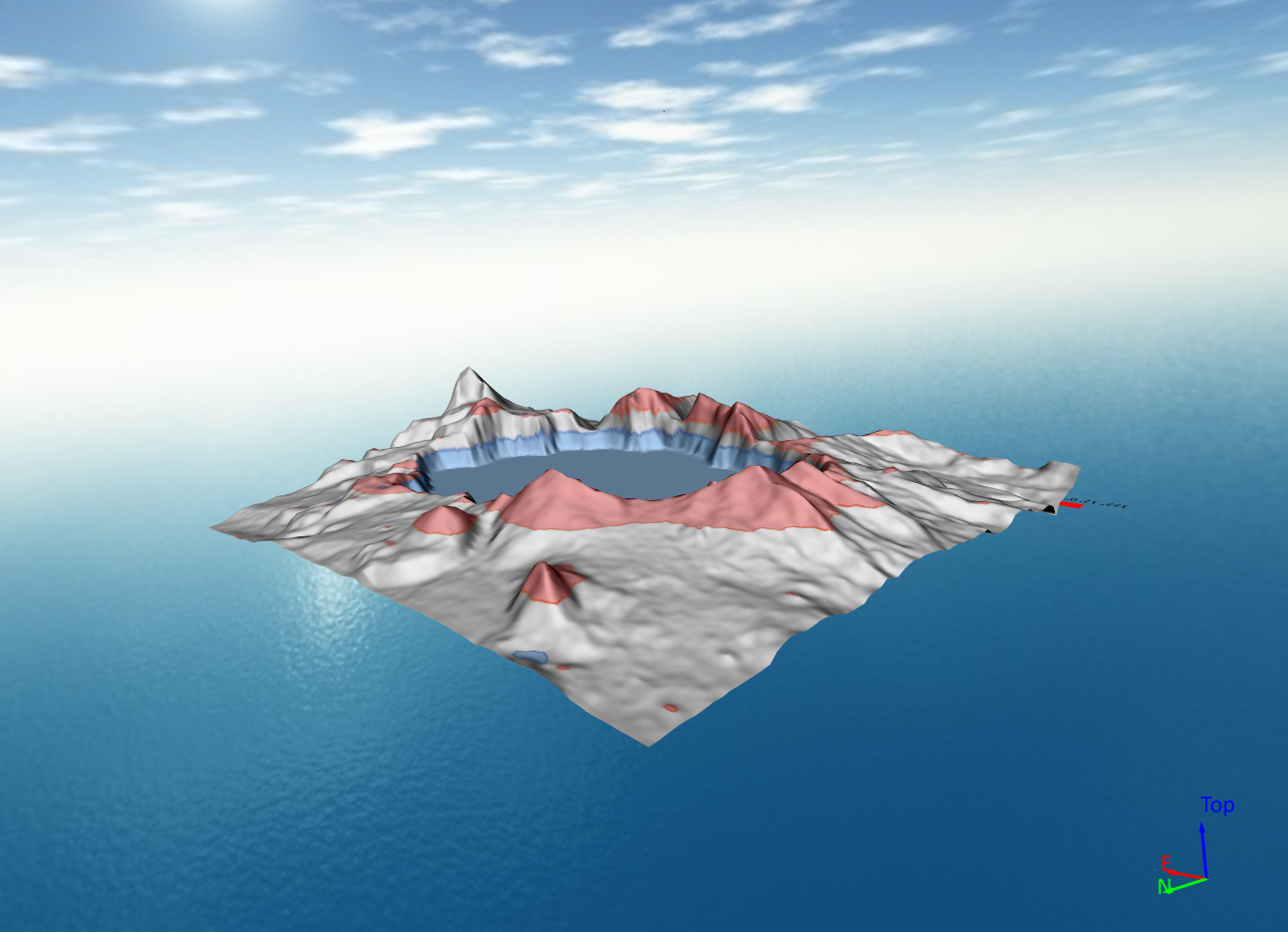
Surfer – Create an Immersive 2D/3D Model in Under 2 Minutes!
Grapher – If You Can Imagine It, You Can Graph It!
- May 29, 2025|Gabbie Rhodes|4 min
Our team really enjoys building social connections. One way we achieve that goal? Coming together for fun, adventurous team hangouts.
- May 21, 2025|Gabbie Rhodes|7 min
There are many gridding algorithms in Surfer to help you uniquely showcase your data, but there are also common mistakes to avoid.
- May 21, 2025|Gabbie Rhodes|8 min
There's nothing wrong with 3D surface maps, but 3D View offers way more options to help you effectively show your data. Learn more.
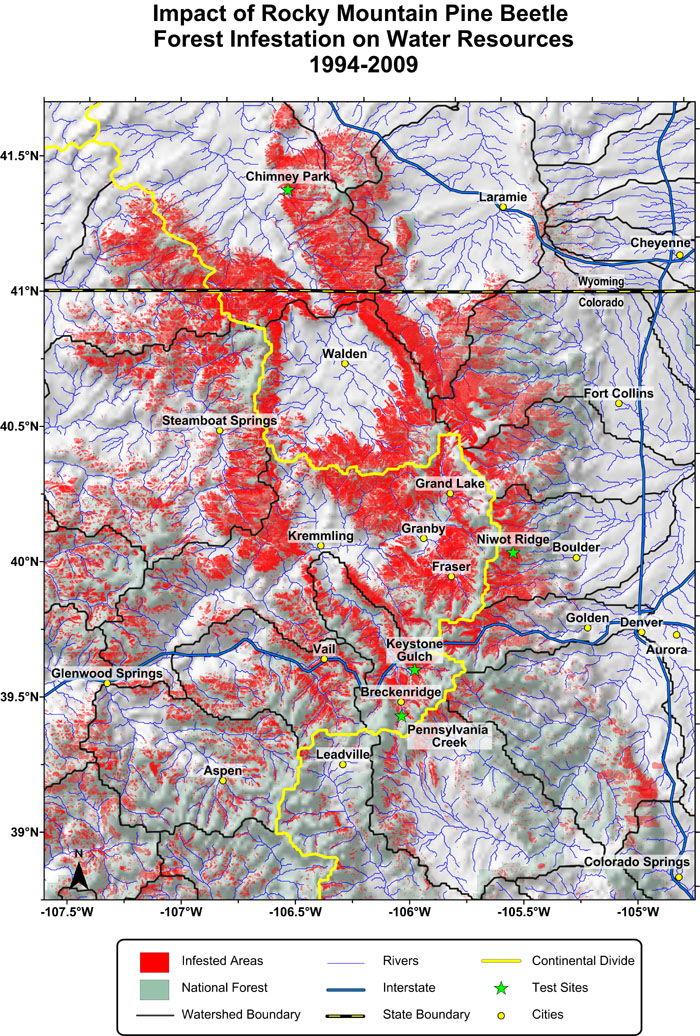
- May 14, 2025|Gabbie Rhodes|6 min
Stakeholders need clear, compelling, and accurate data visualizations to manage water resources. Watershed maps help get the job done.
- May 13, 2025|Gabbie Rhodes|7 min
The latest Grapher release has exciting updates that'll streamline your workflow and help you explore and discover ways to enhance your visuals!
- May 7, 2025|Gabbie Rhodes|4 min
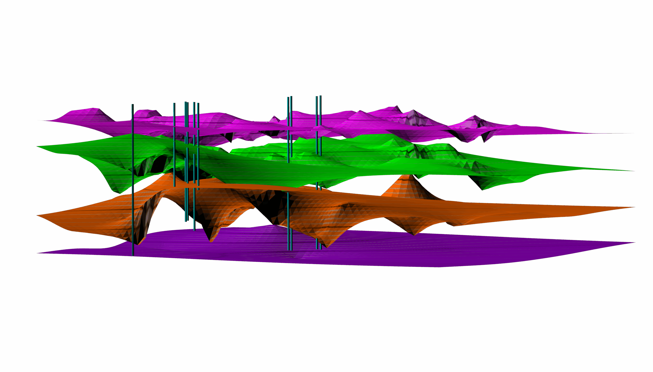
Water availability shifts due to precipitation, runoff, evaporation, and more. How can you visualize the changes? Enter peaks and depressions maps.
- May 7, 2025|Gabbie Rhodes|6 min
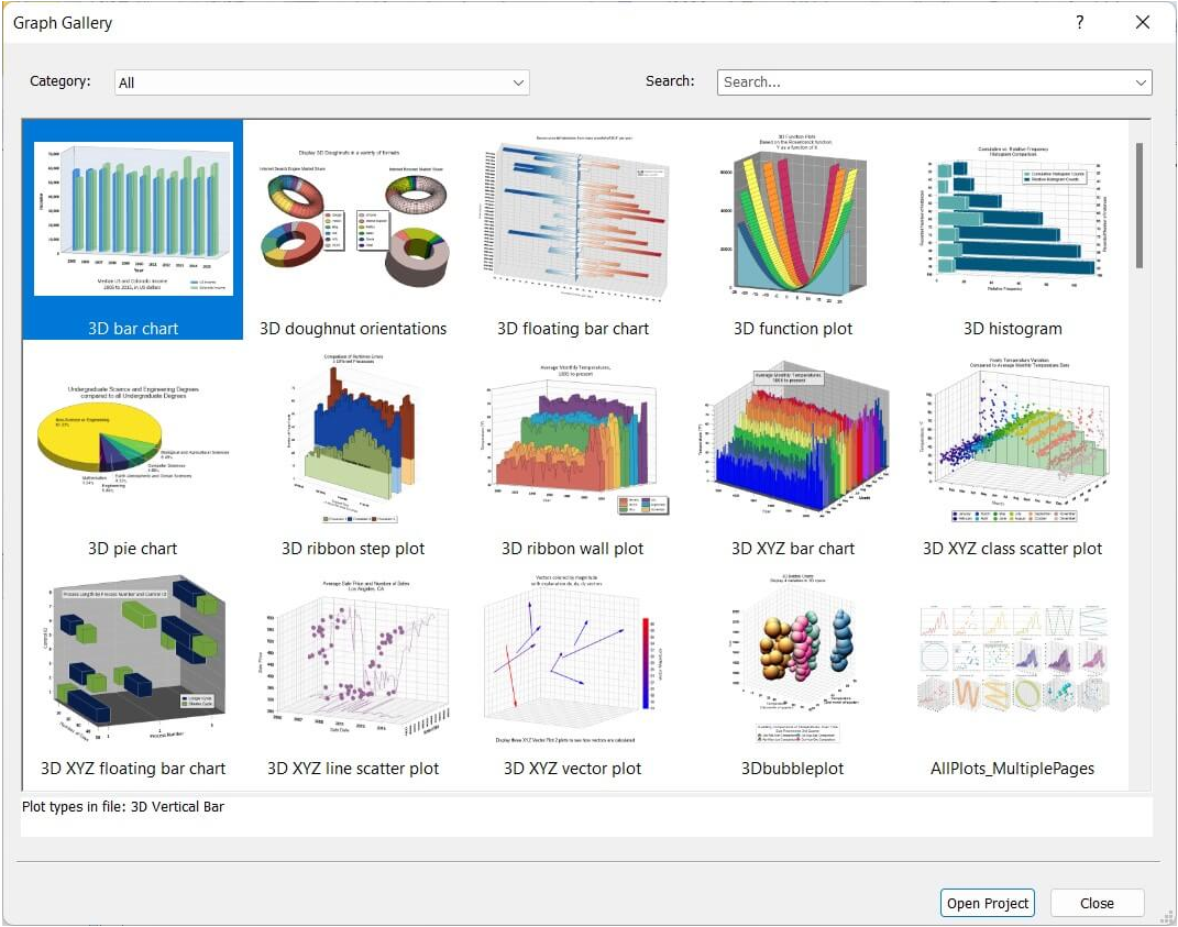
Do you ever need inspiration when creating a new graph? If so, here's good news: you can rely on great examples in Grapher for help.
- Apr 30, 2025|Gabbie Rhodes|7 min
There are multiple benefits of software beta programs, especially the ones at Golden Software. That's why you should participate in them.
- Apr 30, 2025|Gabbie Rhodes|6 min
LiDAR sensors gather high-resolution data, and now point cloud layers in Surfer are helping showcase that data efficiently and clearly.
- Apr 23, 2025|Gabbie Rhodes|11 min
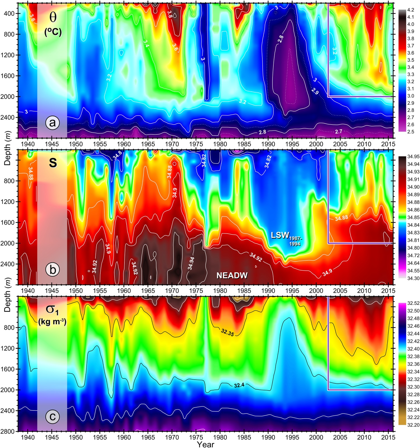
Some data visualizations are so good they stand the test of time. One is a high-profile plot that was created in Surfer and that's still relevant today.
- Apr 23, 2025|Gabbie Rhodes|7 min
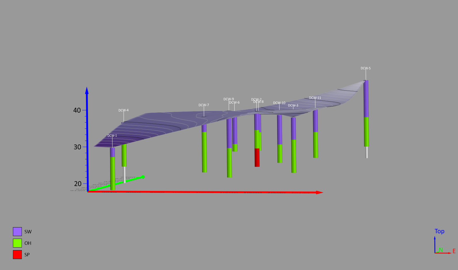
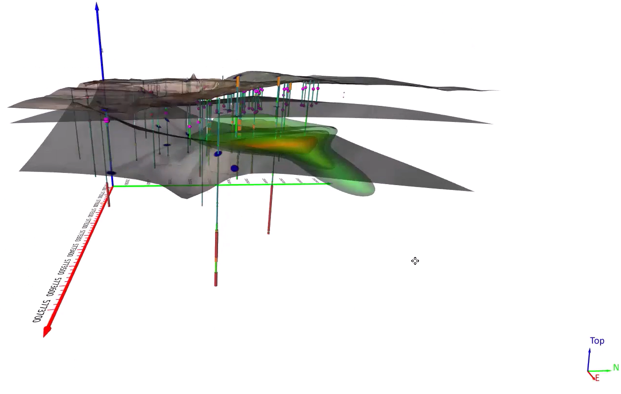
Do you want give stakeholders more insight into the subsurface? There's a specialized map type you should consider using: drillhole maps!
- Apr 16, 2025|Gabbie Rhodes|8 min
Want to make your data visualizations better so they appeal to any audience? We've created an ultimate guide to help you do it. Learn more.