Templates: Your New Graphing Go-To (Part 3)—How to Ensure Effective Data Visualization With Templates
You work with data for emerging environmental insight, informing infrastructure design, and shaping scientific understanding. But even the most valuable dataset can lose its impact if it isn’t visualized clearly. A graph that’s hard to interpret can distract from your findings and confuse your stakeholders, preventing them from making informed decisions.
Fortunately, that’s where templates come in. They help turn complex data into powerful visuals. And in this third installment of our blog series, Templates: Your New Graphing Go-To, we’ll explore how they help ensure you create effective graphs every time.
The Struggle Behind Building Effective Graphs
Even the most experienced geoscientists and engineers know that creating a clear, professional graph isn’t always straightforward. Questions can easily come up like:
- “Why doesn’t this look right?”
- “Is my data structured correctly?”
- “Why do my axes look off?”
- “How do I make this graph look cleaner for stakeholders?”
These questions can quickly lead to frustration and time lost. You can spend hours adjusting formatting, figuring out data requirements, or reworking a graph that just doesn’t look quite right. The worst part? Accomplishing your desired look may still be challenging, especially if you’re on a tight deadline. You might not have enough time to revise and enhance your graph.
How Templates Eliminate the Guesswork and Bring Confidence to Your Graphs
Templates are the solution to creating effective graphs efficiently. The reason for this is simple: they give you structure, visual clarity, and a smooth workflow. For context, here’s how templates make it easier to quickly create effective graphs.
Clear Input Expectations to Reduce Uncertainty
Templates provide guidance on how to structure your input data, so you’re not stuck troubleshooting formatting issues. That means you don’t have to spend time digging through documentation or fixing data errors. You can just follow the instructions to populate a template with your input data. The result? Less uncertainty and faster, more accurate graph creation.
Built-In Best Practices for Visual Design
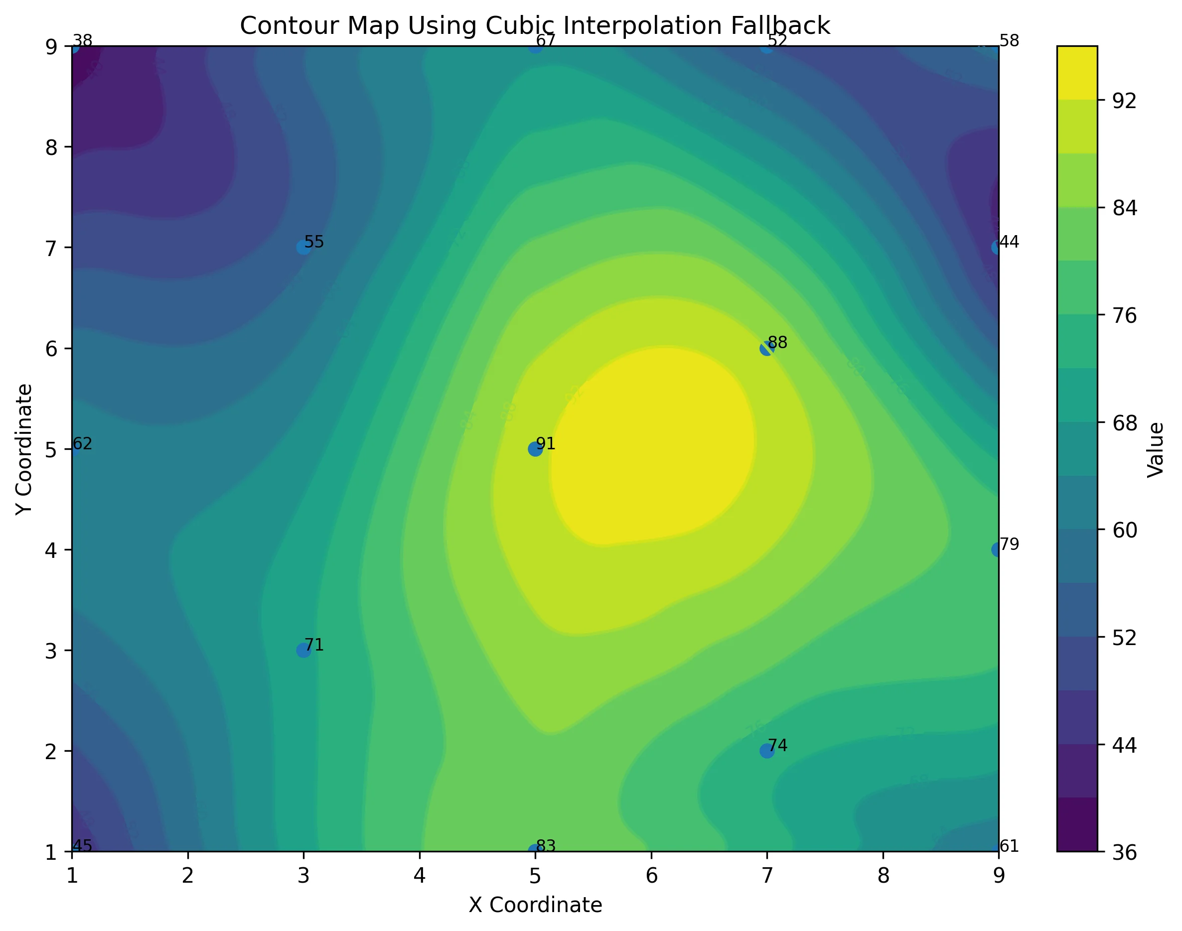
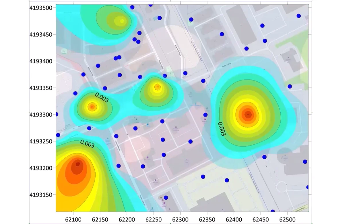
Each template is built on proven design principles and real-world examples of results that scientists and engineers delivered to stakeholders. Common project considerations, thoughtful color schemes, logical legend placement, readable labels, and correctly scaled axes are all preconfigured, ensuring your graphs look clear and consistent from the start. With these standards baked in, you can produce visuals that communicate your findings effectively and professionally, without second-guessing your layout choices.
Professional Results With Simple Steps
You don’t need to be a design expert to create impressive visuals. Templates make it easy to generate stakeholder-ready graphs in minutes by providing simple steps to follow and the opportunity to easily make customizations. Whether you’re preparing a technical report, regulatory submission, or client presentation, templates help you deliver polished, publication-quality results without any complexity involved.
From Frustration to Confidence: A Real-World Example
Templates make effective data visualization easy, but what does it actually look like to incorporate them into your workflow to enhance your graphs? This is where an example can help.
Take a geoscience consultant who regularly creates stiff plots for groundwater chemistry reports. They format them manually and always find it challenging. Aligning axes, adjusting labels, and ensuring ion balances are displayed correctly takes hours—and even with all the hard work, results don’t always look as polished as they hoped.
Once this geoscience consultant starts using a pre-built stiff plot template, that all changes. Instead of spending valuable time figuring out formatting, they simply import their dataset and instantly have a clean, professional visualization that they can customize if necessary. The finished plot not only impresses stakeholders but also improves communication by clearly showcasing complex geochemical relationships.
Turn Your Data Into Clear, Confident Visuals
Your data deserves to be visualized effectively so it can drive informed decision-making. Templates make that possible by removing uncertainty and replacing it with structure, visual clarity, and a smooth workflow. So whether you’re building a stiff plot, a ternary diagram, or any other visualization, use templates to ensure every graph you create is effective at giving stakeholders what they need to move forward.
Recent Articles
- Jun 23, 2026|Gabbie Rhodes|10 min
Ever stop and wonder: does AI make mistakes? Before you start using AI tools to create your maps, discover the answer to this key question.
- Jun 23, 2026|Gabbie Rhodes|7 min
What contributions are women making in STEM? Discover eight examples of women in STEM fields and the meaningful impact they’re making.
- Jun 17, 2026|Gabbie Rhodes|8 min
Both work and family require energy and intentionality. To ensure you approach them effectively, discover tips to balance work and family life.
- Jun 17, 2026|Gabbie Rhodes|11 min
Senior Technical Sales Specialist Drew Dudley hosted a webinar to provide tips for ensuring coordinate systems display accurately and consistently.