Unlocking Surfer’s New Release: Smarter 3D Modeling, Cleaner Maps, and Faster Workflows
The latest version of Surfer has arrived, bringing new capabilities designed to help you produce more effective subsurface models, speed up your workflow, and communicate complex findings with greater clarity. From creating multiple clipping planes in the 3D View to quickly generating legends from base layers without symbology, this release introduces enhancements that help you quickly transform data into clear visuals and communicate key insights with confidence.
“With this release, we focused on giving users more intuitive ways to create maps, filter and slice 3D grids, and design comprehensive legends,” said Surfer Product Manager Kari Dickenson. “Whether they’re building 3D models or preparing final outputs for clients and stakeholders, these new capabilities help users work more efficiently while creating high-quality visualizations that are easier to understand.”
Ready to discover some of these new capabilities? Let’s take a closer look at the top new features in the latest version of Surfer.
Save Image Slices and Contour Slices as Grids or Images
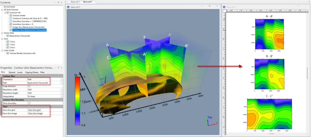
One of the standout additions in this release is the ability to save image slices and contour slices directly from the 3D View as grids or image files. Instead of simply using slices to explore your model interactively, you can now quickly export them as grids for additional analysis or as images to include them in reports and presentations.
A major benefit of this enhancement is a better understanding of your data. On top of placing an image slice or contour slice along a straight line between two points, you can now define slices along multiple segments or curves, making it easier to investigate the critical parts of your 3D model and understand the full story your data is telling.
Beyond deeper understanding, this feature also fundamentally elevates how you communicate your findings. You can slice directly through the exact features you want stakeholders to notice and pull those internal details straight out of 3D space. From there, you can export the slice as an image file to drop into reports and presentations, or save it as a 2D grid to generate standalone contour and color relief maps. The result is a workflow that transforms subsurface models into visuals that effectively highlight key details for stakeholders.
Create Multiple Clipping Planes in the 3D View
When working with subsurface models, seeing the entire dataset at once isn’t always the most effective way to analyze or communicate your findings. That’s why the latest version of Surfer equips you to create up to four clipping planes in the 3D View.
With multiple clipping planes, you can cut your model from different directions to focus on a specific volume or feature of interest. This empowers you to investigate certain aspects of your data, while also producing cleaner visuals for reports and presentations. By paring down the visual noise, you direct stakeholders’ attention straight to the key features that matter most. Whether that’s a natural resource, contaminant plume, or another area of interest, multiple clipping planes help create focused visualizations that communicate your findings clearly.
Filter 3D Grid Visualizations for Greater Clarity
Aside from clipping a 3D model, filtering how your data is displayed can make subtle subsurface patterns more visible. That’s where the new 3D grid filtering comes into play.
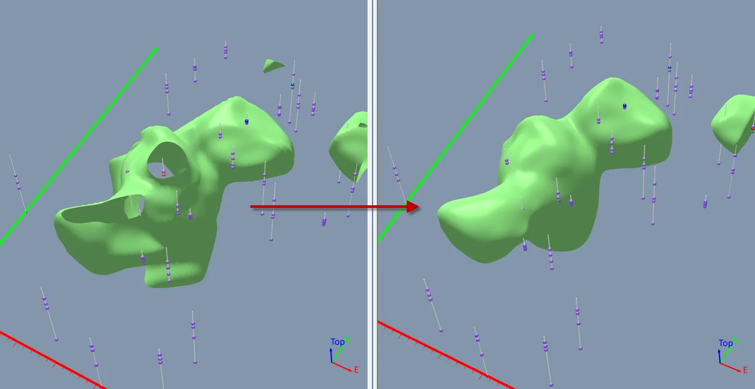
This Surfer release adds filtering for isosurfaces, contour slices, image slices, block renders, and volume renders, giving you greater control over how to show your 3D data. Depending on the filter you choose, you can refine your visualization in several different ways. Here are just a handful of options that are available:
- Interquartile Range: Highlights local variability by comparing the spread between the 25th and 75th percentiles, helping you identify areas with greater variation.
- Maximum and Minimum: Expands or contracts features within the visualization to emphasize or suppress specific structures.
- Sobel and Prewitt: Detect edges and transitions within the data, helping reveal boundaries and other important subsurface features.
- Mean Removal: Removes the local average to emphasize anomalies and outliers that may otherwise blend into the surrounding data.
- Bounding: Constrains values to a specified range so it’s easier to focus attention on the most meaningful portions of the dataset.
- Brightness and Contrast: Adjusts the visual appearance of image slices so important details stand out more clearly.
- NoData Options: Gives you greater control over how NoData regions are handled, whether you want to preserve, expand, or ignore them during filtering.
Rather than changing the underlying data, these filters refine how it’s visualized. Maybe you want to smooth an isosurface to better reveal an overall trend, emphasize sharp transitions within a model, or highlight subtle anomalies that might otherwise be overlooked. These filters give you the flexibility to tailor your visualizations, so they reveal key insights that make complex subsurface relationships easy for both technical and non-technical audiences to understand.
Collaborate More Easily With Document Comments
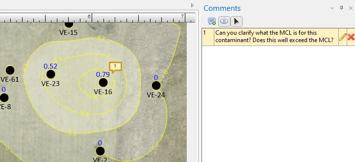
Projects often involve multiple reviewers, whether they’re coworkers or stakeholders—and with the latest Surfer release, you can add, edit, and display comments directly within your Surfer document to give reviewers the context they need. Additionally, reviewers can leave comments for you in the project file itself, making it fast and simple to communicate exactly what needs attention. Whether someone wants a contour interval adjusted, a label moved, or a visualization updated, their feedback stays connected to the project rather than scattered across multiple conversations.
It’s important to note that document comments are also valuable for your own workflow. You can leave reminders, write decisions, or record instructions for future updates directly inside the project file. When you revisit the project weeks or even months later, those notes are right where you need them, saving you time from digging through notebooks or old email threads to remember important context.
Create Cleaner, More Flexible Legends
A great map deserves a great legend, and this release introduces two enhancements that empower you to create polished legends more efficiently than ever.
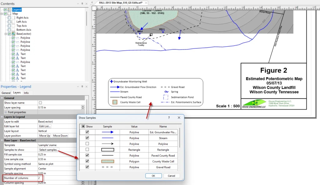
The first improvement is that you can design multiple legend columns for drillhole, contour, vector, post, and base layers. This makes it much easier to fit large legends into the available space while improving readability.
The second enhancement is that you can create legends directly from base layers without symbology. This update is especially useful when working with formatted SHP files or other base layers containing roads, buildings, sample locations, and similar features. Surfer now uses the formatting already present in these files to build a legend for you. With this benefit, you not only save time but also ensure your legend stays synchronized with your map.
Build Maps More Intuitively With a Streamlined Home Ribbon
Even small workflow improvements can save significant time over the course of a project. That’s exactly what inspired the redesigned Home Ribbon and map creation workflow in this Surfer release.
The updates deliver a more intuitive workflow so you can build the map you want with fewer steps. Some of the most noticeable changes include:
- Smarter map creation: Click any layer type to automatically create a new map when one doesn’t exist, or add the layer to an existing map when one does.
- Fewer unnecessary clicks: The separate Add to Map | Layer commands have been removed, streamlining the process of building multi-layer maps.
- Flexible new map creation: Need another map on the page? Simply SHIFT+click a layer type, or use the new New Map shortcut from the plot window.
- Quicker access to map components: Frequently used tools like legends, scale bars, graticules, profiles, axes, and color scales are now easier to access directly from the ribbon.
If you’ve been using Surfer for years, please know that we don’t make changes to the user interface frequently or lightly. This redesign was inspired directly by feedback from both veteran power users and new users, followed by extensive usability testing to ensure every adjustment genuinely speeds up your day-to-day mapping and modeling. While changing familiar habits may take a moment, our testing showed that the new streamlined layout is significantly efficient and effective in various workflows, making the transition well worth it.
Explore the Latest Version of Surfer
The latest release of Surfer empowers you to do more with your data. Whether you’re creating clearer subsurface models, refining 3D visualizations, collaborating more effectively with teammates, or streamlining everyday mapping tasks, the new features are designed to help you produce more intuitive outputs and communicate findings clearly, while still working efficiently.
Ready to experience these new capabilities for yourself? Download the latest version of Surfer today and start exploring everything this release has to offer.
Recent Articles
- Sep 16, 2026|Gabbie Rhodes|7 min
The latest Surfer release delivers smarter 3D modeling, cleaner maps, and faster workflows. Unlock these benefits by discovering the top features.
- Sep 9, 2026|Gabbie Rhodes|4 min
Explore how Submara Survey bridged the gap between terrestrial elevation data and underwater bathymetry to guide costal development in Norway.
- Sep 9, 2026|Gabbie Rhodes|10 min
In a recent webinar, John Vanderlaan, founder and owner of Prism GeoImaging, Inc., explored how to visualize geophysical data effectively.
- Sep 2, 2026|Gabbie Rhodes|8 min
Effective wildfire mitigation requires more than tracking fire behavior alone. You have to monitor multiple variables, and visualizations can help.