Visualizing Technical Data (Part 2): Using Maps and Graphs to Showcase Water Quality Data


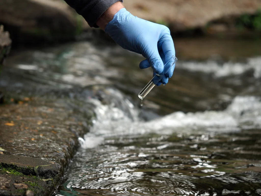
Water quality analysis often requires answering more than one question about what’s happening within an environment. Depending on what you’re investigating, that can mean collecting samples from multiple locations, measuring numerous chemical and physical parameters, tracking conditions across months or years, and considering surrounding features that can help explain what you’re seeing. However, once you’ve collected the data needed to answer various questions, it’s hard to bring it all together in a way that makes insights clear.
That’s where using maps and graphs becomes especially valuable.
In the second post of our Visualizing Technical Data blog series, we’re diving into what maps and graphs bring to water quality analysis, what you can uncover when you use them together, and real-world examples that bring these ideas to life. Ready to dive in? Let’s get started.
Why Can Water Quality Data Be Difficult to Visualize?
First, let’s set the stage by looking at why it’s beneficial to use both maps and graphs to visualize water quality data.
Oftentimes, a water quality project requires answering multiple questions. Depending on your goals, you may need to determine the following:
- Where are concerning or unusual conditions occurring?
- What do samples from those locations contain?
- How do measurements differ among locations?
- How are conditions changing over time?
- What relationships exist among different water-quality parameters?
Answering those questions means collecting and analyzing a wide range of data. You might measure dissolved oxygen, biochemical oxygen demand (BOD), nitrogen and phosphorus, pH, conductivity, turbidity, contaminant concentrations, major-ion chemistry, or a combination of several parameters. You might also collect those measurements from numerous sampling locations and across multiple sampling events.
By the end of your research phase, you could easily have a multidimensional dataset, leading to a visualization challenge. A single map or graph can effectively answer some of your questions, but it’ll be less suited to others. If you want to get the most out of your technical data, it’s best to let maps and graphs tackle the questions they’re designed to answer so you get a well-rounded analysis and better insights for stakeholders.
Use Maps to Show Where Water Quality Conditions Occur
So, what questions should you let maps answer? When analyzing water quality data, maps are particularly valuable for establishing geographic context. They help you understand not only where measurements were collected, but also how water quality conditions vary across an area and how those conditions relate to surrounding features. Here’s more insight on what that looks like practically.
Put sampling locations into context
Two of the first questions you may need to answer are: Where were samples collected, and what’s around those locations? Maps are perfect for gaining that insight.
Depending on the project, sampling and monitoring locations can be mapped alongside features such as:
- Rivers, lakes, streams, and coastlines
- Roads and infrastructure
- Industrial or developed areas
- Discharge points or potential contaminant sources
- Relevant project boundaries
Site maps, base maps, and sampling-location maps are a few options you can use to provide spatial context for the measurements collected at each location. For example, a site map could display monitoring wells alongside nearby surface-water features, infrastructure, and potential contaminant sources. Seeing those features together can help you identify spatial relationships worth investigating and give stakeholders a clearer picture of the conditions surrounding each sampling location.
See how water quality measurements vary across an area
Another question your project requires answering may be: How do water quality conditions vary across the project area?
Maps can help you move beyond individual sampling locations to examine broader spatial patterns in water quality. When sufficient spatial data is available, you might visualize measurements such as:
- Dissolved oxygen
- Biochemical oxygen demand
- Nitrogen and phosphorus
- Contaminant concentrations
- Other measured or modeled water-quality parameters
Depending on your water quality data and analytical goal, those measurements can be represented using:
- Contour maps
- Color-relief maps
- Classified maps
- Sampling-point maps symbolized by measurement
- Base from data later that has pie chart symbology
- Maps combining water-quality measurements with contextual layers
These maps can help reveal areas with comparatively high or low values, spatial gradients, potential hotspots, and relationships between water-quality conditions and surrounding features. For instance, a contour map showing dissolved oxygen across a study area can make locations with comparatively high or low concentrations easier to identify, giving you a specific place to investigate more closely.
Use Graphs to Dig Deeper Into Water Quality Measurements
Maps can point you toward an interesting location or spatial pattern, but you may still have things you need to discover. Has a concerning measurement always been elevated? How much do conditions vary from one monitoring location to another? Do samples from different locations have similar water chemistry?
Graphs can answer these types of questions, adding a deeper layer to your analysis. By taking a closer look at the measurements themselves, these visuals can help you investigate changes over time, variability among locations, and relationships within water chemistry data. Here’s a closer look at what that means.
Track how conditions change over time
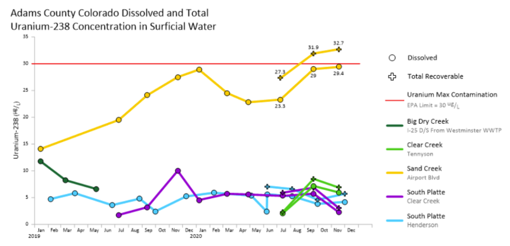
Water quality conditions aren’t necessarily static. When measurements are collected repeatedly from the same locations, graphs can help you see how those conditions evolve across days, months, seasons, or years. You can also compare multiple monitoring locations or parameters over the same timeframe.
Time-series and line graphs can specifically help you answer questions like:
- Are measurements increasing or decreasing over time?
- Do conditions follow seasonal patterns?
- Have any sudden changes occurred?
- How do changes over time differ among monitoring locations?
For example, suppose a map identifies elevated nutrient concentrations around a particular monitoring location. A time-series graph can take the investigation further by showing whether those concentrations have remained consistently elevated, fluctuate seasonally, or reflect a more recent change.
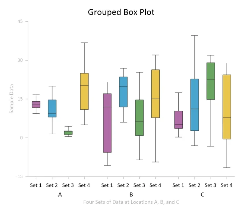
Compare variability across sampling locations
Sometimes, comparing individual measurements doesn’t tell you enough about how conditions differ among sampling locations. Looking at the distribution of measurements collected over time can provide additional context about what’s typical—and how much conditions vary—at each location.
Box plots are particularly useful for these comparisons because they can help answer questions like:
- Do monitoring locations have different median values?
- Which locations show greater or less variability?
- How do the ranges and distributions compare among locations?
- Are there potential outliers worth investigating?
Here’s a scenario that puts this into perspective. Perhaps you’re comparing nitrate concentrations across several monitoring sites. After using a map to understand where those monitoring stations are located, you could create box plots to see whether one site consistently records different values or greater variability than the others.
Explore differences in water chemistry
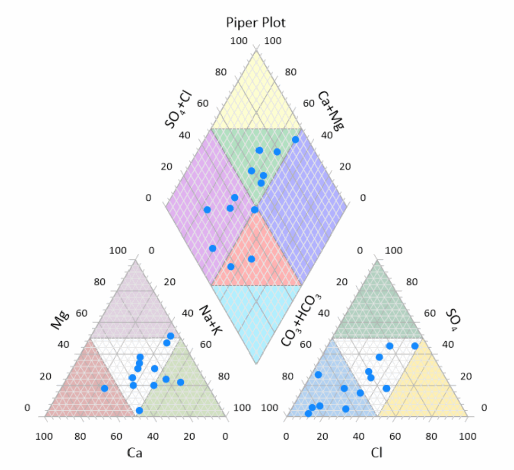
Some water quality questions require looking beyond individual concentrations to examine the relative composition of multiple chemical constituents. In these cases, specialized water-chemistry diagrams can help you compare the hydrochemical characteristics of samples.
Piper plots, in particular, can answer questions like:
- How does major-ion composition differ among samples?
- What hydrochemical facies dominate different parts of the aquifer or river basin?
- Do any samples have similar hydrochemical characteristics?
- Are there broader patterns or groupings within the water chemistry data?
Say, for instance, you want to understand whether samples collected from different wells share similar water chemistry. You could first locate those wells geographically on a map and then plot the samples on a Piper diagram to compare their hydrochemical characteristics and relate any similarities or differences back to where they were collected.
Connect Maps and Graphs to See the Full Water Quality Story
The value of using maps and graphs together becomes especially clear when you see how they complement each other in an actual water quality modeling workflow.
One of our customers uses both Surfer and Grapher to analyze and present outputs from the Sistema Base de Hidrodinâmica Ambiental (SisBaHiA), an environmental hydrodynamic modeling system. Surfer is used for spatial outputs, including maps of water-level isolines, dissolved oxygen, biochemical oxygen demand, phosphorus and nitrogen, and hydrodynamic circulation vectors. Grapher is used for visualizing time-series data from monitoring points throughout the modeling domain, as well as for creating specialized graphs such as current ellipses that compare east-west and north-south current components.
Together, the visualizations give the team two complementary views of its modeling results: maps show how conditions vary across the larger geographic area, while graphs show how conditions behave at individual locations over time. That combination is particularly valuable for projects covering large areas. One of the team’s models of the Amazon Delta, for instance, spans more than 1,000 kilometers, requiring both spatial snapshots and time-series data from numerous monitoring locations.
Give Your Water Quality Data More Than One View
Water quality data has a lot to tell you, but you may need more than one visualization to uncover the full story. Maps can help you understand where conditions are occurring and how they vary across an area, while graphs can reveal how measurements change over time, differ among locations, and relate to one another.
But water quality data is just one example of what maps and graphs can visualize together. In the next post in our Visualizing Technical Data blog series, we’ll explore how maps and graphs can work together to analyze and communicate mineral exploration datasets.
Until then, we want to hear from you: How are you using maps and graphs to analyze or communicate your water quality data? Leave a comment below and share your approach.
Recent Articles
- Oct 7, 2026|Gabbie Rhodes|8 min
In the second post of our Visualizing Technical Data series, learn how maps and graphs can showcase your water quality data and uncover insights.
- Oct 7, 2026|Gabbie Rhodes|12 min
Have you ever wondered: what are the causes of a landslide? Discover the answer and how to visualize at-risk areas.
- Sep 29, 2026|Gabbie Rhodes|9 min
When visualizing technical data, a map will reveal certain insights, while a graph will reveal other insights. You need both to get the full picture.
- Sep 29, 2026|Gabbie Rhodes|5 min
Repetition slowing you down? Automation can quicken your high-volume workflow, remove manual steps, and even improve consistency.