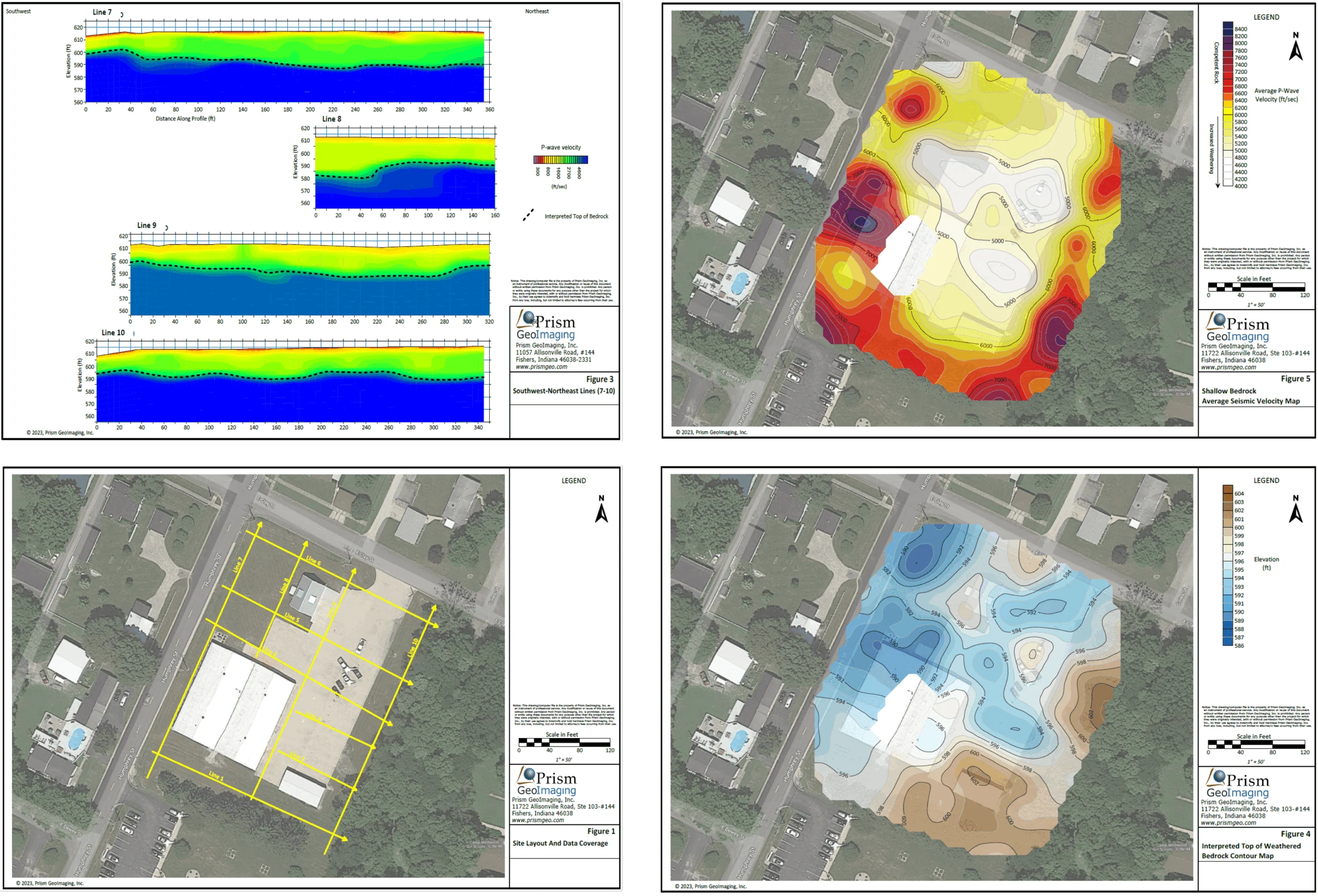
Why Map Elements Matter More Than You Think (and How They Impact Understanding)
A map can contain accurate information, use appropriate symbology, and be carefully designed—yet still fail to communicate your data effectively.
The problem isn’t always the data itself. More often, it’s the absence of critical map elements that give stakeholders the context needed to understand. That’s why these elements deserve a closer look. Map elements often have the biggest impact on how confidently stakeholders interpret your data and make decisions. So, let’s take time to explore why they matter more than you might realize and best practices for using them successfully.
What Are Map Elements?
First, let’s define map elements so there’s complete clarity.
Map elements are the supporting annotations that provide context for the data you’re visualizing on a map. While the data tells the story, map elements help stakeholders better understand that story by delivering key details.
Common map elements include:
- Titles
- Legends
- Labels
- Scale bars
- North arrows
- Text callouts
- Graticules
- Inset maps (when appropriate)
Although these annotations may seem secondary to the data itself, they’re key contextual tools that help stakeholders interpret information accurately and confidently.
Why Map Elements Matter
Understanding what map elements are is only half the equation. The more important question is: how do they actually deliver context? Below are various ways map elements provide the details needed to enhance understanding.
Explain what the data means
One of the primary purposes of map elements is to establish context before stakeholders start interpreting your data.
Well-designed elements immediately help answer questions such as:
- What is this map showing?
- What variables are being visualized?
- When was the data collected?
- What question is this map intended to answer?
Providing this information equips decision-makers to quickly understand the purpose of your map instead of making assumptions. Case in point: consider a map titled “Groundwater Results.” It provides very little context. Is it showing groundwater elevations, contaminant concentrations, groundwater flow direction, or sampling locations? A more descriptive title—such as “Groundwater Benzene Concentrations – Fourth Quarter 2025 Monitoring Event”—immediately tells stakeholders what they’re viewing and when the data was collected.
Reduce misinterpretations
Maps rely heavily on visual cues, but those cues only work when viewers understand what they represent. Elements help clarify information such as:
- Symbols
- Colors
- Units
- Abbreviations
By removing ambiguity, these map annotations reduce incorrect assumptions and increase confidence in conclusions. For instance, a well-designed legend empowers stakeholders to immediately recognize that a color gradient represents contaminant concentrations rather than elevation, helping them interpret site conditions accurately.
Improve spatial awareness
Understanding spatial relationships is one of the primary reasons maps are valuable. Elements help reinforce those relationships by providing important geographic reference points.
Elements such as the following help decision-makers orient themselves within a map:
- North arrows
- Scale bars
- Graticules
These map components make it easier to understand direction, estimate distance, and identify location, leading to more informed spatial interpretation. For example, an engineer reviewing a proposed utility corridor can quickly estimate distances between infrastructure and nearby fault lines using a scale bar instead of relying on visual estimation alone.
Use technology to reduce collaboration friction
Not every part of collaboration requires technical expertise. Many administrative tasks consume valuable time that could be better spent analyzing data, enhancing visuals, or reviewing deliverables. To help team members focus more on critical tasks, incorporating AI into workflows is helpful.
AI can streamline routine activities such as:
- Meeting summaries
- Action-item extraction
- Organizing project notes
- Summarizing discussions
- Drafting follow-up communications
- Formatting data for maps, graphs, and models
Here’s an example to put this into perspective: after a project meeting, AI tools can generate a summary of key decisions, action items, and next steps, giving every team member a clear record of what was discussed.
Guide the viewer’s attention
Not every feature on a map is equally important. Some locations, observations, or findings deserve greater emphasis than others.
Map elements help direct your audience’s attention toward the information that matters most. A few that do this well include the following:
- Labels
- Text callouts
- Highlighted features
By drawing attention to key areas, these elements make maps easier to interpret and help your stakeholders focus on the most significant findings first. A simple callout, for example, can pinpoint a groundwater monitoring well with contaminant concentrations above regulatory limits, immediately directing attention to the area requiring further investigation.
Make maps easier for non-technical audiences
Not everyone who views a map has the same technical background as you. Clients, regulators, project managers, and community stakeholders often need to understand the results without having specialized expertise.
Clear elements help translate technical information into something more accessible, making maps easier to understand across both technical and non-technical audiences. Suppose you clearly label monitoring wells, property boundaries, and contaminant plume extents. This will help decision-makers—with varying levels of technical expertise—understand remediation progress without needing a background in hydrogeology.
Essential Map Elements to Consider for Every Map
Now that we know how map elements provide key context, the next step is knowing which elements to include and how to use them successfully. While not every map requires every single element, the following ones form the foundation of clear, effective communication.
Map title
The title is often the first thing people notice, making it one of the most important elements on your map. It should immediately communicate what your map shows and provide enough context for stakeholders to understand its purpose.
An effective map title should follow these three rules:
- Be specific
- Describe the purpose of your map
- Include the location and timeframe when helpful
A title like “Site Map,” for instance, tells almost nothing. A title such as “Groundwater Nitrate Concentrations – Spring 2026 Monitoring Event” immediately communicates what is being mapped, the variable being analyzed, and when the data was collected.
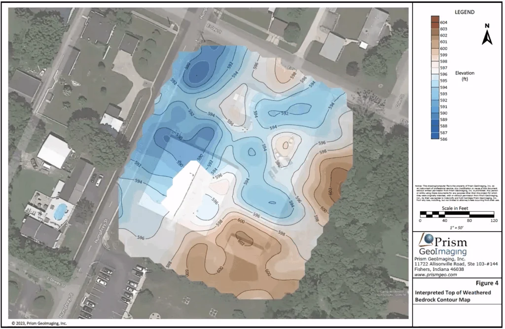
Legend
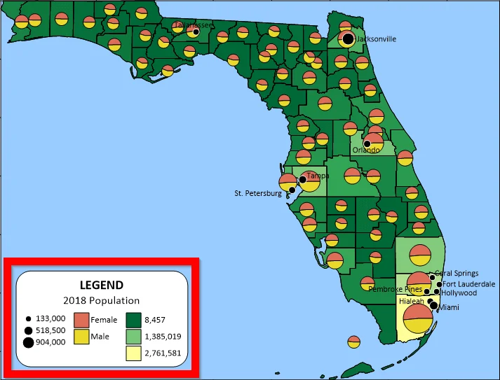
A legend explains what the colors, symbols, and line styles on your map represent, giving viewers the information they need to interpret the data correctly. Without it, decision-makers have to interpret visual elements on their own.
When creating a legend, follow these best practices to ensure it’s well-designed:
- Include only the symbols used on your map
- Organize entries logically
- Keep descriptions concise and easy to understand
Here’s an example: consider an environmental site investigation map. A good legend will clearly distinguish monitoring wells, fault lines, property boundaries, and contaminant plume extents, empowering your audience to interpret the map accurately without additional explanation.
Labels
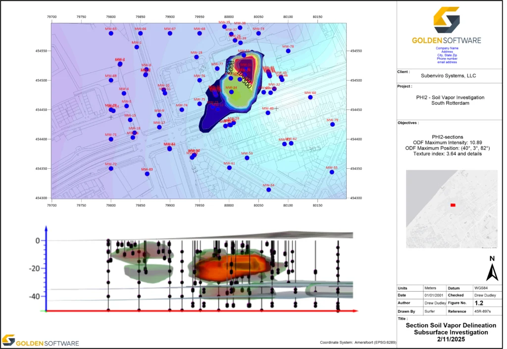
Labels identify important features and help others navigate your map more efficiently. Rather than forcing stakeholders to cross-reference external documents, labels place critical information directly where it’s needed.
To improve readability, follow these guidelines when using labels:
- Avoid unnecessary clutter
- Prioritize the most important features
- Maintain consistent formatting throughout the map
Depending on the project, labels may identify wells, roads, rivers, faults, sampling locations, or nearby communities. By highlighting the features most relevant to your map’s purpose, labels make your visualization easier to interpret at a glance.
Scale bar
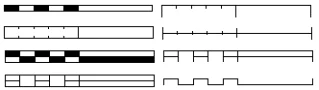
Maps represent real-world locations, but stakeholders still need a way to understand actual distance. A scale bar provides that reference, equipping viewers to estimate sizes and spatial relationships quickly.
To ensure the scale bar is as useful as possible, consider these two tips:
- Select units appropriate for your audience: Match the standard engineering or environmental units used throughout the rest of your project documentation (such as feet, miles, or meters).
- Always use a graphical bar rather than text: If a map is resized, copied into a presentation slide, or printed on a different page size, a text scale like “1 inch = 50 feet” becomes completely incorrect and misleading. A graphical scale bar, however, shrinks or grows right along with the map image, preserving its scale accuracy no matter how the document is viewed or reformatted.
To further show the power of a scale bar, here’s an example: a project manager or regulator reviewing a site plan can use the scale bar to quickly visualize the overall footprint of a contaminant plume relative to a property line, without needing to open raw GIS files.
North arrow
A north arrow establishes map orientation, helping your audience understand directional relationships across the mapped area. Although not every map requires one, including a north arrow is generally a good practice unless the orientation is already obvious or clearly communicated elsewhere.
A north arrow becomes especially valuable when decision-makers need to understand how features relate to one another geographically. For example, emergency planners evaluating infrastructure near an active fault can quickly determine whether hospitals, evacuation routes, or utility corridors are located north or south of the hazard.
Graticules
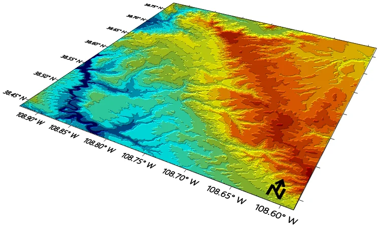
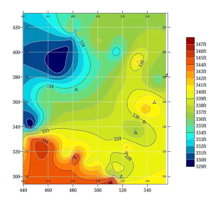
For many engineering, environmental, and geoscience projects, knowing the precise location of a feature is just as important as understanding what that feature represents. Graticules provide that geographic reference, improving navigation and positional accuracy across your map.
For example, imagine a field crew returning to collect follow-up groundwater samples. Graticules equip team members to locate monitoring wells and sampling sites more efficiently, reducing navigation errors and helping ensure data is collected from the correct locations.
Text callouts
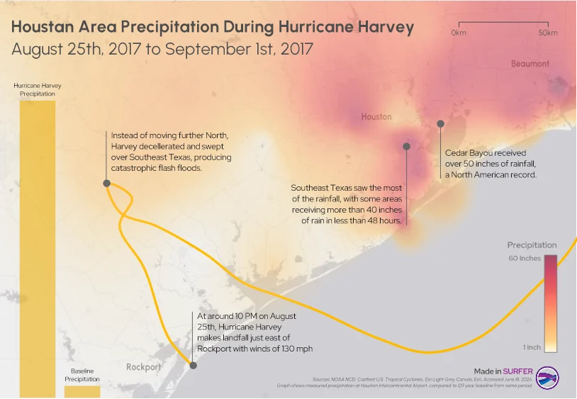
Sometimes a map contains findings that deserve additional explanation or emphasis. Text callouts provide an effective way to direct people’s attention to those areas without overwhelming the rest of your map.
When using callouts, implement these proven strategies:
- Use them sparingly
- Focus on the most important findings
- Keep text concise and informative
To put this map elements into greater perspective, imagine you created a groundwater remediation map. You could include a callout identifying an area where contaminant concentrations exceed regulatory thresholds, briefly explaining why the location requires additional investigation or remediation. Rather than expecting decision-makers to discover the most important finding on their own, the text callout immediately draws attention to the information that matters most.
Context Turns Data Into Understanding
The quality of a map isn’t determined solely by the accuracy of its data. It’s also determined by how clearly that data is communicated. Even the most carefully created map can leave stakeholders confused if it lacks the context needed to interpret it correctly.
That’s why map elements deserve intentional attention. By using titles, legends, labels, scale bars, north arrows, graticules, and callouts thoughtfully, you can help decision-makers understand your maps and take informed steps.
The next time you create a map, don’t treat elements as the finishing touches. Treat them as an essential part of communicating your data clearly and confidently.
Now we’d love to hear from you: What’s one map element you think is most often overlooked and why? Leave a comment below and join the conversation.
Recent Articles
- Sep 9, 2026|Gabbie Rhodes|4 min
Explore how Submara Survey bridged the gap between terrestrial elevation data and underwater bathymetry to guide costal development in Norway.
- Sep 9, 2026|Gabbie Rhodes|10 min
In a recent webinar, John Vanderlaan, founder and owner of Prism GeoImaging, Inc., explored how to visualize geophysical data effectively.
- Sep 2, 2026|Gabbie Rhodes|8 min
Effective wildfire mitigation requires more than tracking fire behavior alone. You have to monitor multiple variables, and visualizations can help.
- Sep 2, 2026|Gabbie Rhodes|6 min
Promising mineral deposits are rarely identified by a single variable. That's why multivariate data visualization is essential to mineral exploration.