- Apr 12, 2023|Your Content Goes Here|4 min
Discover the top features scientists and engineers in the environmental industry should consider when choosing mapping software.
- Mar 29, 2023|Your Content Goes Here|3 min
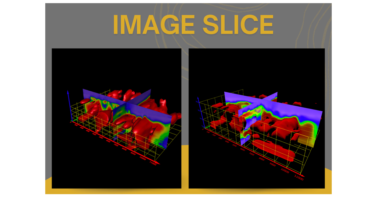
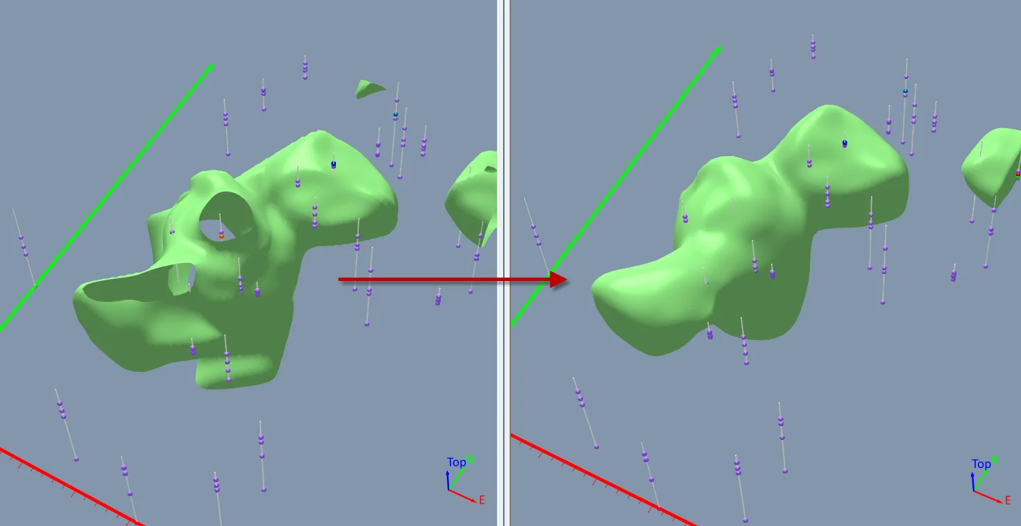
With Surfer any scientist or engineer can utilize powerful 3D modeling functionality to create the site models they need. Ultimately helping you reduce you software toolkit and create 3D models that leave a lasting impression on clients.
- Feb 24, 2023|Your Content Goes Here|3 min
It can be stressful when you get the notice that it is time for a software upgrade. Read these tips for a smooth upgrade process.
- Dec 13, 2021|Your Content Goes Here|1 min
Golden Software sells 2D & 3D data modeling, mapping, graphing and analysis software solutions for engineers and scientists in environmental services, engineering consulting, resource exploration, and university settings.
- Oct 19, 2021|Your Content Goes Here|4 min
Finding the software for your firm can be a daunting task. This blog lists 5 tips on what you should look for when shopping for software.
- May 12, 2021|Your Content Goes Here|3 min
In order to win new clients and retain your existing ones it is vital to stay up to date on the technology and software used in your industry.
- May 29, 2019|Your Content Goes Here|3 min
geoLogic and Golden Software have been partners for over 20 years as geoScout utilizes Surfer for its gridding features.
- Apr 1, 2019|Your Content Goes Here|2 min
The right software licensing option for you and your team can save future headaches and put more money in your pocket.
- Mar 26, 2019|Your Content Goes Here|2 min
Opting out of maintenance may seem like you are saving money at the time. However, this blog describes the lost value if maintenance isn't active.
- Sep 16, 2026|Your Content Goes Here|7 min
The latest Surfer release delivers smarter 3D modeling, cleaner maps, and faster workflows. Unlock these benefits by discovering the top features.
- Sep 9, 2026|Your Content Goes Here|4 min
Explore how Submara Survey bridged the gap between terrestrial elevation data and underwater bathymetry to guide costal development in Norway.
- Sep 9, 2026|Your Content Goes Here|10 min
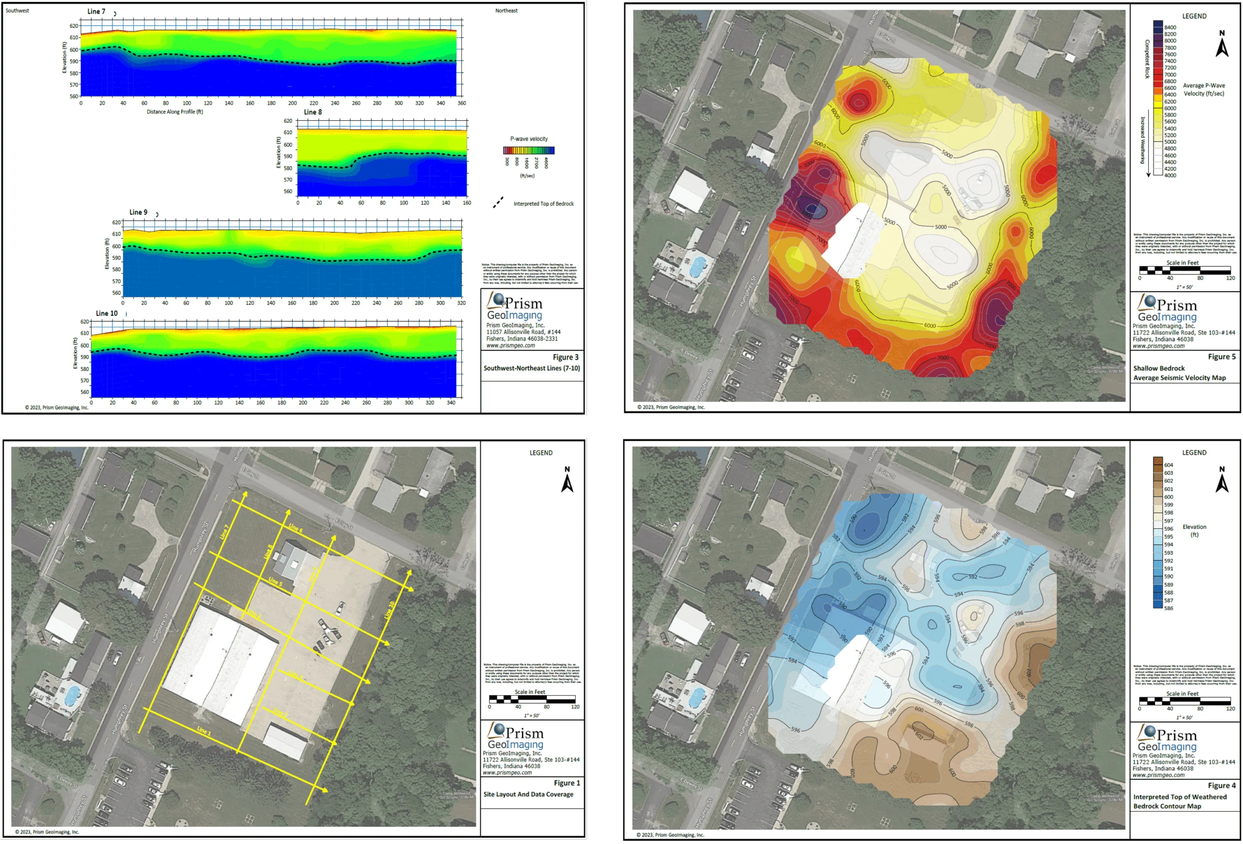
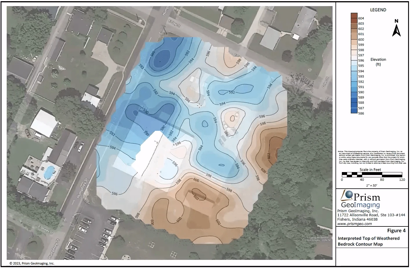
In a recent webinar, John Vanderlaan, founder and owner of Prism GeoImaging, Inc., explored how to visualize geophysical data effectively.
- Sep 2, 2026|Your Content Goes Here|8 min
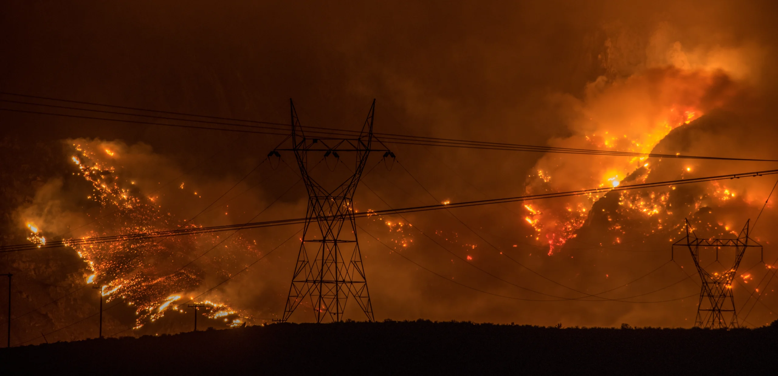
Effective wildfire mitigation requires more than tracking fire behavior alone. You have to monitor multiple variables, and visualizations can help.
- Sep 2, 2026|Your Content Goes Here|6 min
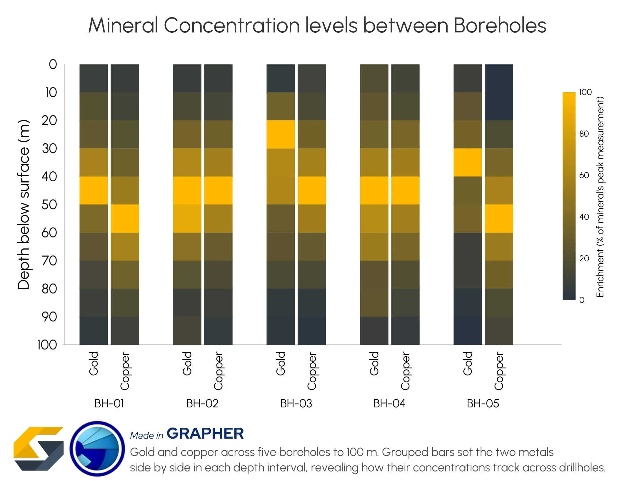
Promising mineral deposits are rarely identified by a single variable. That's why multivariate data visualization is essential to mineral exploration.
- Aug 26, 2026|Your Content Goes Here|8 min
Whether you produce visuals every day or only occasionally, small workflow improvements when mapping data can save you significant time.
- Aug 26, 2026|Your Content Goes Here|8 min
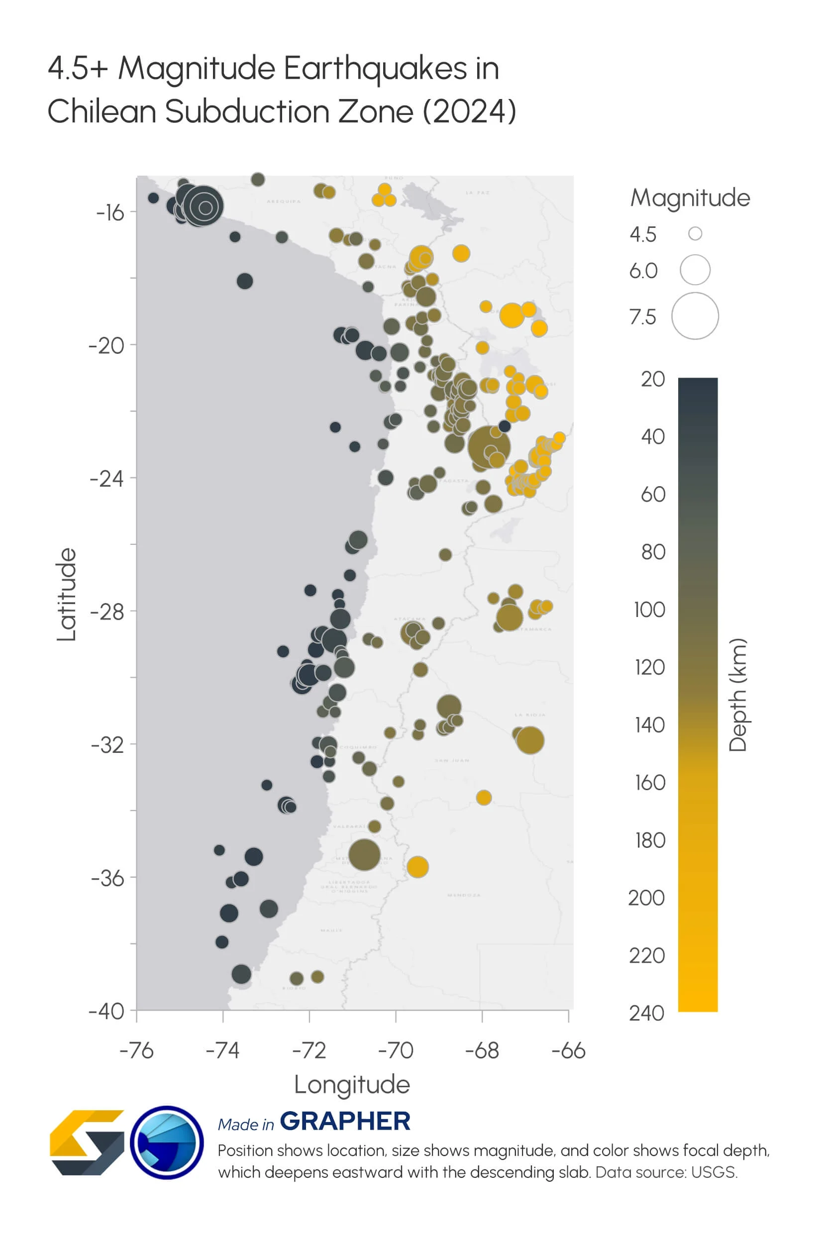
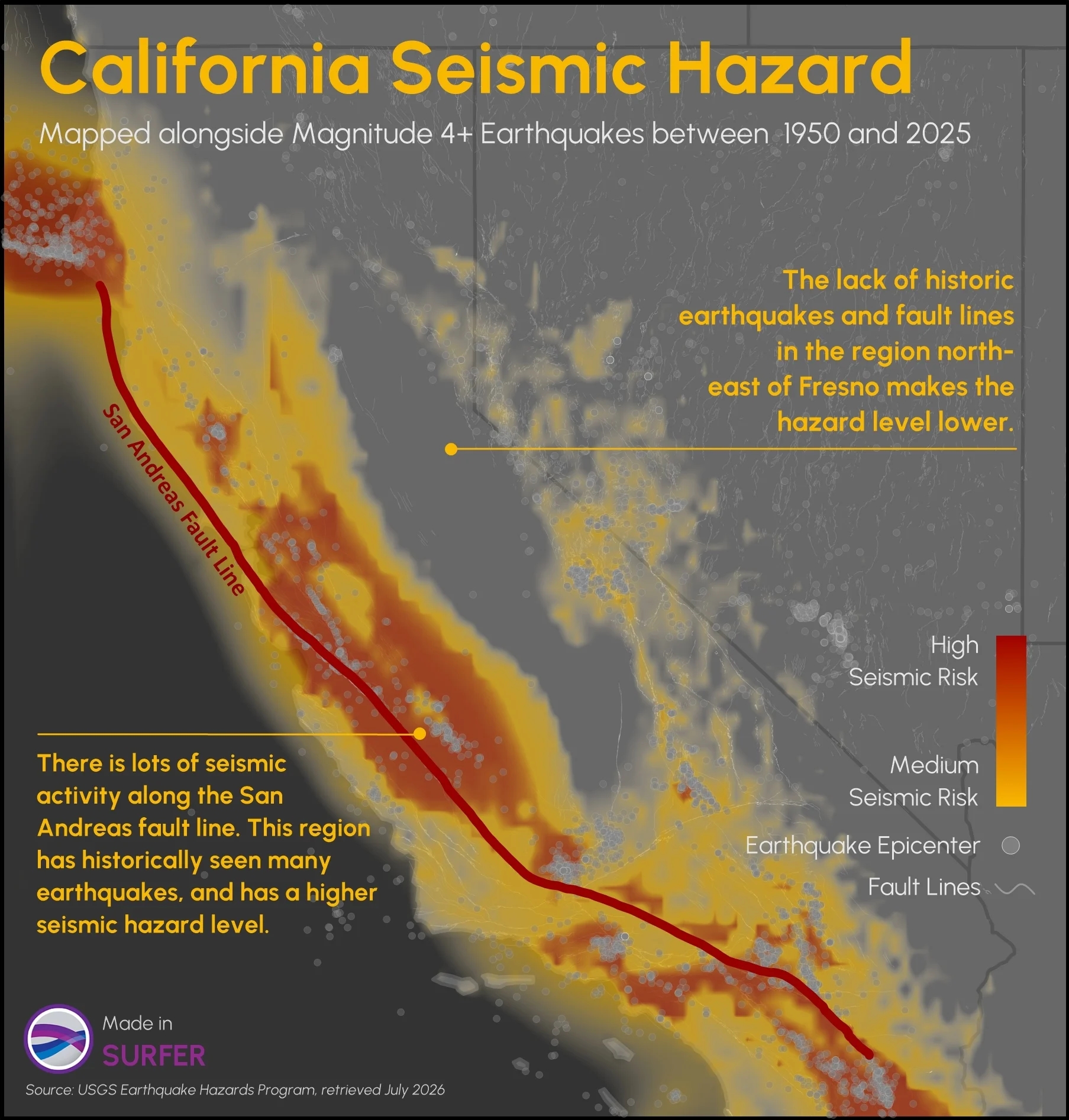
Explore how to create multivariate visualizations for earthquake data so you can easily interpret and share the complete picture with stakeholders.
- Aug 19, 2026|Your Content Goes Here|9 min
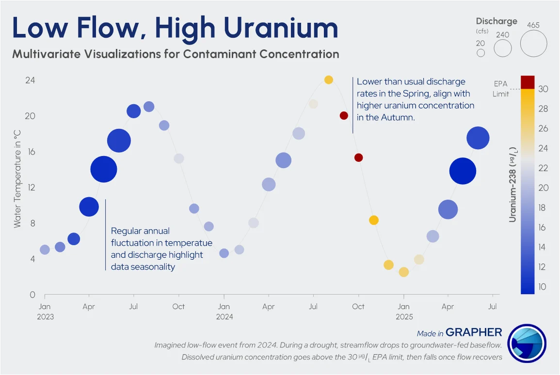
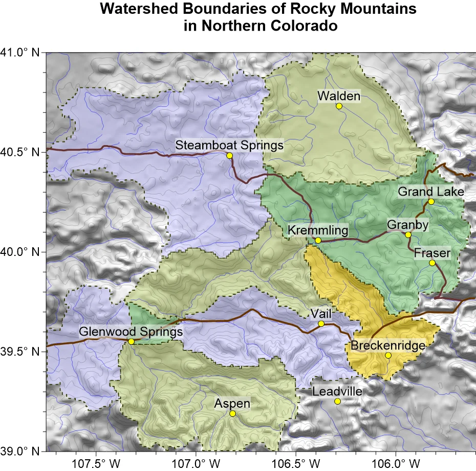
No single measurement exists in isolation with watersheds. Discover how to bring your multivariate hydrological data together.
- Aug 19, 2026|Your Content Goes Here|7 min
The latest version of Grapher is here! Its new features are designed to help you work more efficiently while delivering greater clarity and impact.
- Aug 12, 2026|Your Content Goes Here|6 min
Two geo-professionals sitting side by side can approach a watershed map in completely different ways. Which approach is best? Let's find out.
- Aug 12, 2026|Your Content Goes Here|12 min
How do you design infrastructure that can withstand earthquakes? It starts with transforming raw numbers into visuals for infrastructure resilience.
- Aug 5, 2026|Your Content Goes Here|5 min
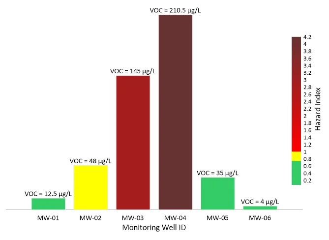
Need to show the relationship between multiple interconnected factors? Visualize multivariate data using an XYZC data structure.
- Aug 5, 2026|Your Content Goes Here|10 min
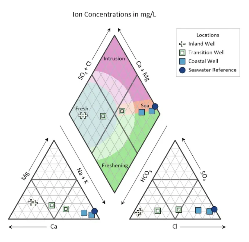
It's critical to turn seawater intrusion into something you can easily interpret and communicate. Here's how piper plots can help you.
- Jul 29, 2026|Your Content Goes Here|12 min
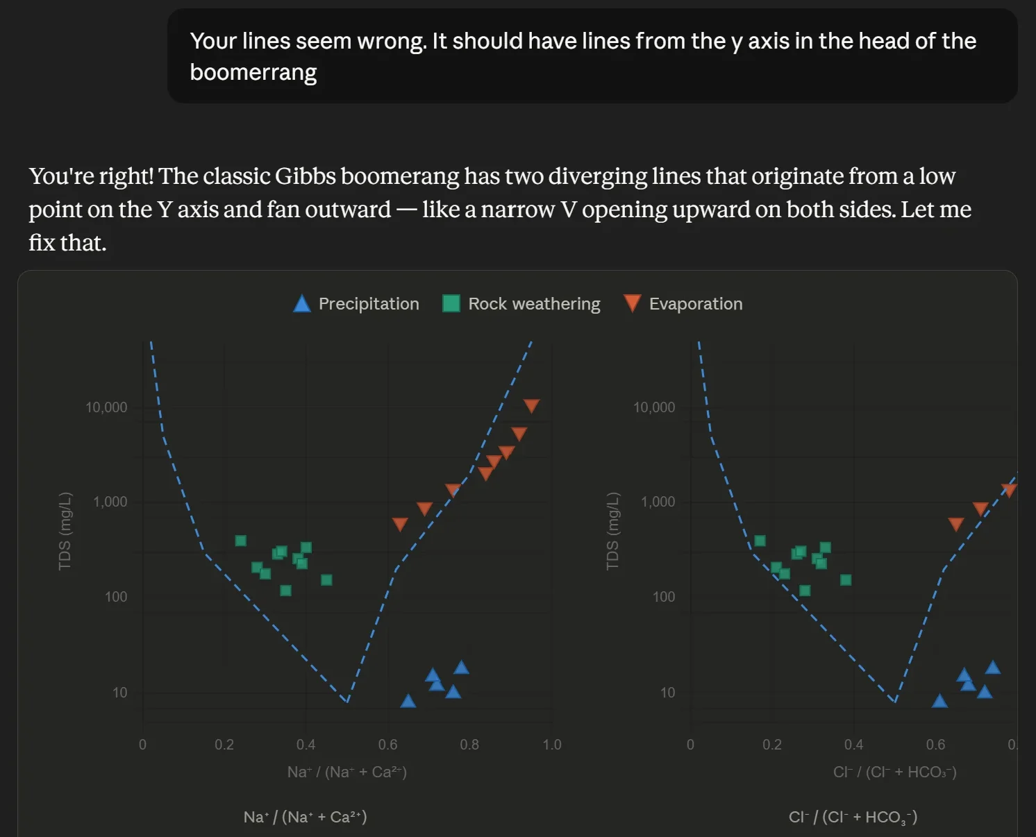
Want to use AI for data visualization? First, consider this: while many AI-generated graphs initially look great, they can misrepresent your data.
- Jul 29, 2026|Your Content Goes Here|9 min
Map elements often have the biggest impact on how confidently stakeholders interpret your data and make decisions. Discover which ones to use.