- Jun 23, 2026|Gabbie Rhodes|10 min
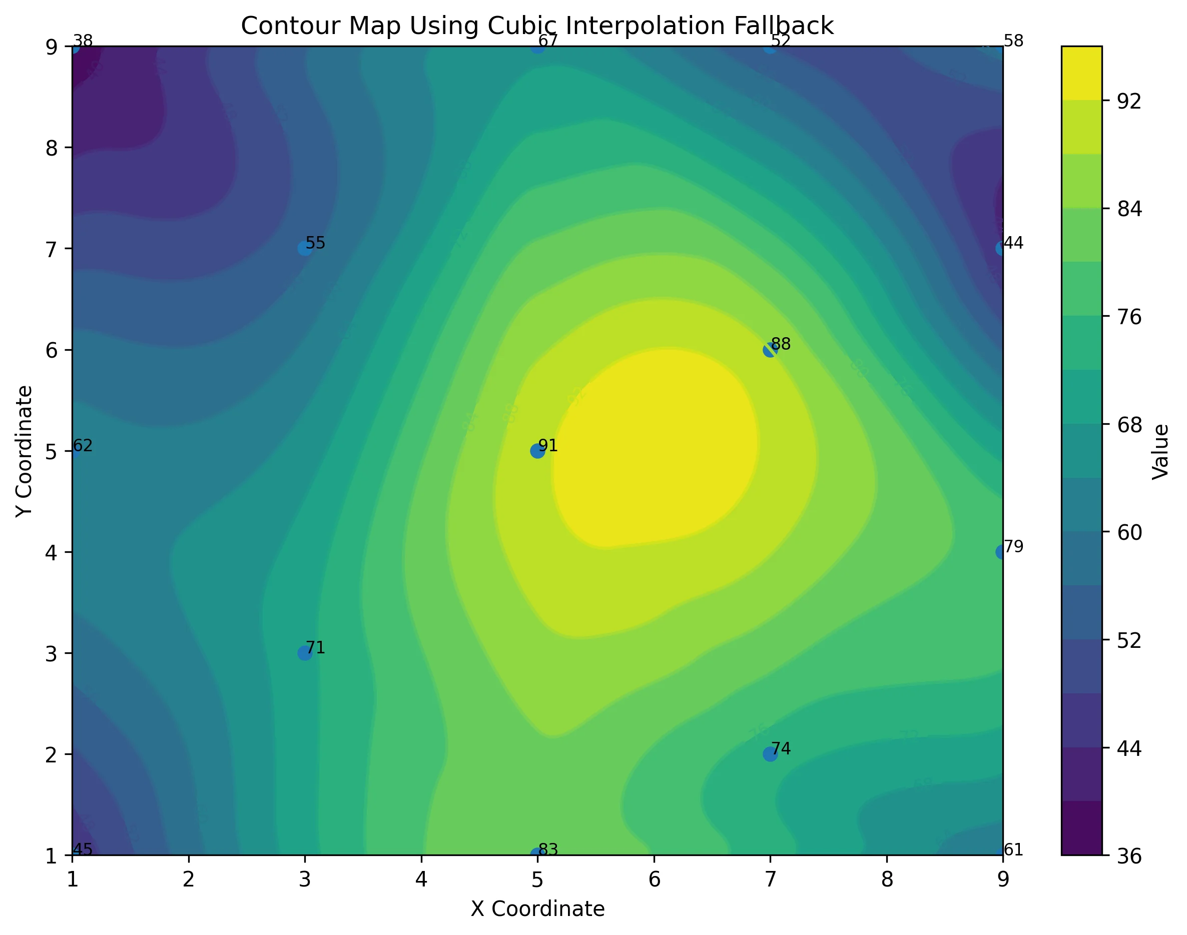
Ever stop and wonder: does AI make mistakes? Before you start using AI tools to create your maps, discover the answer to this key question.
- Jun 23, 2026|Gabbie Rhodes|7 min
What contributions are women making in STEM? Discover eight examples of women in STEM fields and the meaningful impact they’re making.
- Jun 17, 2026|Gabbie Rhodes|8 min
Both work and family require energy and intentionality. To ensure you approach them effectively, discover tips to balance work and family life.
- Jun 17, 2026|Gabbie Rhodes|11 min
Senior Technical Sales Specialist Drew Dudley hosted a webinar to provide tips for ensuring coordinate systems display accurately and consistently.
- Jun 10, 2026|Gabbie Rhodes|9 min
During peak season, it’s hard to complete high-quality work on time. Fortunately, some practical workplace productivity hacks can help.
- Jun 10, 2026|Gabbie Rhodes|5 min
When it comes to software, the right licensing model matters. A one-time fee and subscription are common options. Which is right for you?
- Jun 3, 2026|Gabbie Rhodes|9 min
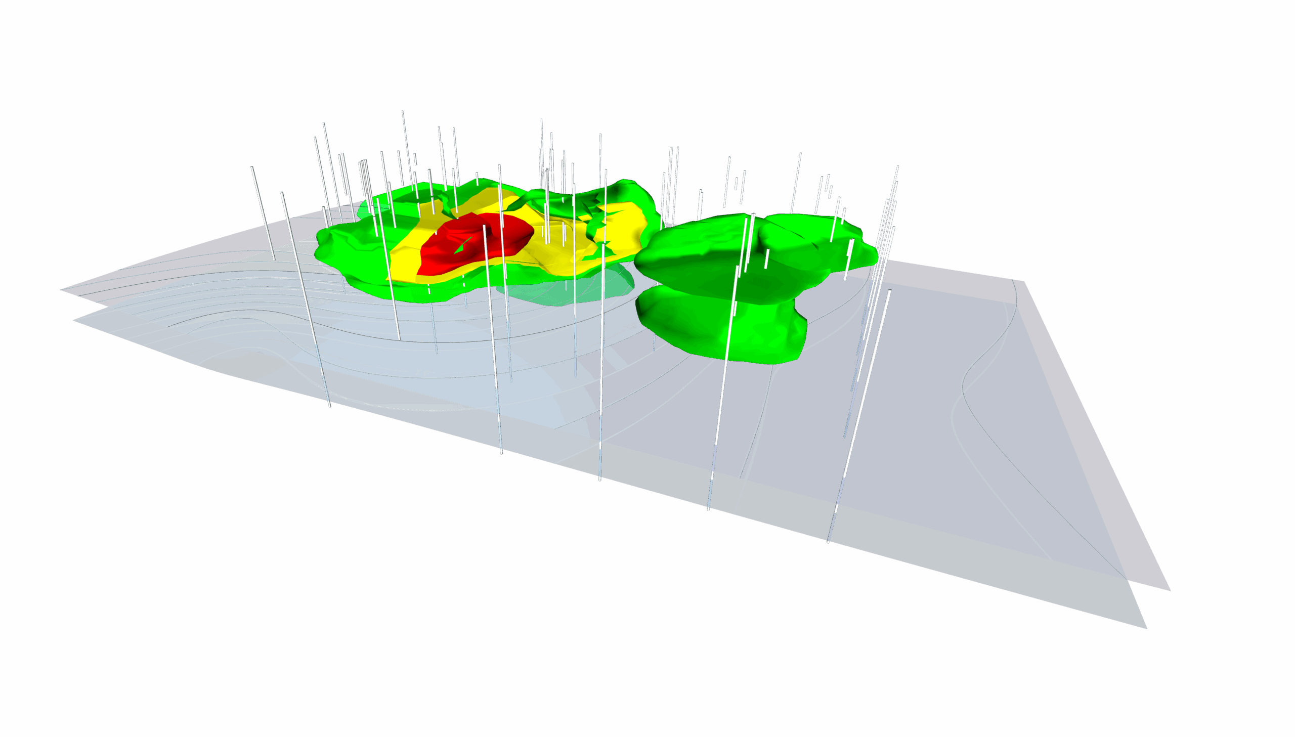
What's the difference between these two 3D data visualizations: 3D View and 3D surface maps? Discover their top differentiators.
- Jun 3, 2026|Gabbie Rhodes|8 min
Hiring a skilled geoscientist or engineer is the first step to strengthening your team. The next is training new employees for success.
- May 27, 2026|Gabbie Rhodes|5 min
Dennis Seger has played a key role at Golden Software, and our team took time to celebrate his leadership legacy as he steps into retirement.
- May 20, 2026|Gabbie Rhodes|14 min
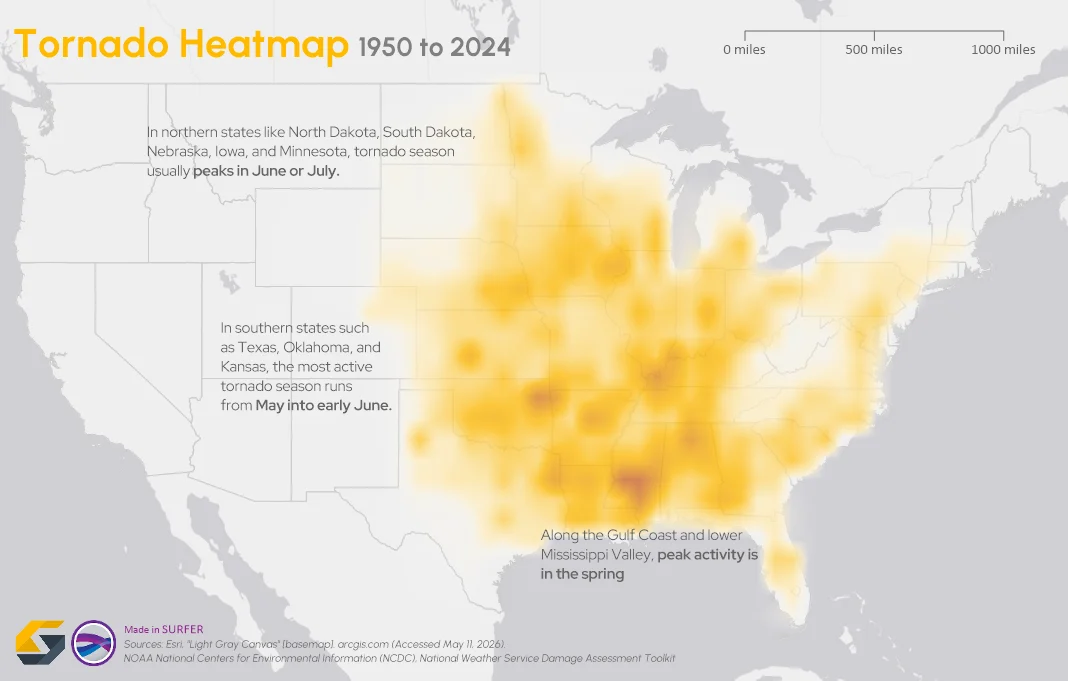
To truly answer the question, "what damage can a tornado cause," the first step is analyzing broader patterns across communities and landscapes.
- May 20, 2026|Gabbie Rhodes|7 min
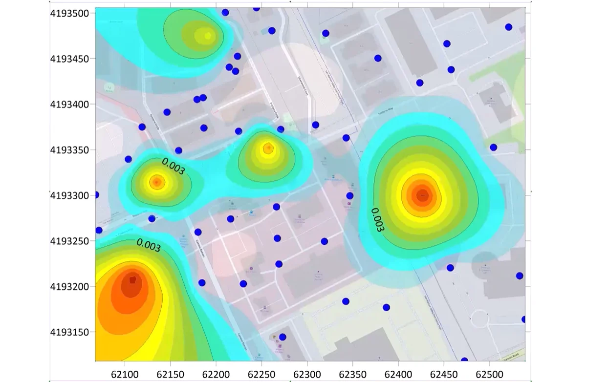
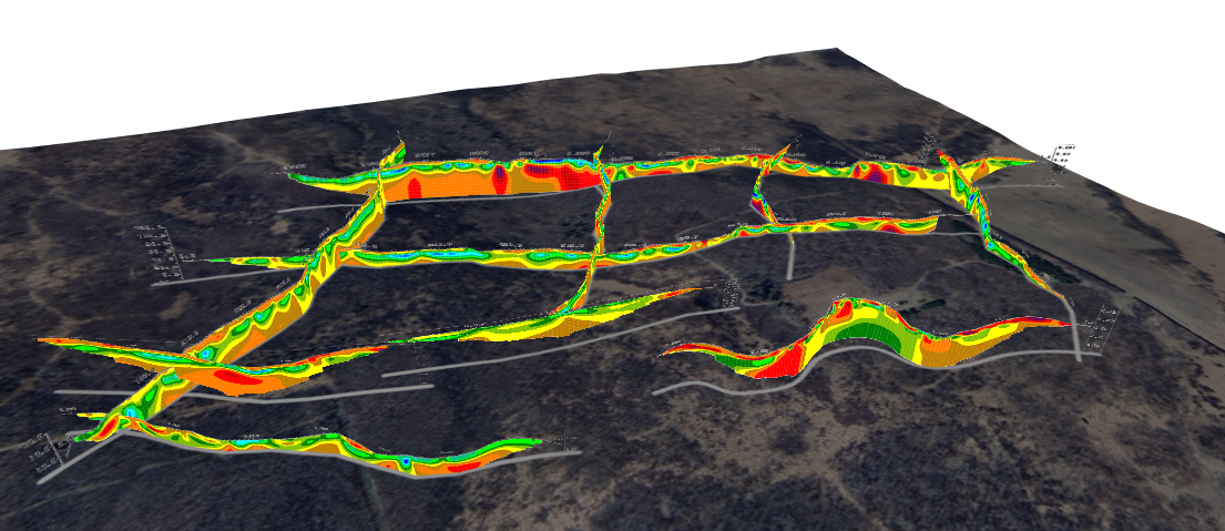
The gap between analysis and true spatial understanding has real consequences in subsurface mapping. 3D modeling closes that gap.
- May 14, 2026|Gabbie Rhodes|10 min
Should you create a grouped, stacked, or a simple bar chart? The structure you choose matters. Discover bar chart examples to guide your choice.
- May 14, 2026|Gabbie Rhodes|7 min
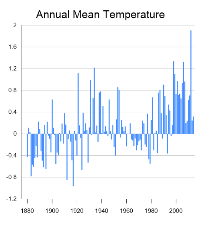
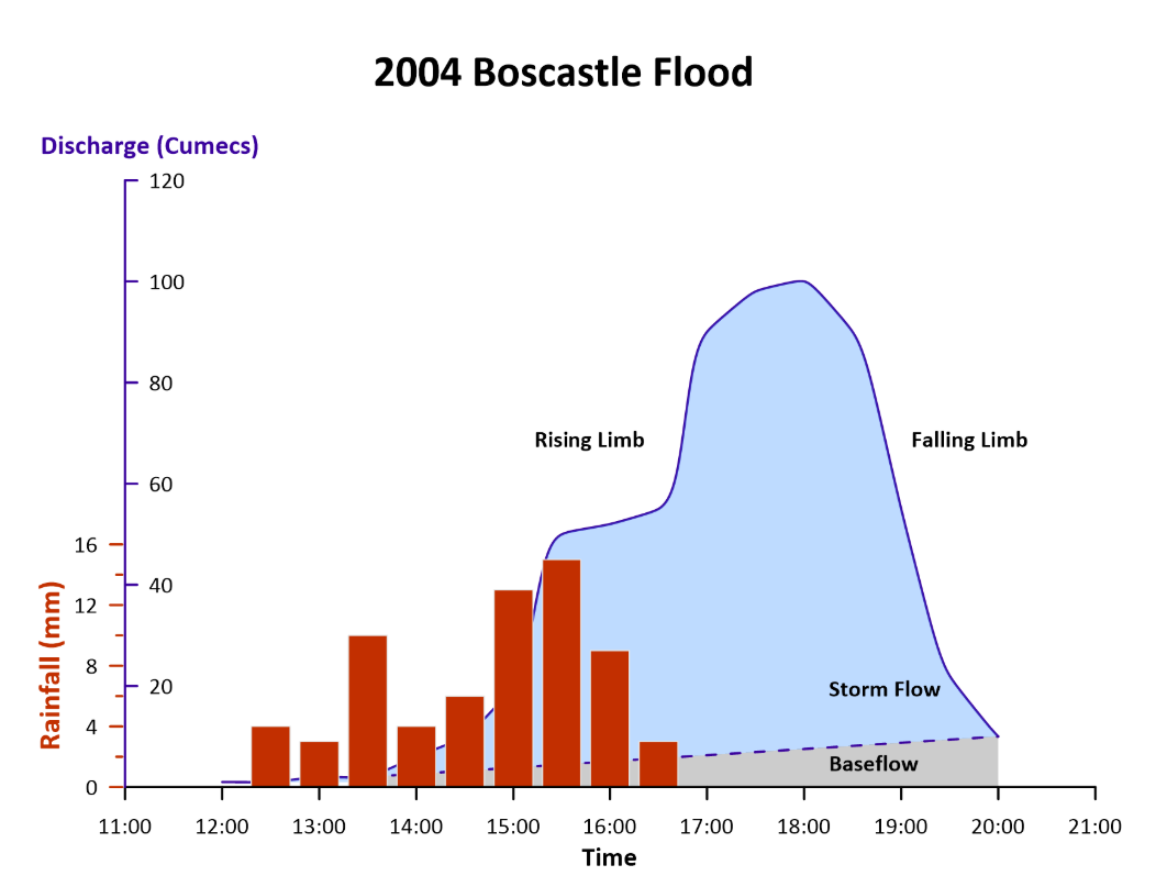
Discover how a scientific bar chart translates technical datasets into structured, understandable insights for stakeholders.
- May 5, 2026|Gabbie Rhodes|9 min
Geoscience and engineering projects rarely live inside a single software. Learn how CAD integration with other tools can achieve project results.
- Apr 29, 2026|Gabbie Rhodes|10 min
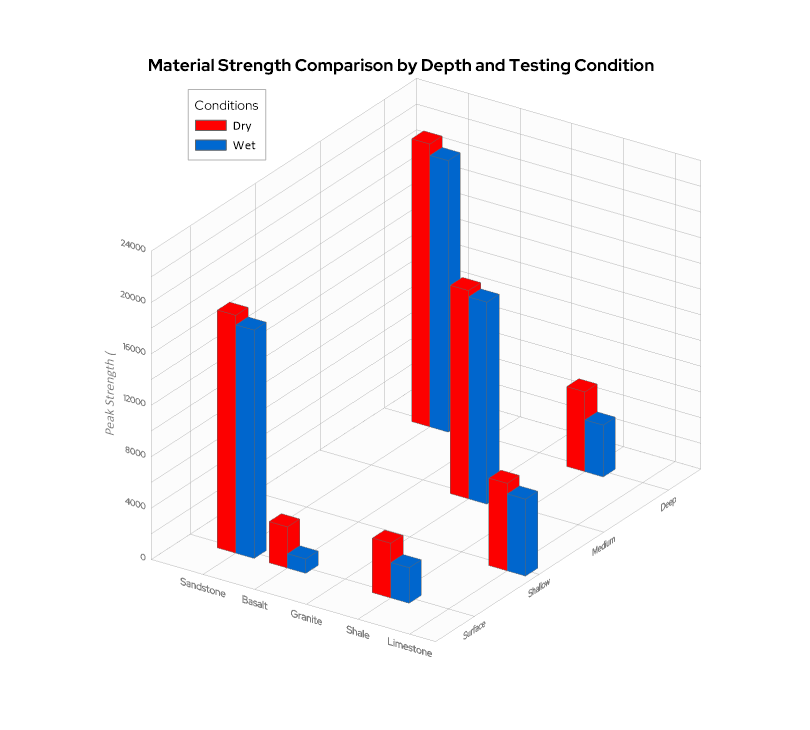
When you’re working with three variables that interact with one another—a 3D bar chart can reveal patterns that a flat chart can’t fully capture.
- Apr 23, 2026|Gabbie Rhodes|16 min
The strongest candidates are often in high demand. But with the right approach, you can attract and recruit top talent to build a stronger team.
- Apr 23, 2026|Gabbie Rhodes|9 min
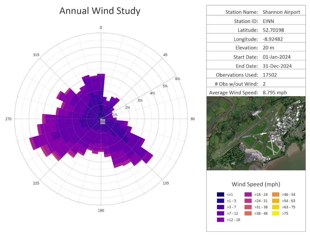
Even accurate data can fall short if time is displayed poorly. That’s why thoughtful time formatting is essential for your data visualization.
- Apr 15, 2026|Gabbie Rhodes|11 min
You’re trained to value precision. Every contour, parameter, and assumption matters. But how do you share complex data to non-experts? Learn tips.
- Apr 15, 2026|Gabbie Rhodes|12 min
IT procurement includes budget justifications, security reviews, and sign-off. To make it through the process, IT procurement best practices matters.
- Apr 8, 2026|Gabbie Rhodes|9 min
Ever wonder how to make a bar chart that impresses viewers? Discover customizations that'll highlight what matters, clarify differences, and more.